Grupo Cardoso
Grupo Cardoso
Brand Identity
Graphic Design
2015
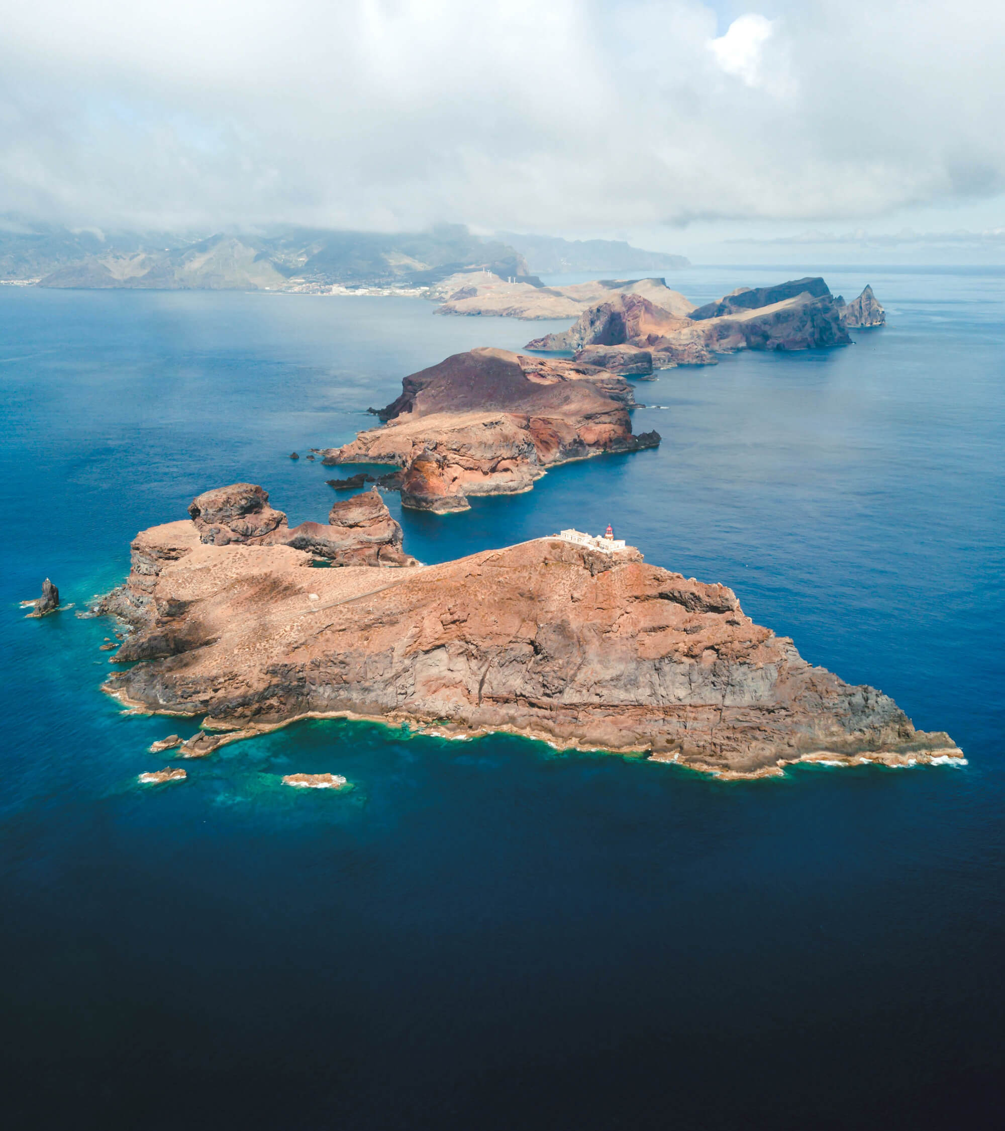
Once upon a time, a tiny island in the middle of the Atlantic became one of the most well-known world destinations. One that has been desired for the past 3 centuries throughout Europe, enchanting and enticing all those who visit it. This tiny island is a small, secure formation in the ocean, where the flowers are exuberant, the scents are alluring, and the greenery is compelling. It was nick-named as Atlantic's pearl. An exclusive and incredibly chic resort, naturally protected from the bustle of big cities.
Fast-forward a couple of centuries, mass tourism, travel marketing, and low-cost airlines took their toll on the island. Once remote and discrete, Madeira became one of the most sought-out touristic hotspots, a safe haven with warm temperatures all year round, associated with senior tourism and all-included resorts. And then something changed.
Madeira positioned itself as an adventurous destination - one where you can enjoy the sea and the mountains, where hiking is a way of life, and the Instagram-friendly sceneries practically fall on anyone's lap – anyone younger and fitter and trendier than the typical Madeira visitor.
So Madeira did what it needed to do: it revamped its' offer, it created a brand for travelers and explorers, it became a lot more than folklore dances and thatched roofs. Hotels, once incredibly chic and later widespread had to pull up their weight in this fight. With fierce and relentless willpower, those who wanted to stay in the game and create a distinct brand for 21st-century travelers - the ones who wanted to thrive - had to reinvent themselves.

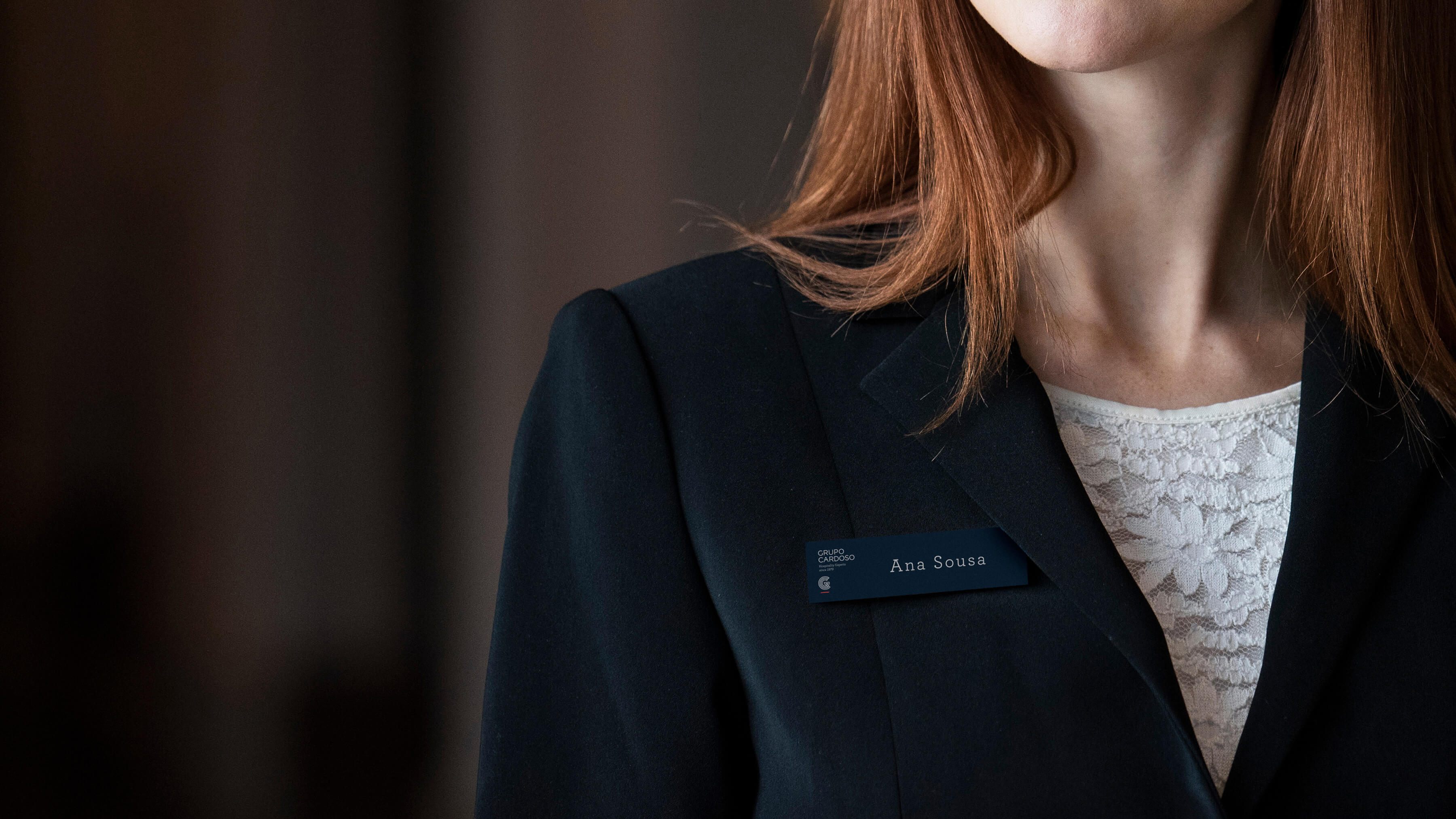
That's what we did for Cardoso Group. It had to be bigger than Madeira, but also the perfect place to stay when visiting. The family name added massive value to this, primarily because of the historical and knowledgeable heritage it portrayed. So we added the "Group" to the title, to make it sound like the real institution it was. It also added to the groups' ability to expand itself beyond the hotel category, becoming a hospitality icon.
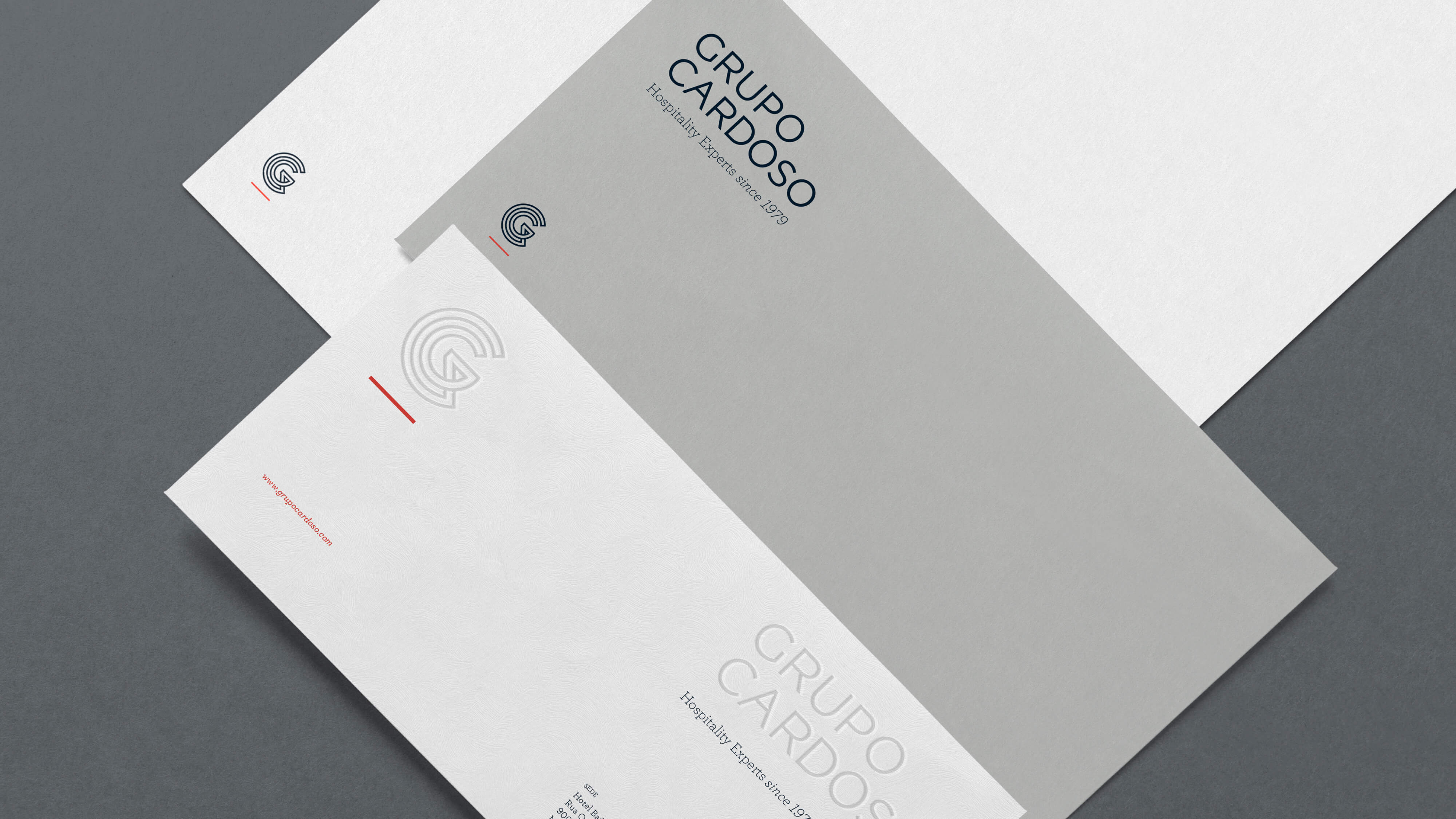
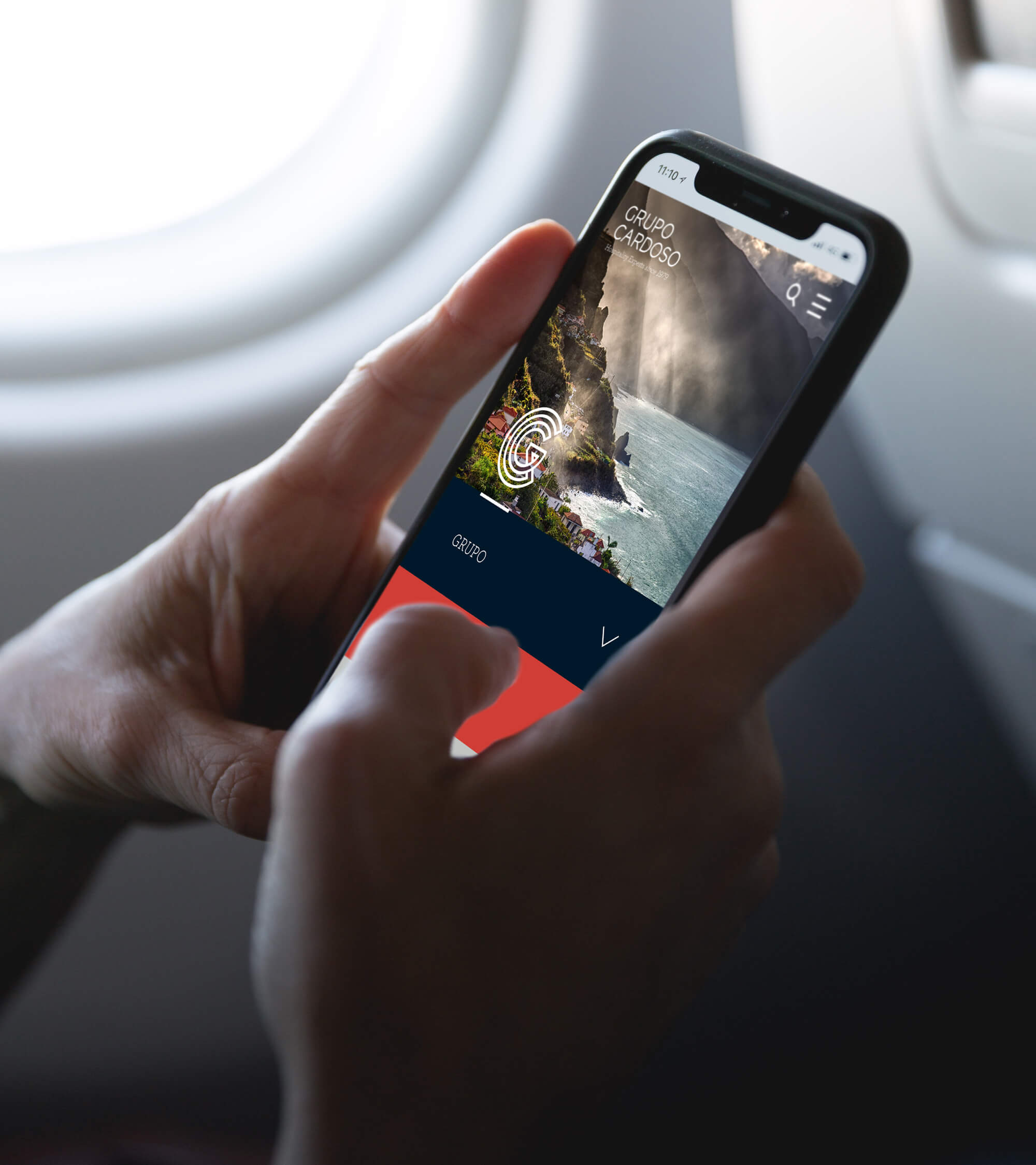
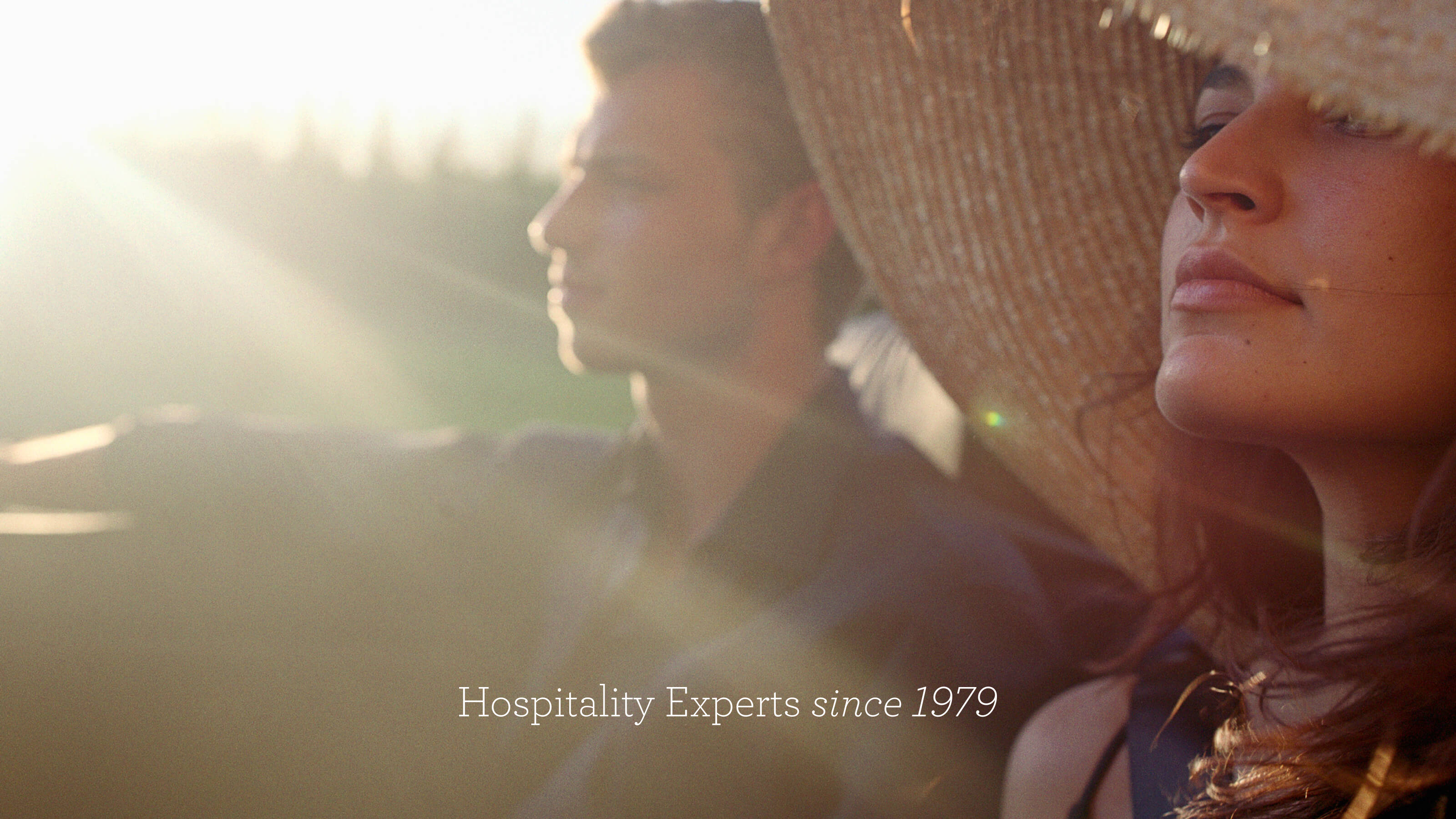
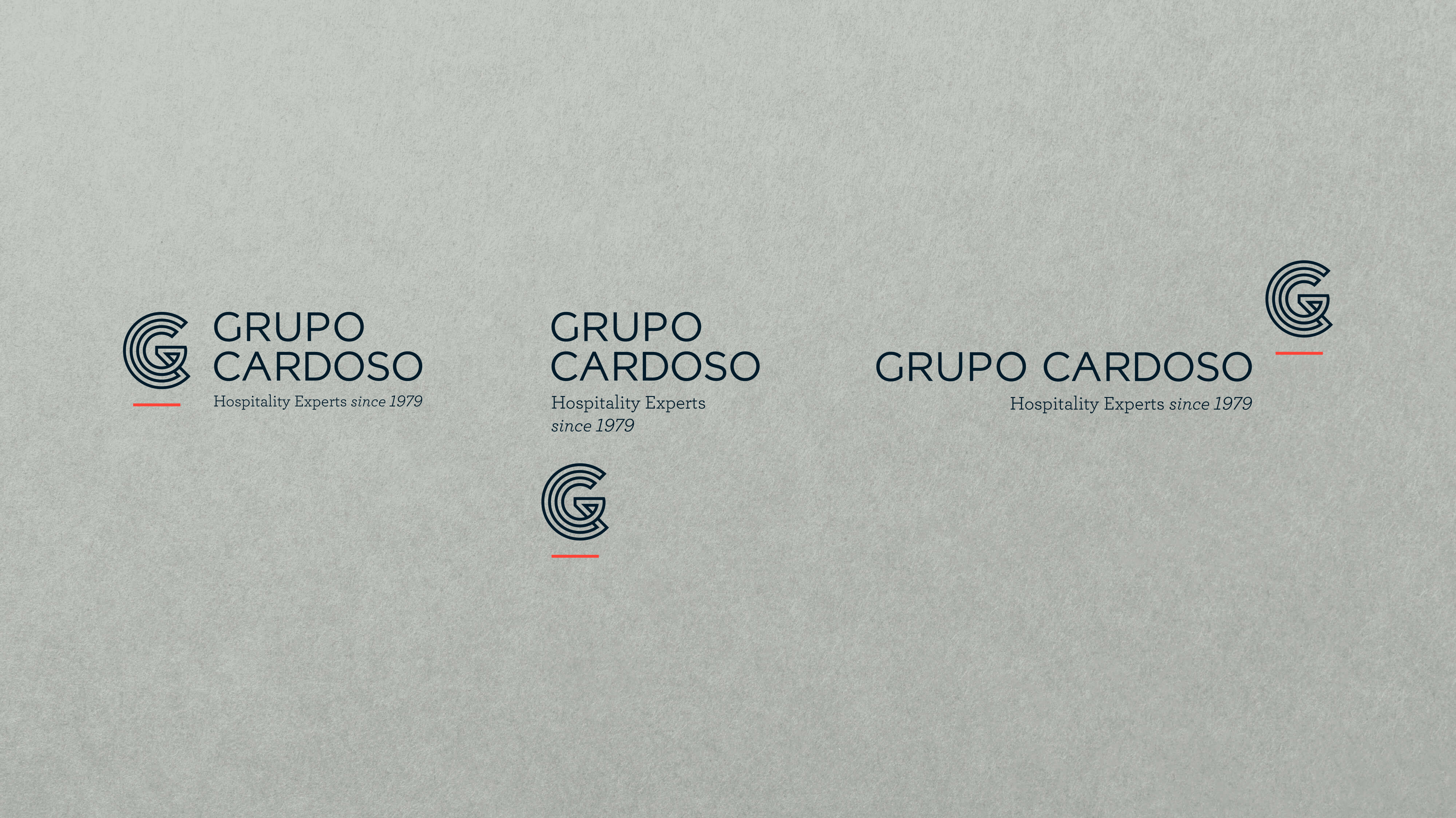
To promote the convergence and meeting values that the group wanted to provide, we also needed to expand it and give it the potential to grow. So the signature was born: "Hospitality Experts since 1979". Our symbol creates a connection between the C and the G, representing the dynamics of evolution and growth. It has the strength of a Monogram, creating a corporate and global identity. The line represents the horizon, but also the sustainability of the group. It also creates an association with the Madeira island, inspiring harmony, and tranquillity.

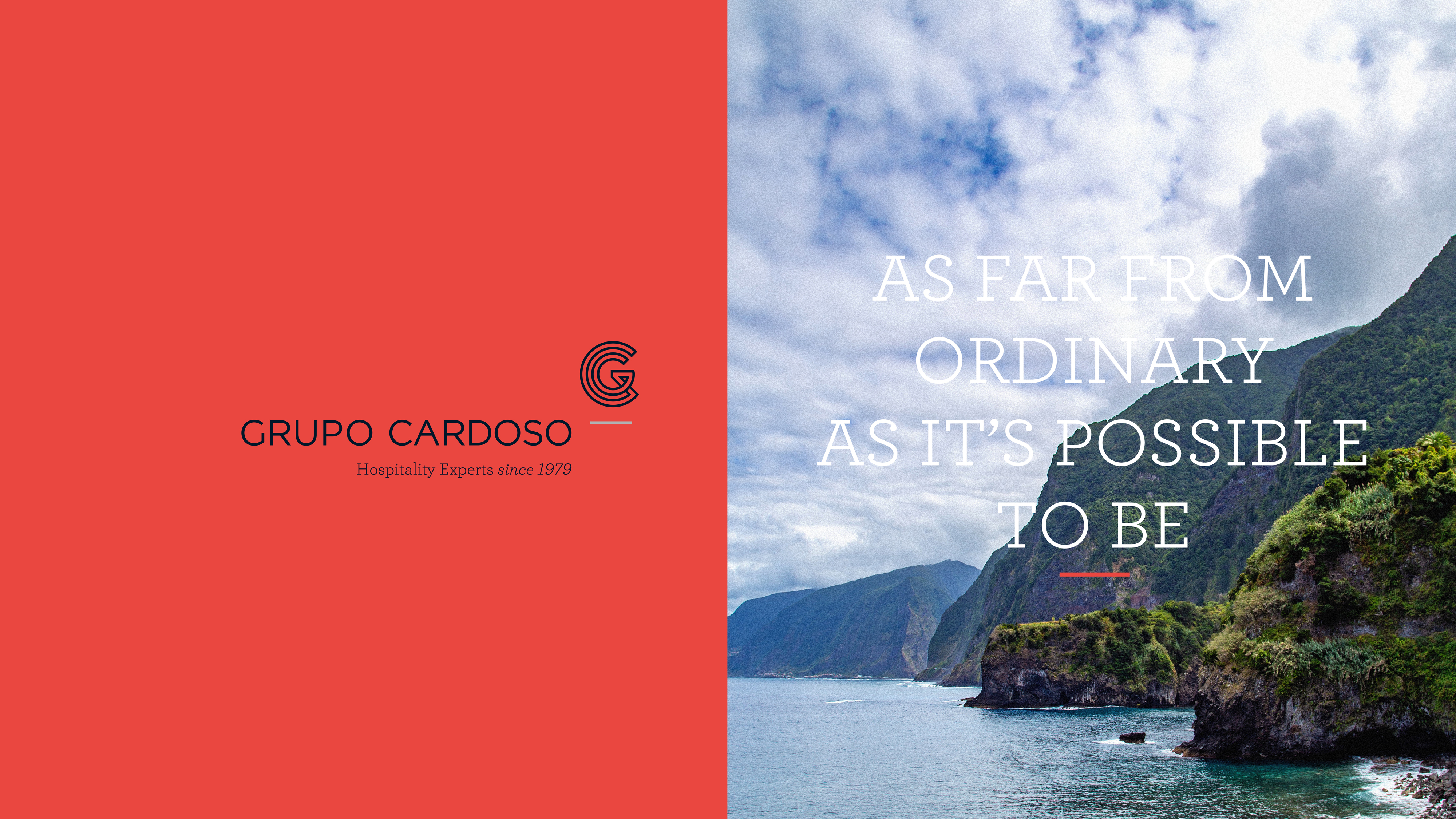

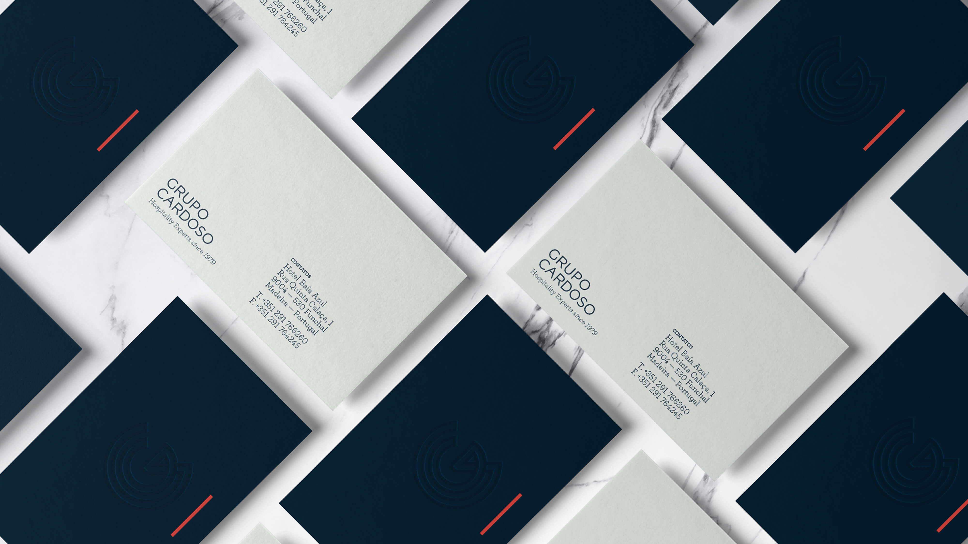
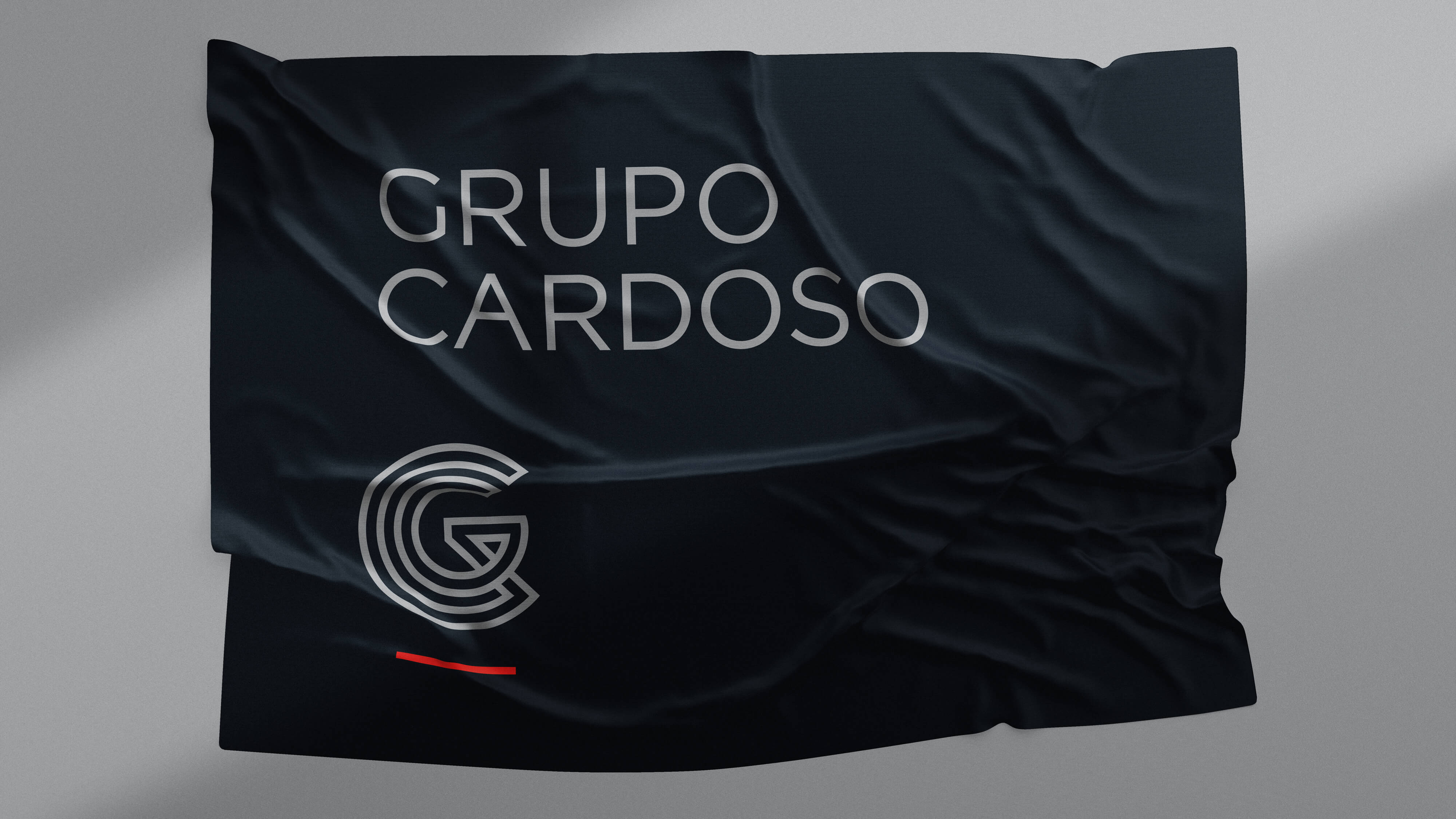
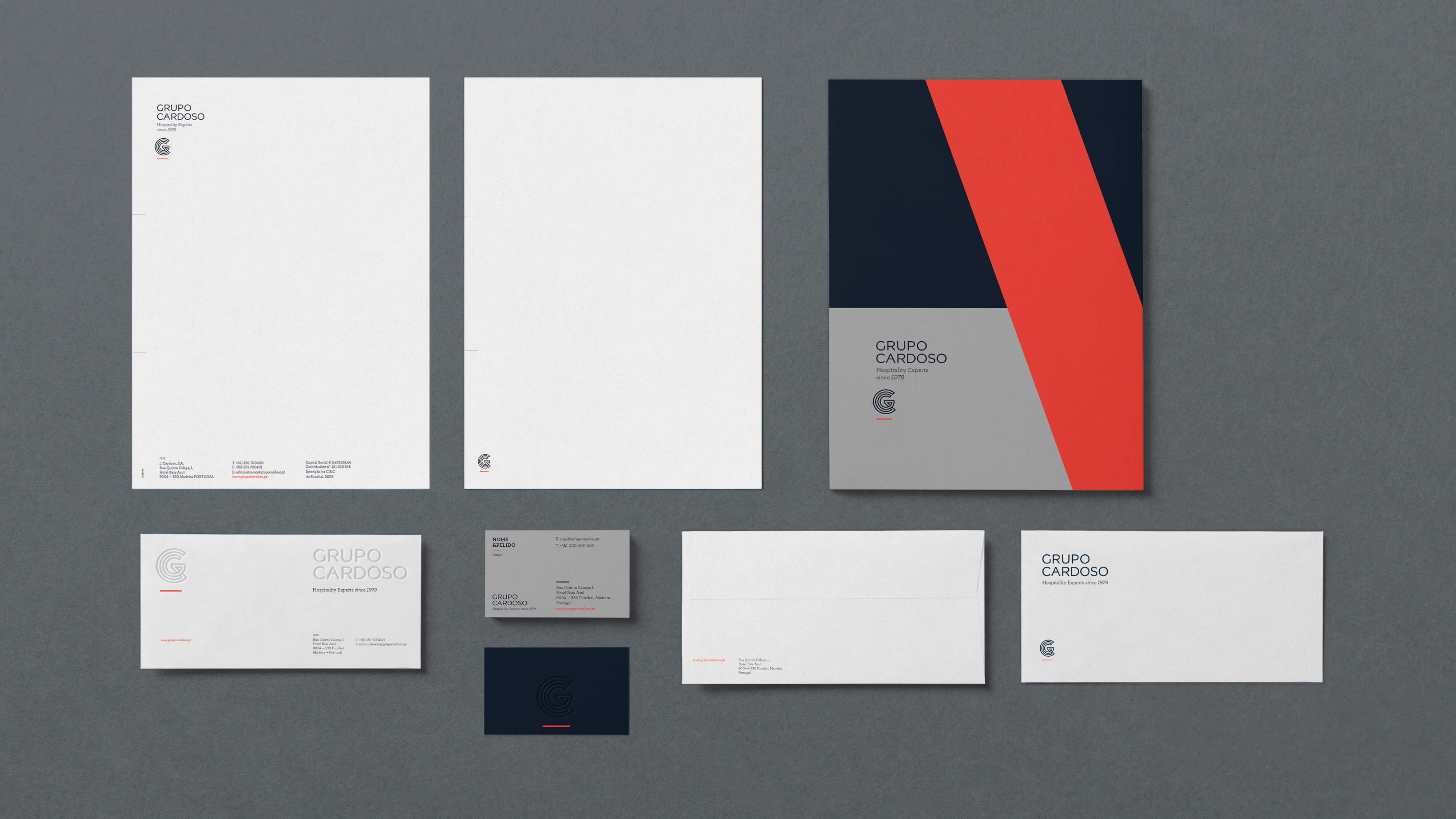
The personalized typography creates a substantial territory. Its clean and straightforward design makes sure that the symbol is balanced. The color scheme translates an institutional and geographical nature: the blue of the deep ocean coexists with a soft, Madeira-exotic red, and also with a severe corporate grey: we mean business, here. Emotion and solidity are the stakeholders of the brand.