Orpheu XI
Avenue
Brand Identity
Graphic Design
Editorial Design
Digital
2017
Fernando Pessoa came by and there are no words to do him justice. Perhaps that is why Orpheu XI was such a special project, capable of enchanting all those who were involved in its design. The birthplace of the magazine that had the collaboration of some of the greatest Portuguese artists of the 20th century, was also the space that launched the modernist movement in the country. Such an illustrious and distinguished house deserved to be treated with the grandeur, passion and poetry that its walls had seen proliferate.
Naming was not an issue: we wanted to pay homage to the former Jansen brewery, which saw Orpheu magazine born; and to refer to its privileged location in Chiado.
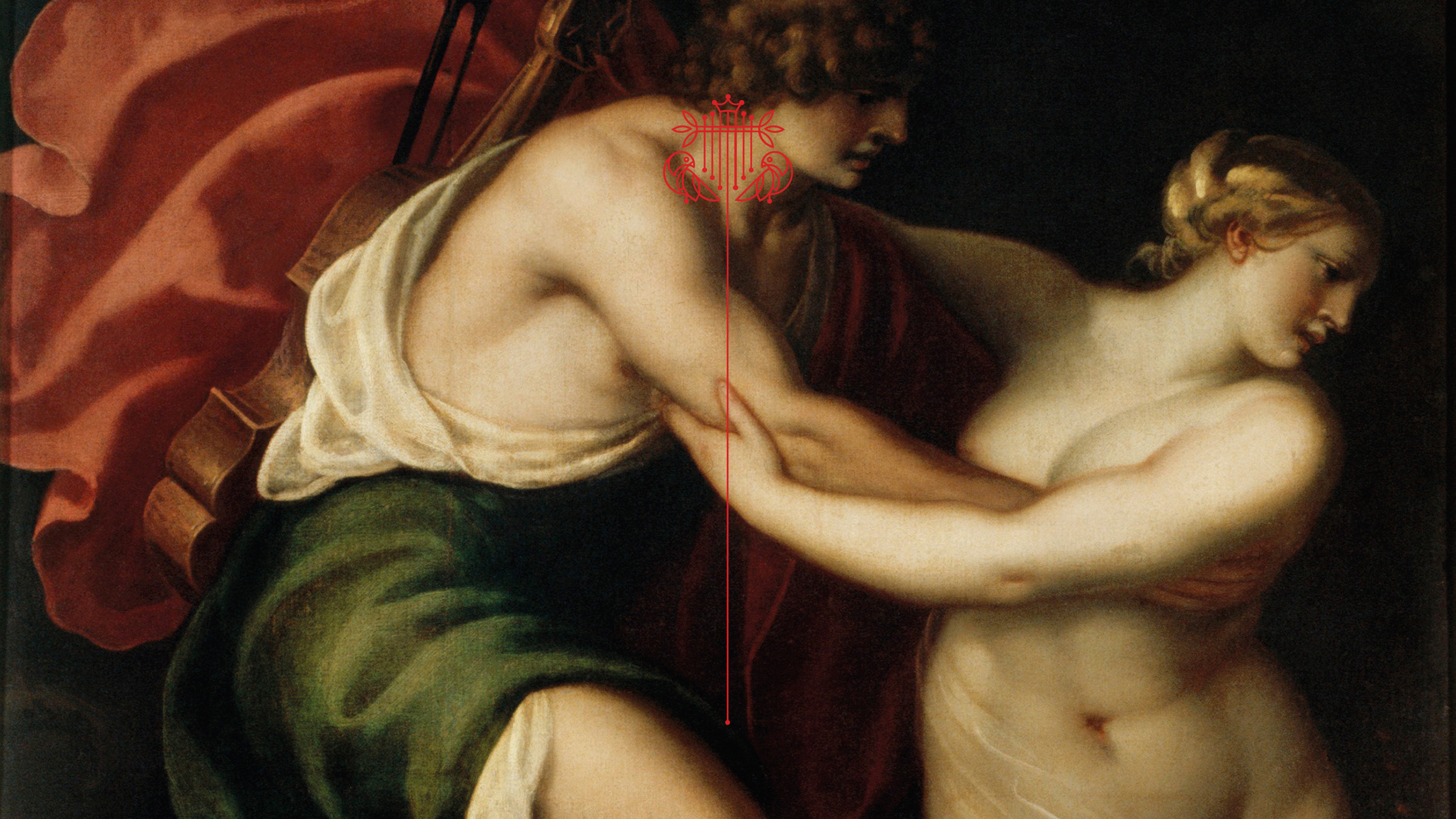
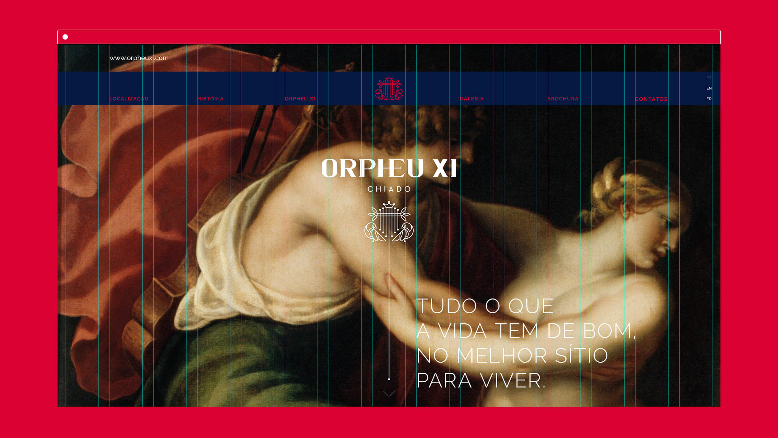
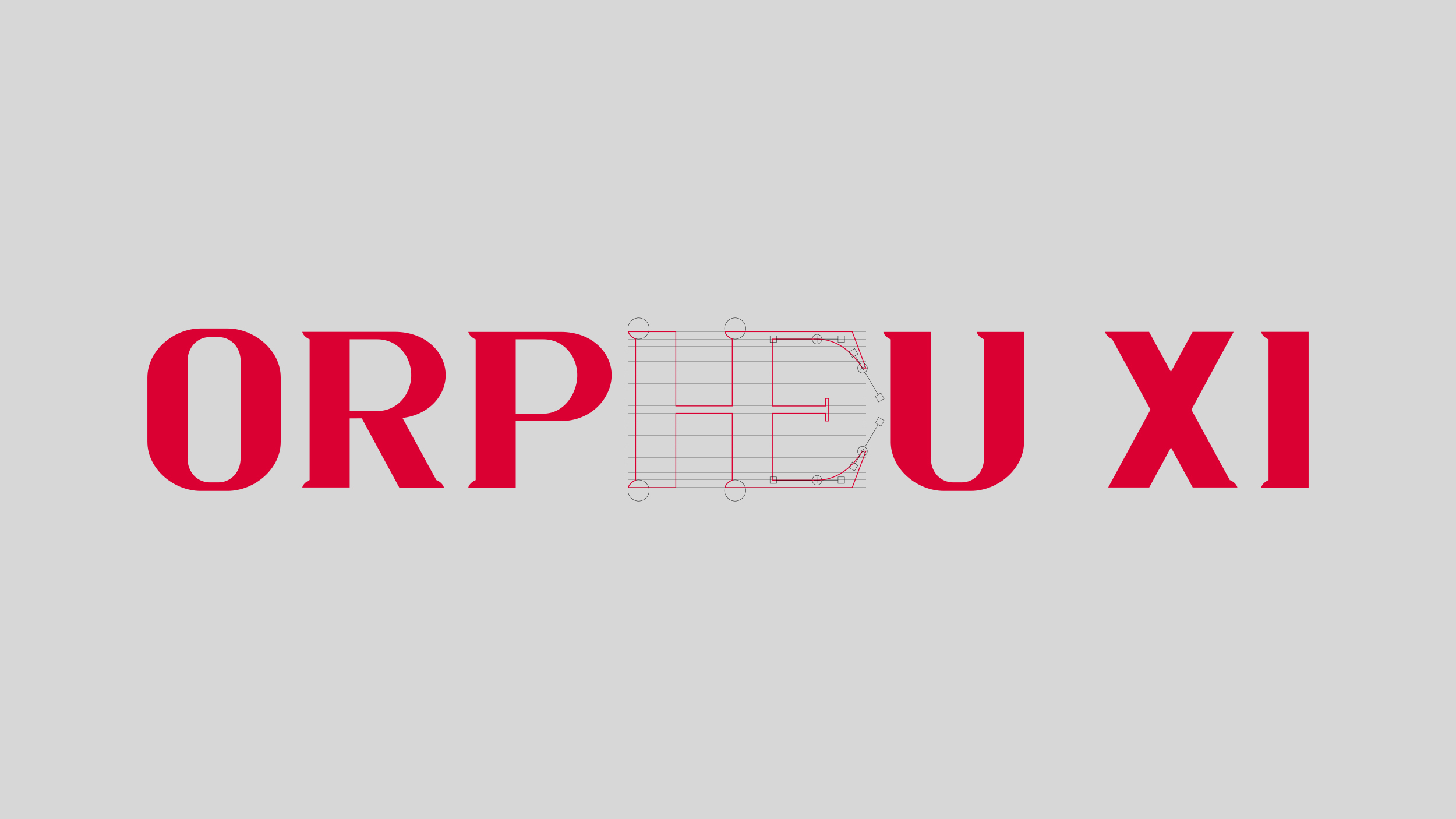
With the door, comes the name: Orpheu XI, represented by the mythical harp that enchants fauna and flora, and that brings an art view to Lisbon’s everyday life.
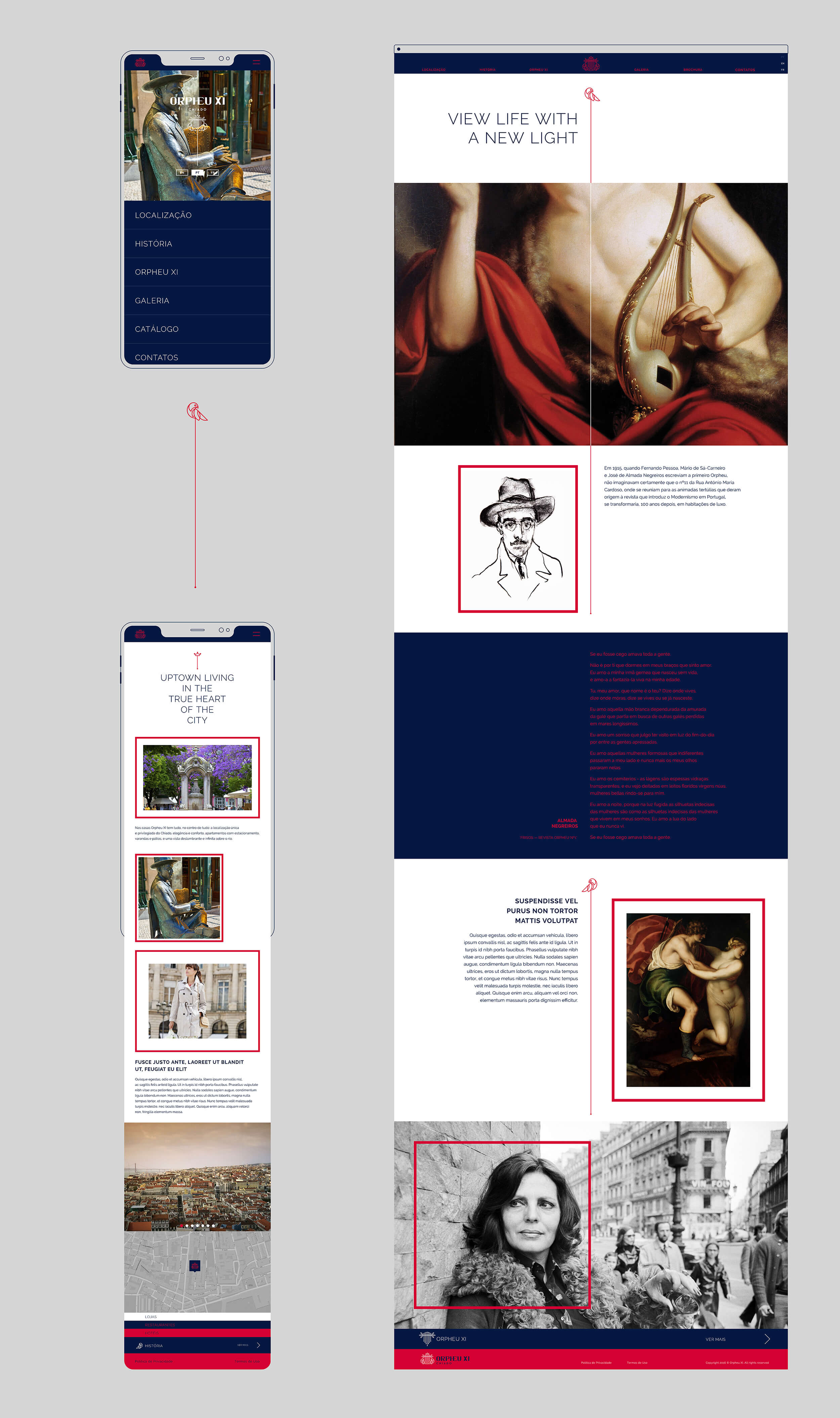
At Orpheu, nothing was trivial, common or obvious. Nothing we did for Orpheu XI could ever be.
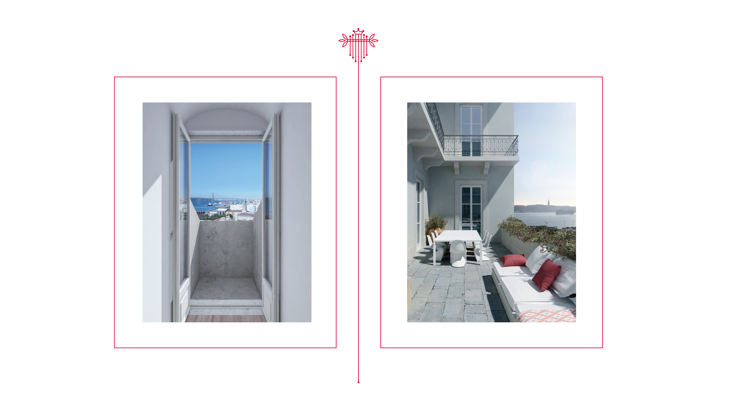
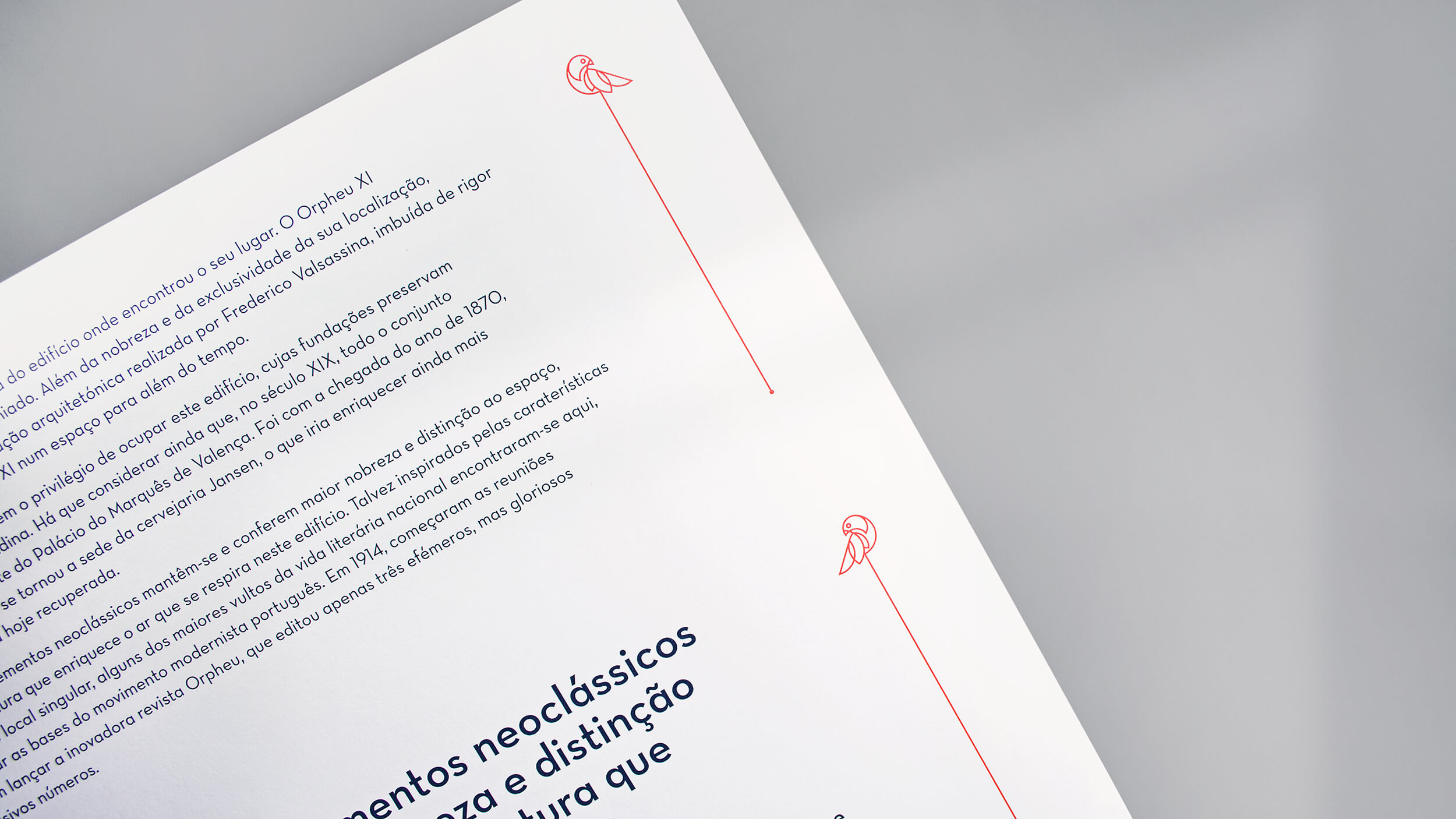
The photographs, illustrations and quotes used throughout the brochure were created and chosen to reinforce the exclusive character (only 10 apartments) of the development, as well as to honour the history of a cultural movement that, in just two editions, changed the national artistic landscape. The ability to see the sublimation of everyday life through the windows that draw the encounter between architecture and art daily had to be clear, conveying the degree of exclusivity of those looking for this address in the heart of the city.
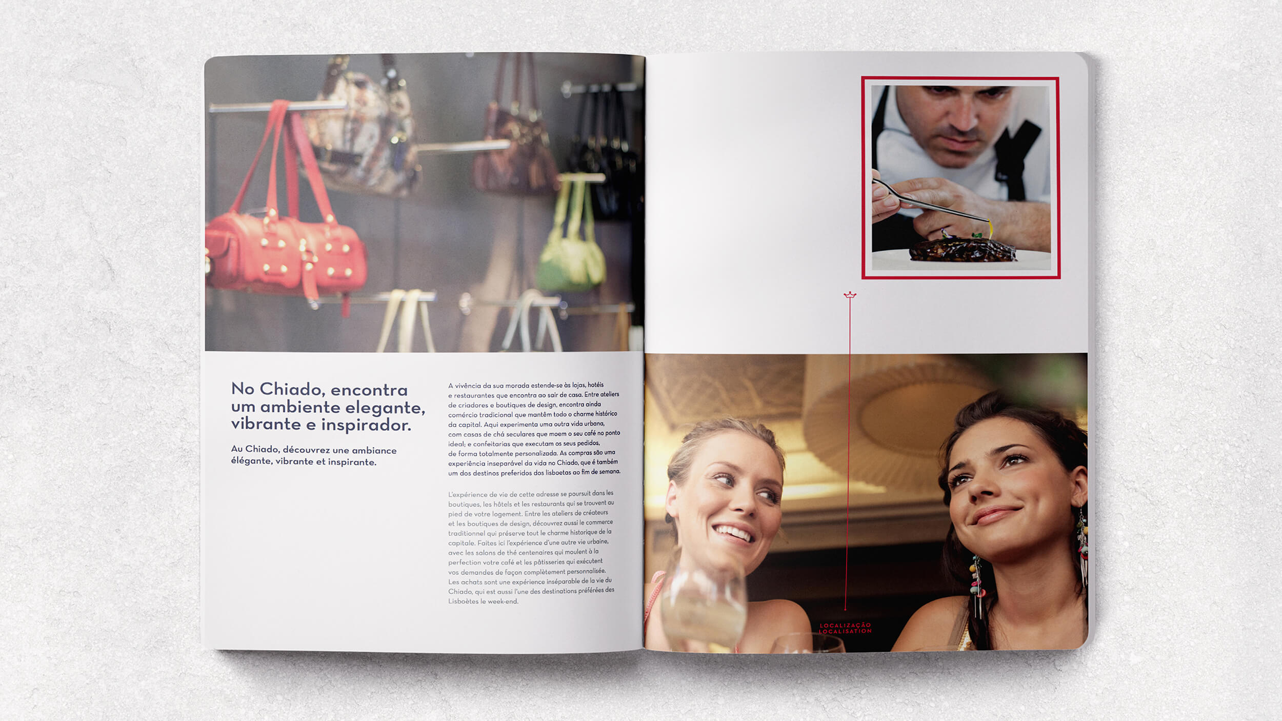
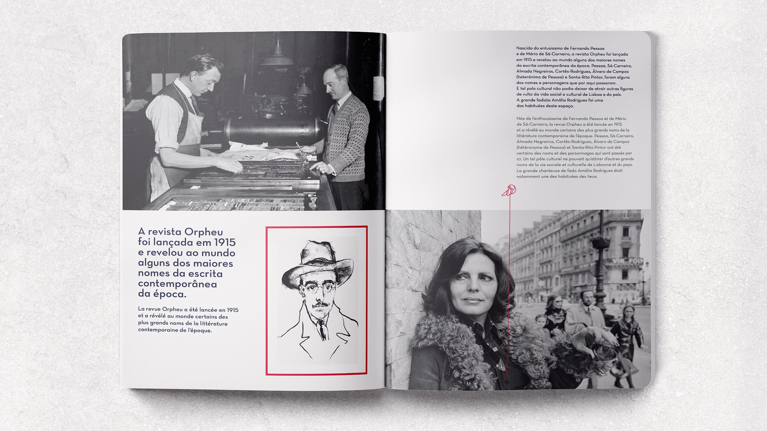
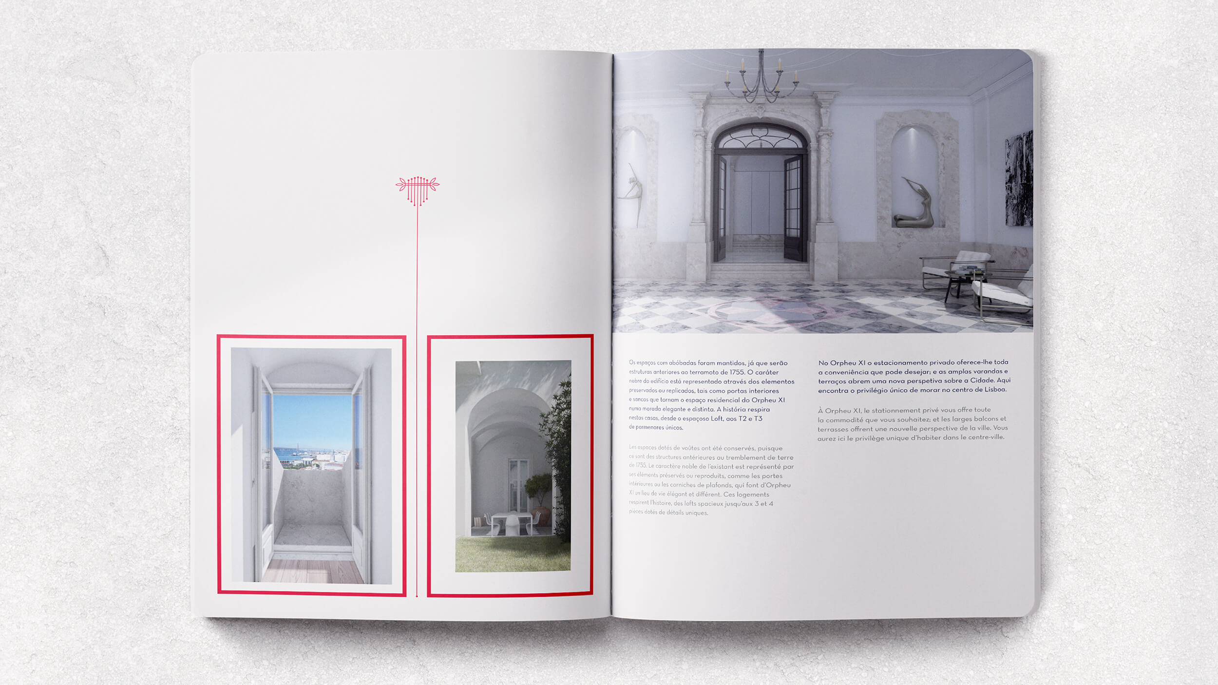
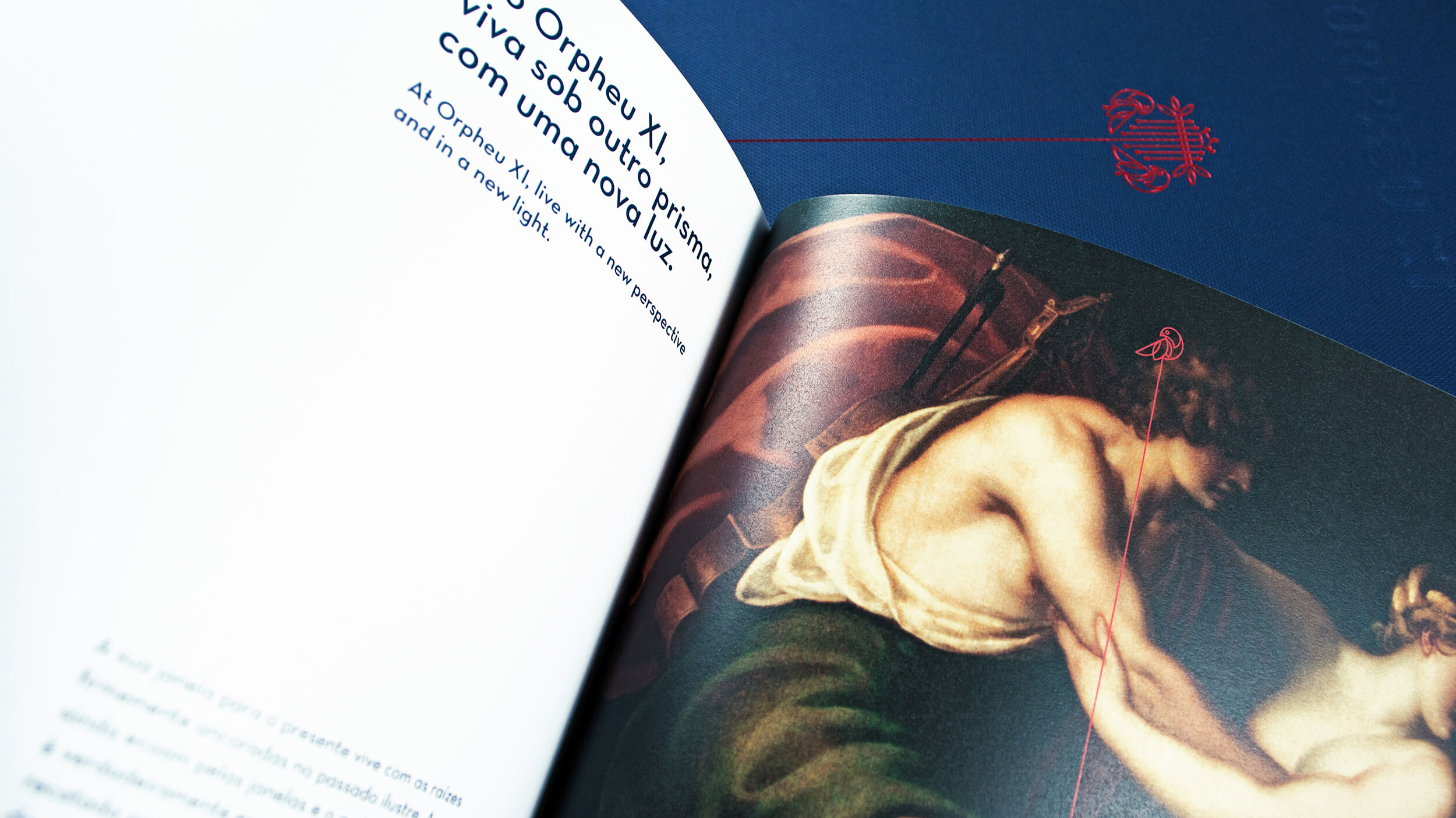
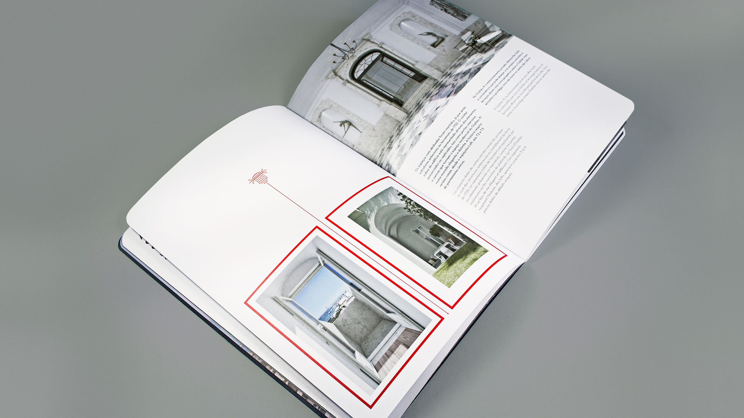
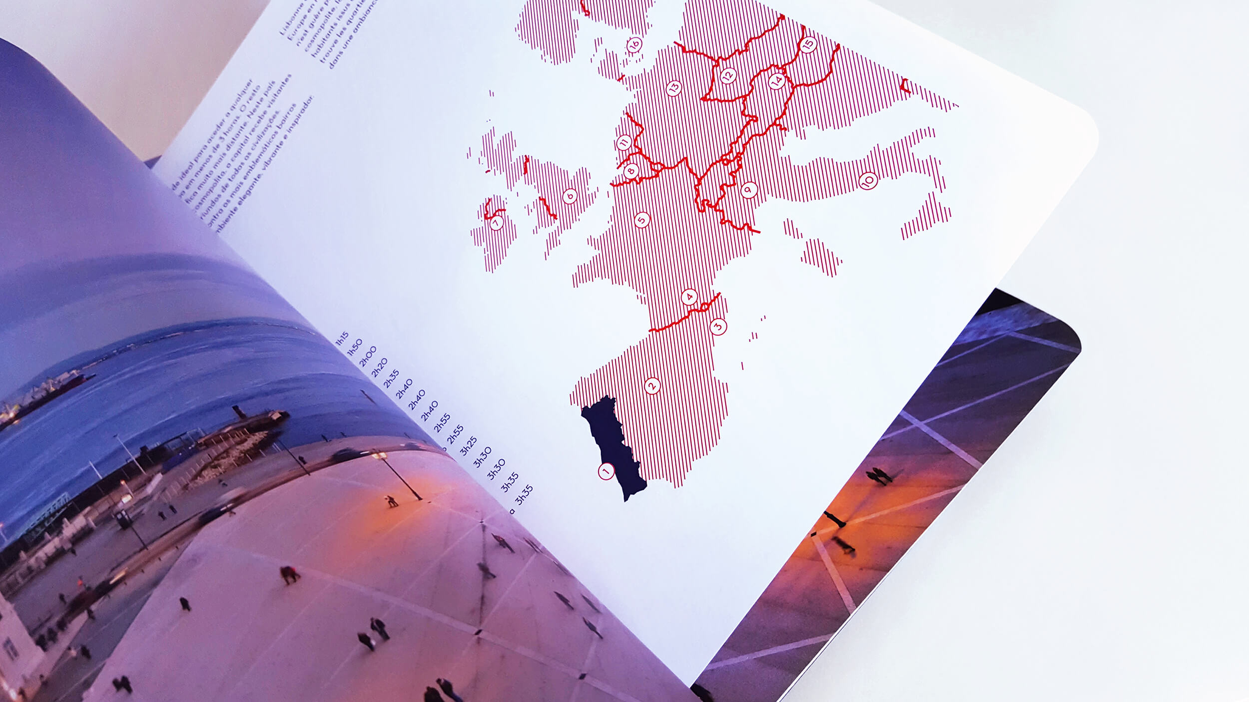
The materials used in the brochure reflect the noble spirit of the space. Like the literature that permeates every inch of the wall and still echoes through the Fernandina Wall, the images reflect the work of the painter António Ramalho, responsible for painting the ceilings of the former Jansen brewery. Every moment in history that gave rise to the most influential art movement in Portugal in the 20th century is reflected in the notebooks that make up the presentation of this building as unique as it is prismatic.
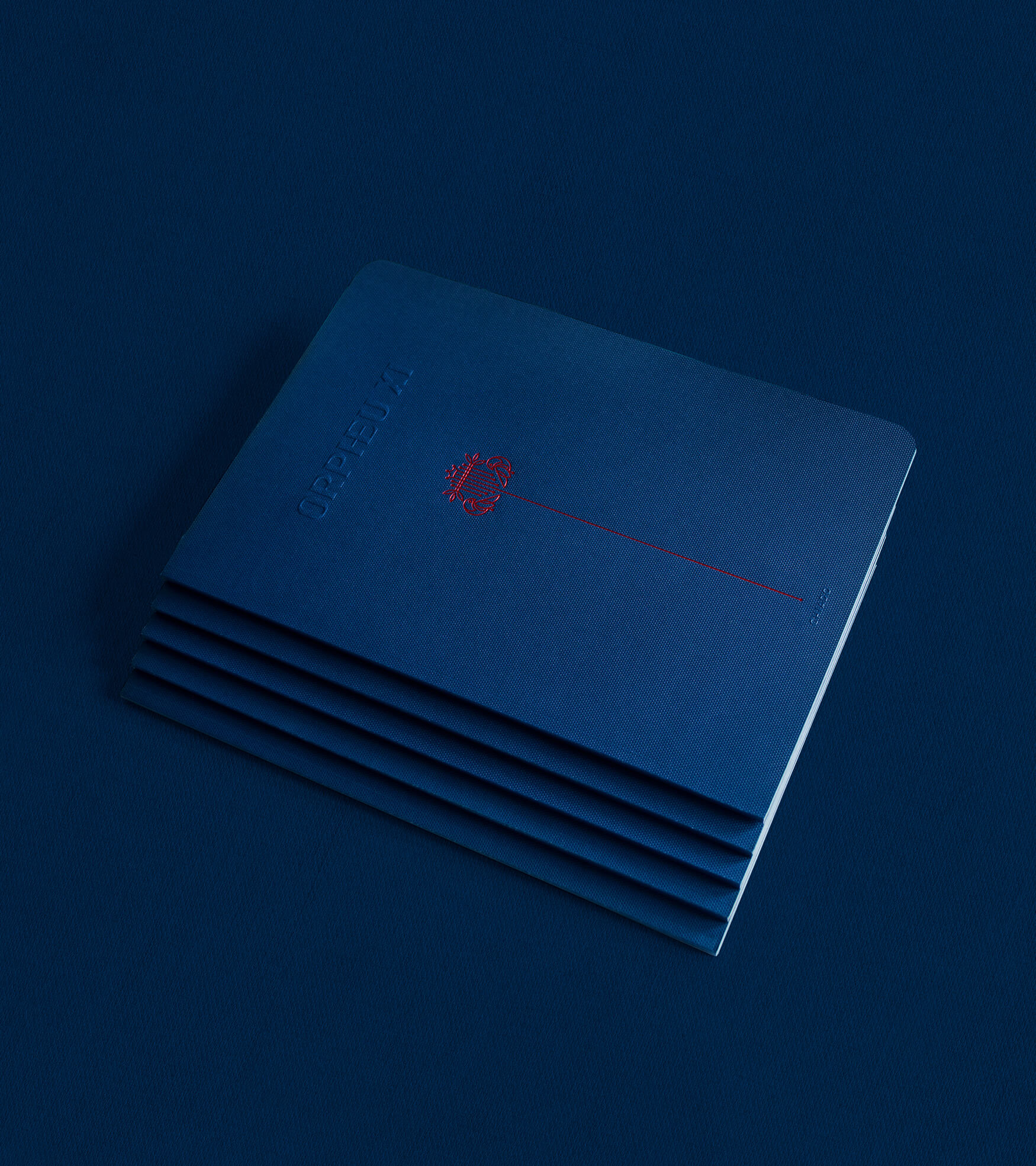
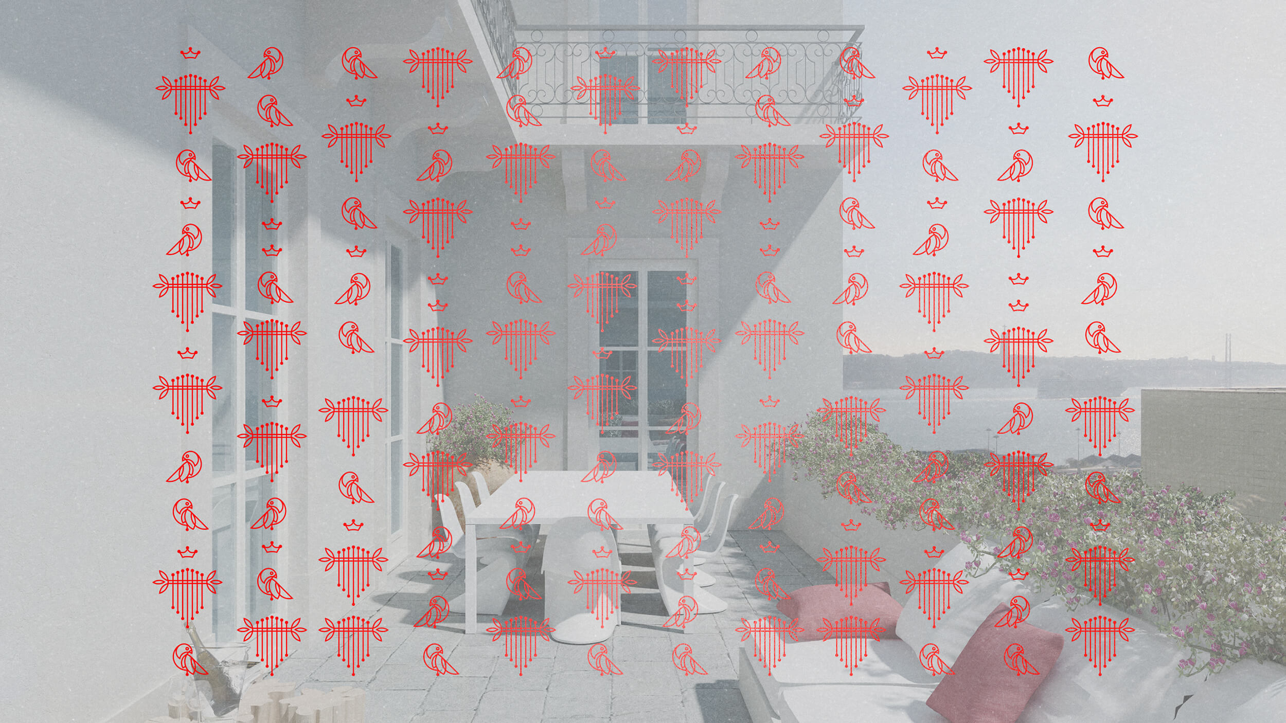
One of the main elements of the building - the balconies facing the Tagus river - evoke mornings, which allows us to add even more richness to the brand's graphic universe: the harp and the birds remind us of Lisbon mornings, which wake up to see the river shine and get ready for days between the Portuguese sidewalk and the sound of fado echoing through the streets. The royal element of the crown is the epitome of the majesty of art and evokes the building's long history - an old palace of the Marquis of Valença, in one of the noblest areas of the city.
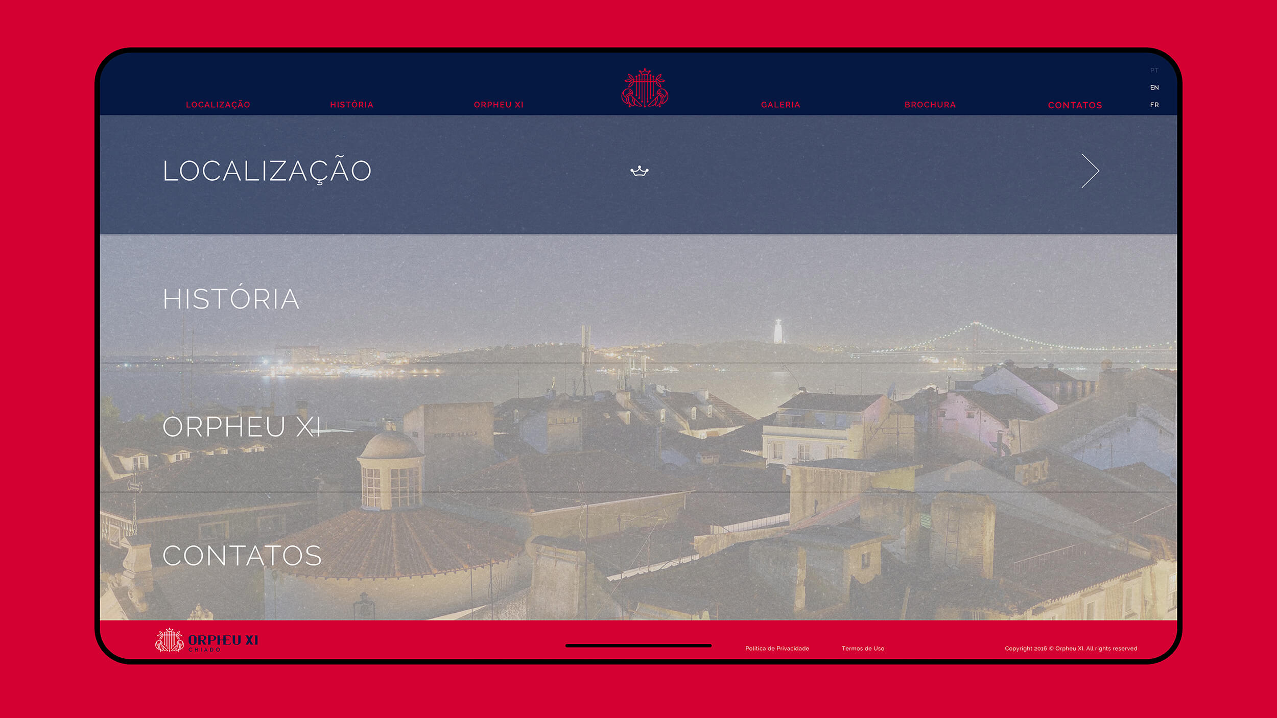
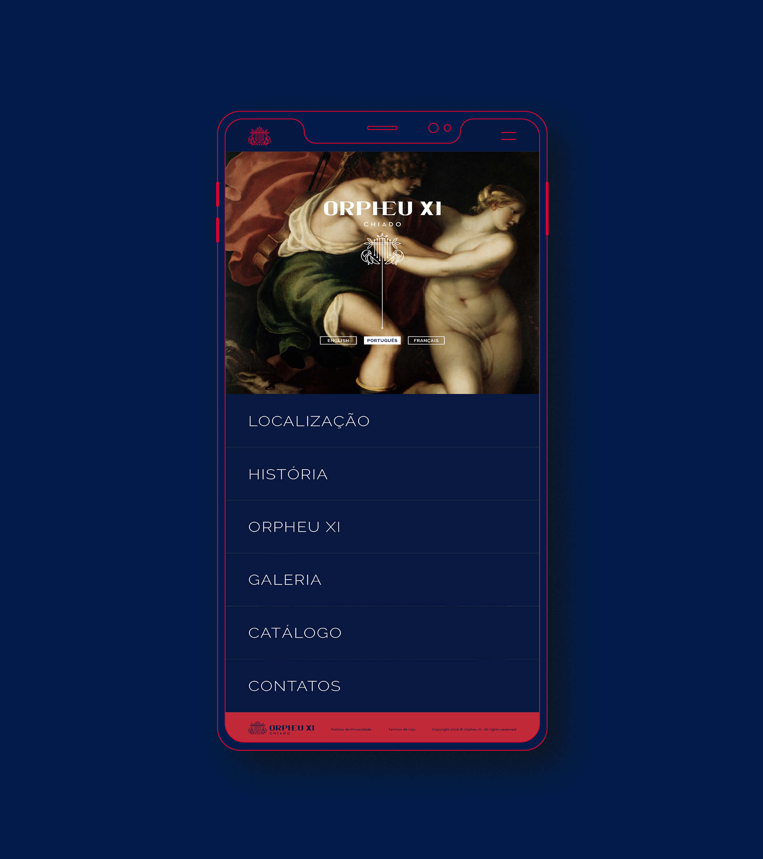
The mental space that we created also allowed us to transport two of the most classic and traditional colours to the 21st-century real estate sector, modernizing the image without removing the stamp of exclusivity and sophistication: Blue Garnet and Red Timeless. The engravings evoke the neoclassical style of the space and the atmosphere of literary gatherings is reinforced by the classic paintings that recall the associated mythological figure.
