Mulberry Hill
Avenue
Brand Identity
Graphic Design
Editorial Design
Digital
2019
Outstanding Amoreiras hill marks the profile of the city and offers one of its' best views. It is home to one of the most desired neighborhoods, providing a central location and implying successful urban living. So, how can we innovate, in an area where the real estate offer is booming? How are we able to transform and recreate the identity of a building in one of the most well-known streets in the area? Creating a name, a character, and a communication proposal that reinforces the importance, privilege, and success that implies living at the top.
The top of the city became a geographical reference to all of our communication. The positive symbolism was associated with the exclusivity of living on the highest point of the capital. The need to create differentiation, due to the countless undertakings related to this location, guided us in choosing a more poetic, more romantic, and more inspiring path.


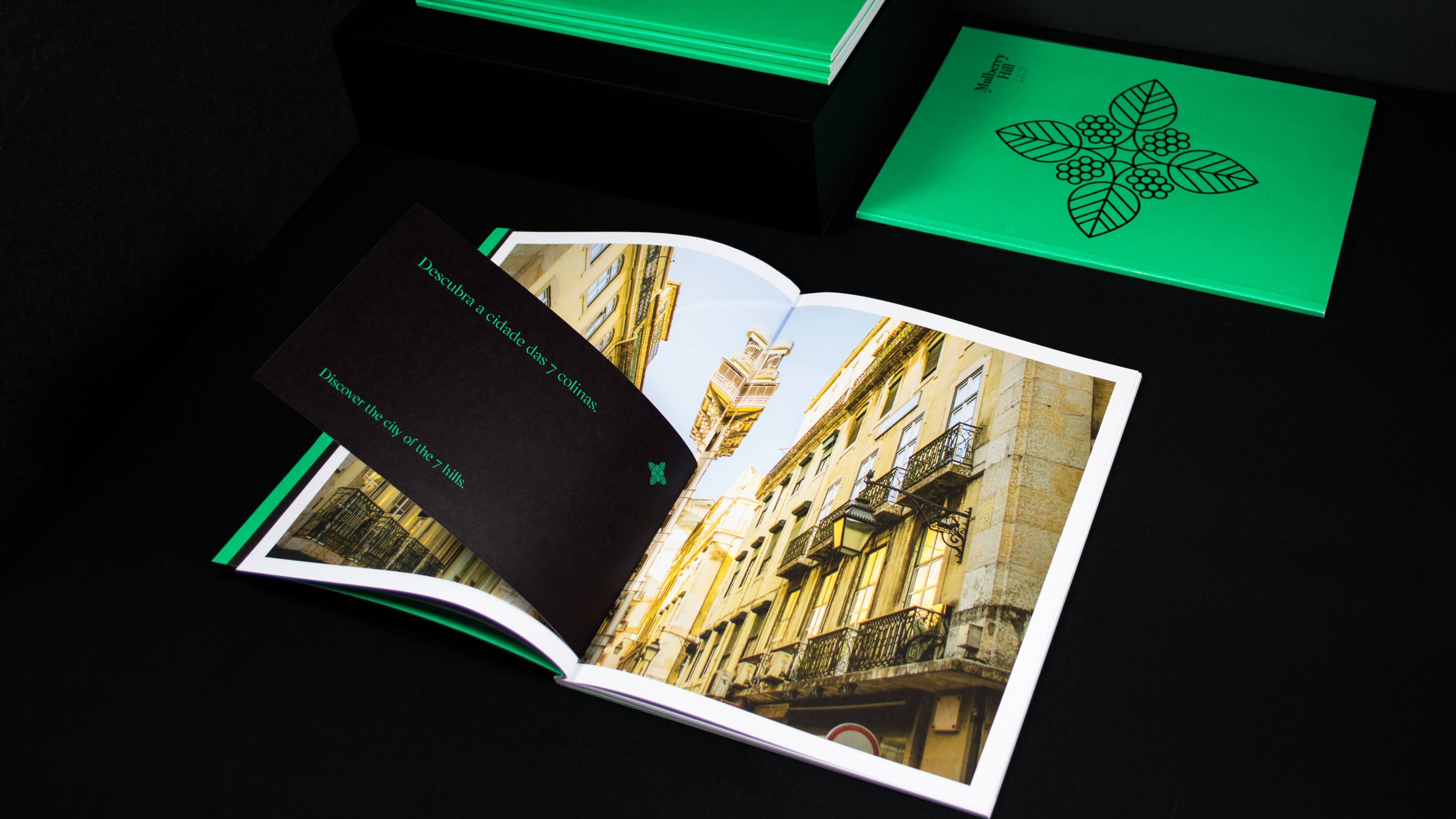
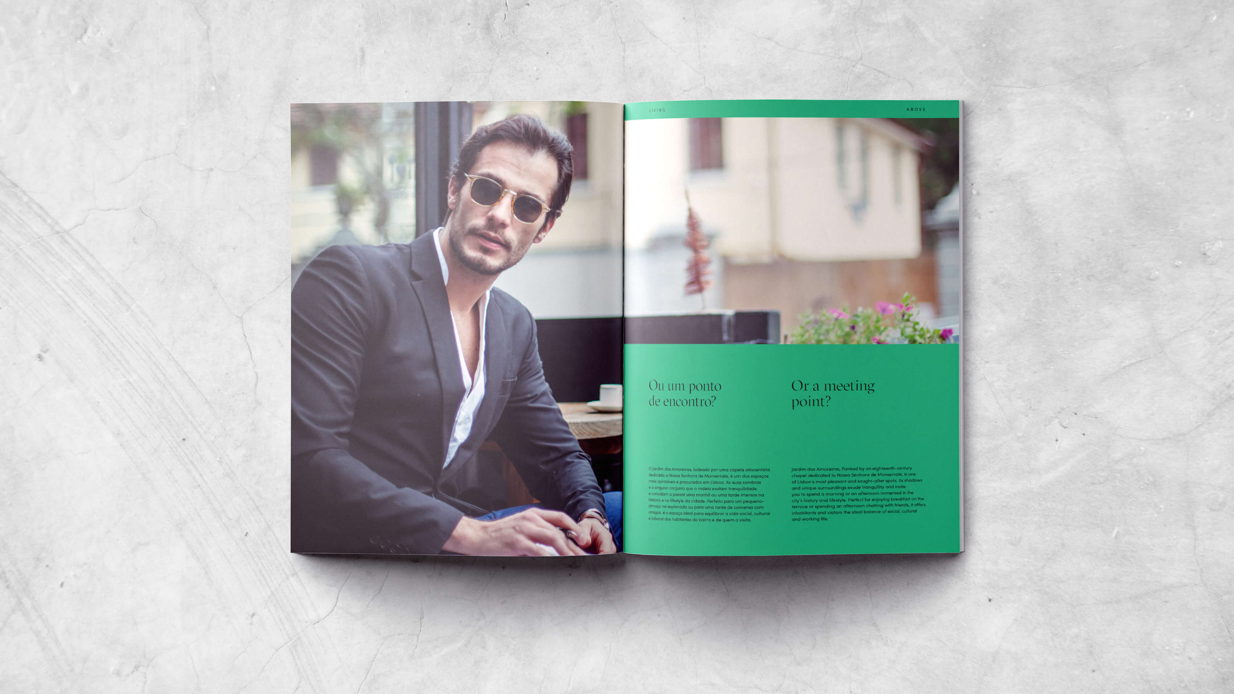
Inspired by the proximity of Jardim das Amoreiras, a mulberry plantation idealized and inaugurated in 1759 by the Marquis of Pombal, we decided to honor the area which aimed to stimulate the Portuguese Silk Industry (the main activity at that time in the area) with a new identity.
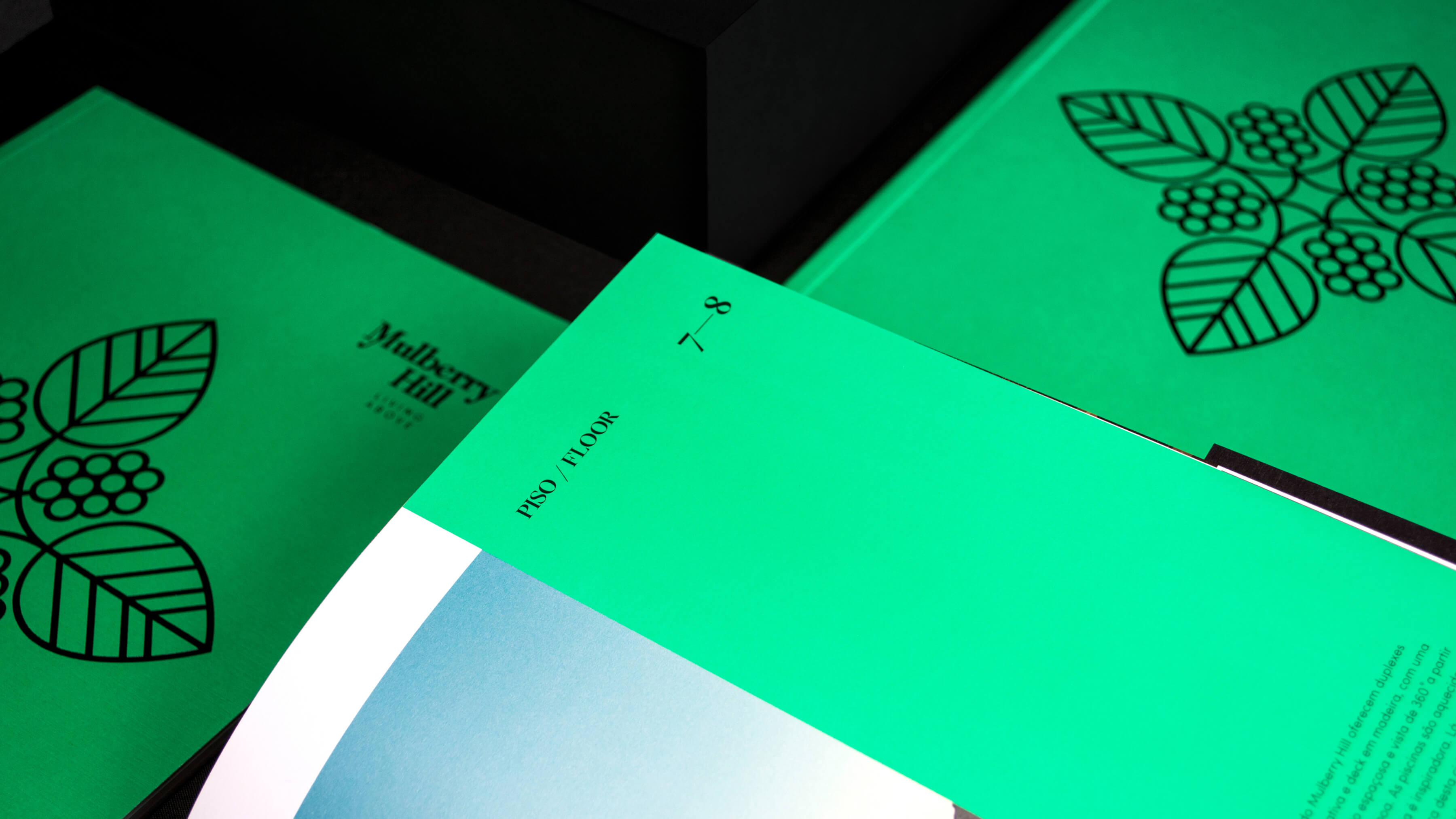
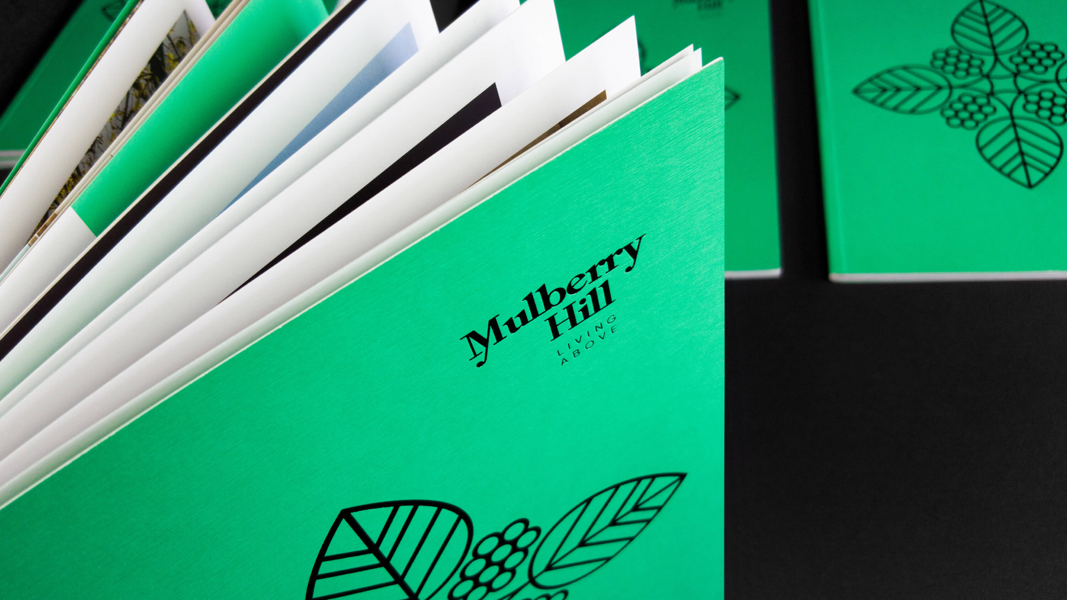
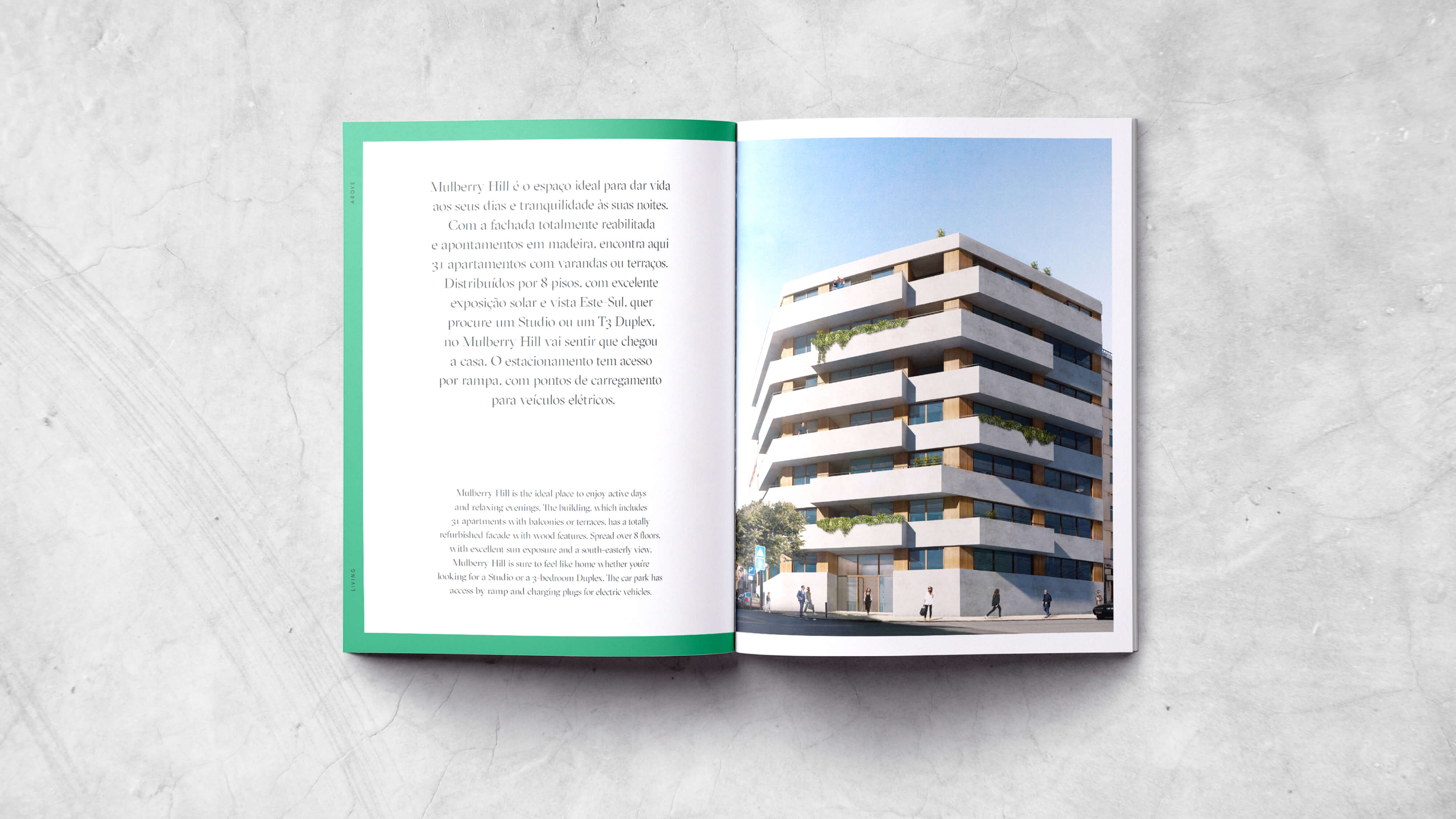
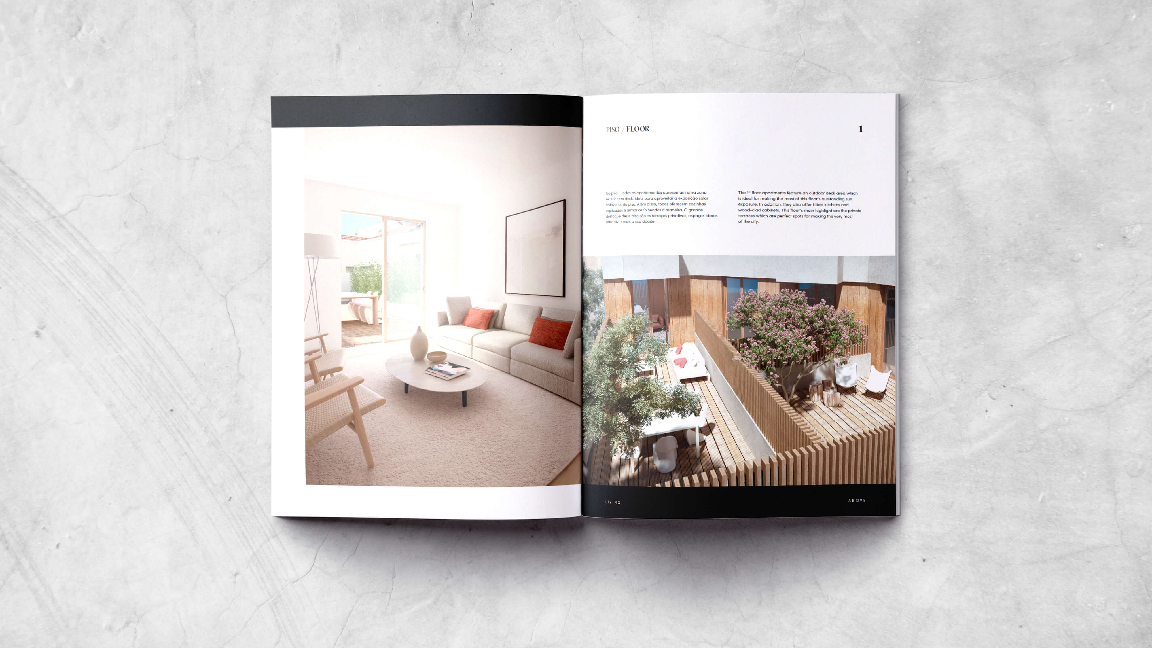
Mulberry Hill was born. A sophisticated building, an idyllic spot in the city, privileged by its roots and sublimated by the balconies that give it wings. The tone of voice, expressed in the brand and signature, portrays the inherent concepts of success, exclusivity, and privilege. Mulberries' foliage and silk are natural inspirations for this project, combining ideas of prestige, elegance, and nature.
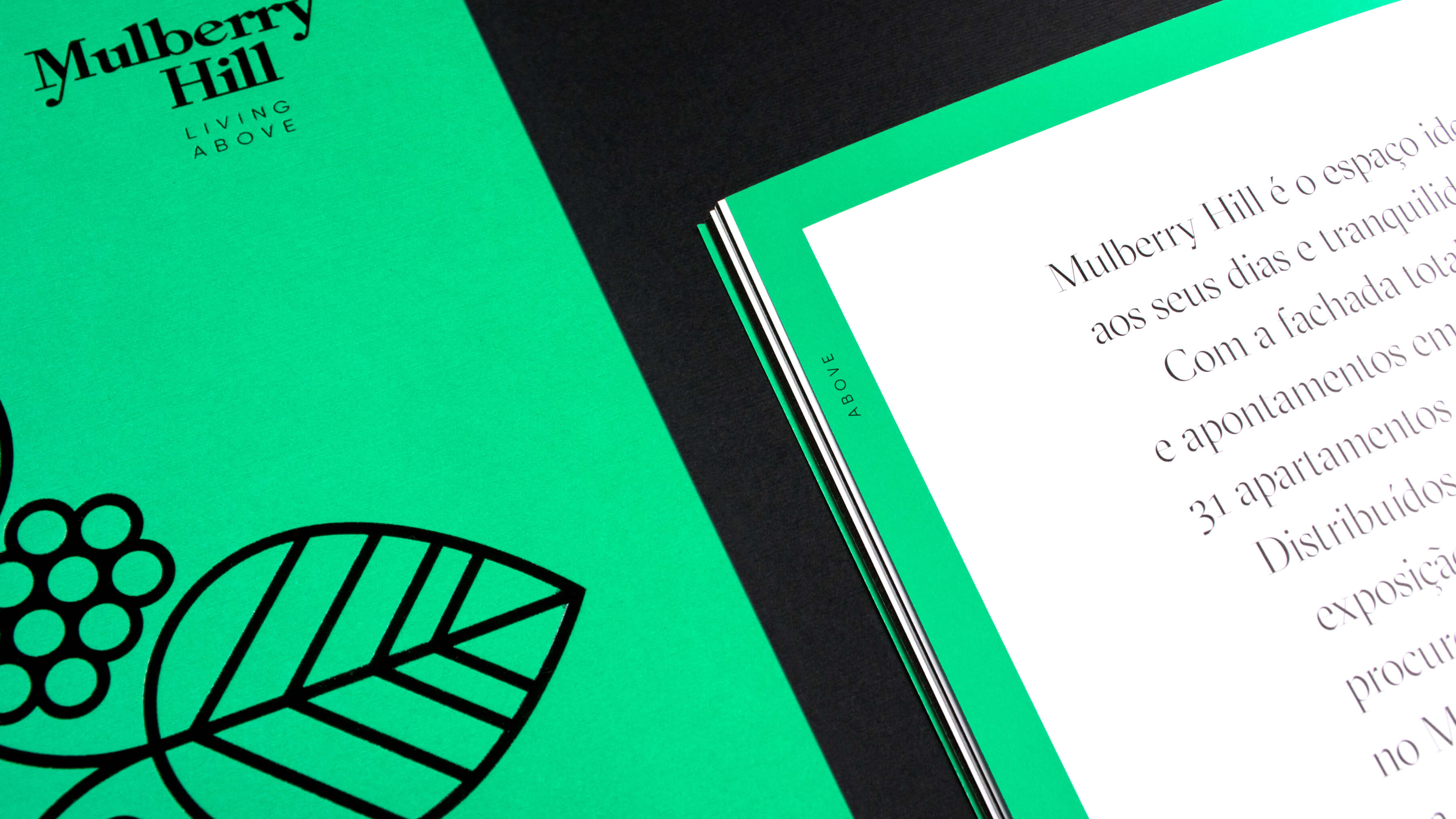
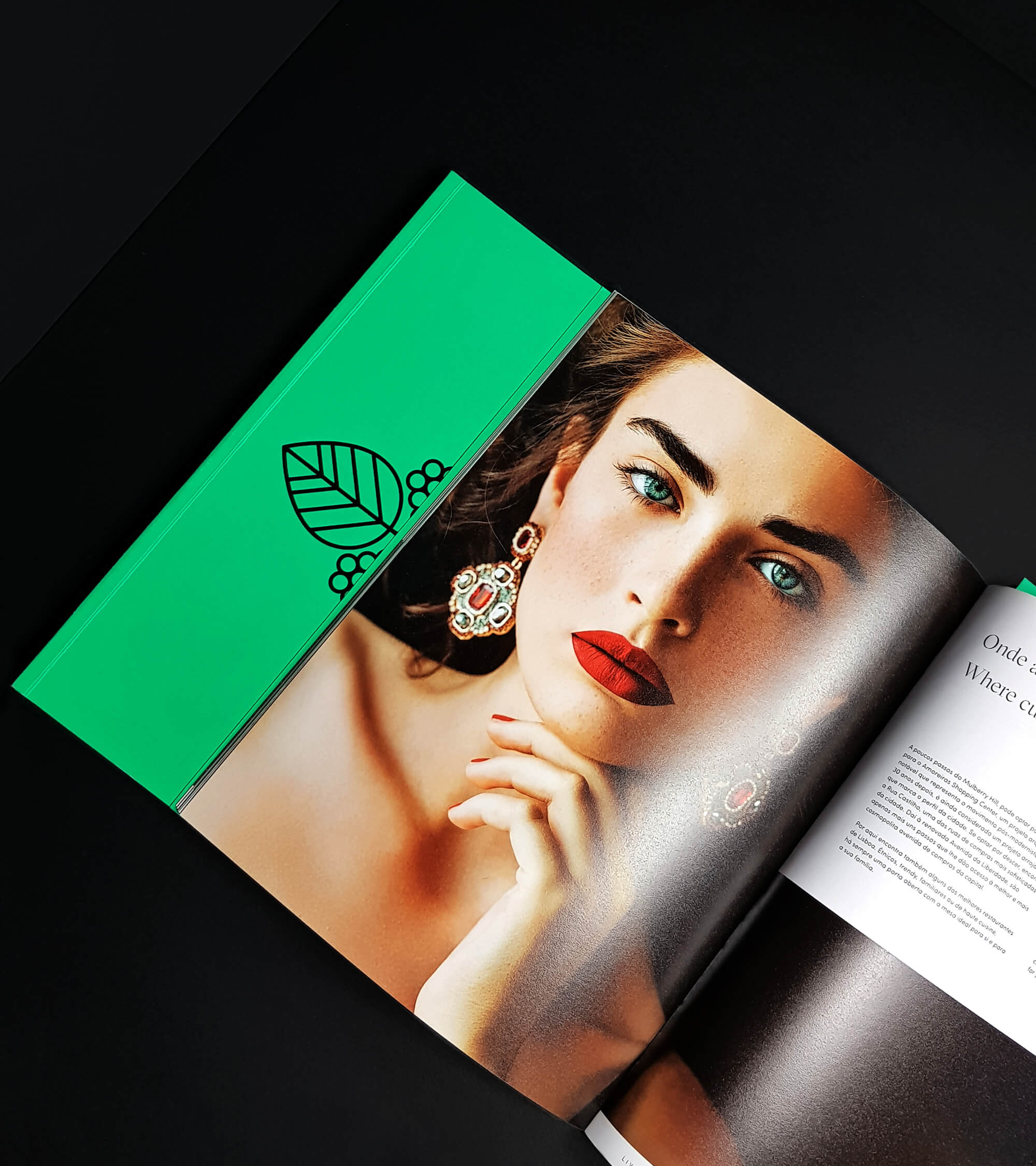
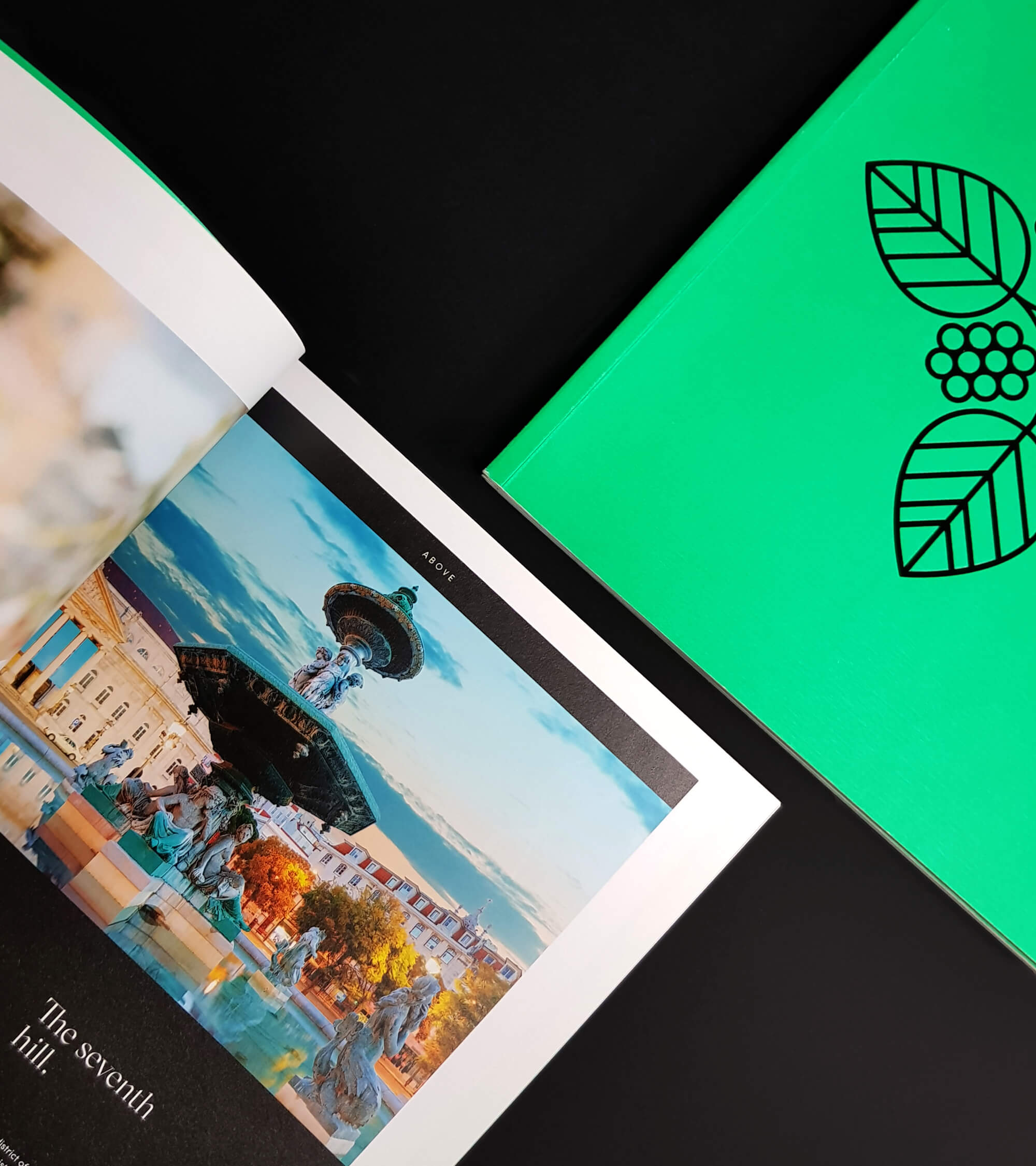
"Living Above" is the claim, capitalizing on the desire, exclusivity, and privilege to live at the top. Thus, we defined a graphic identity around the name Mulberry Hill. The mulberry foliage, the green tone, and the black identify the brand, ensuring the presence of nature, delicacy, comfort, and convenience. A natural yet contemporary approach evokes a welcoming, elegant, and sophisticated environment.

We decided to create an English name, to reinforce the international character of the building and create its communication territory. Mulberry Hill is a unique, sophisticated place that invites visitors to stay and linger. Noble, elegant, charming, it is the ideal building to live with distinction.
The identity takes on a classic contemporary bearing, without becoming old — a sober but comforting and reassuring posture, guaranteed by the details of the exceptional and distinguished serif.


The colors Green Reflection and City Black reinforce the city values identified and desired to harmonize the entire territory. This color contrast is evident in the brand’s graphic universe, especially in the brochure, in which the chromatic pattern is reinforced by the high-gloss black hot stamp, adding urbanity to the brand's most delicate and natural mood.