Hotel Alto Lido
Grupo Cardoso
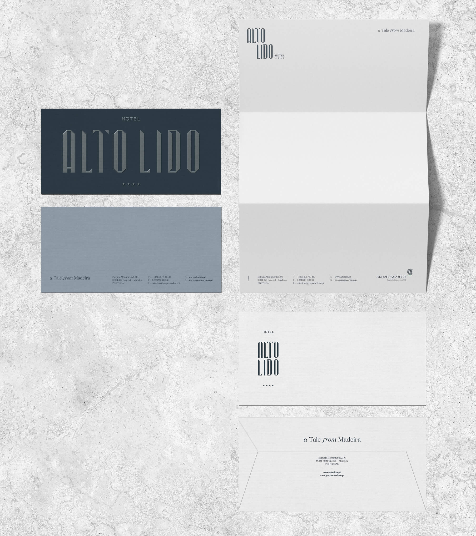
Brand Identity
Graphic Design
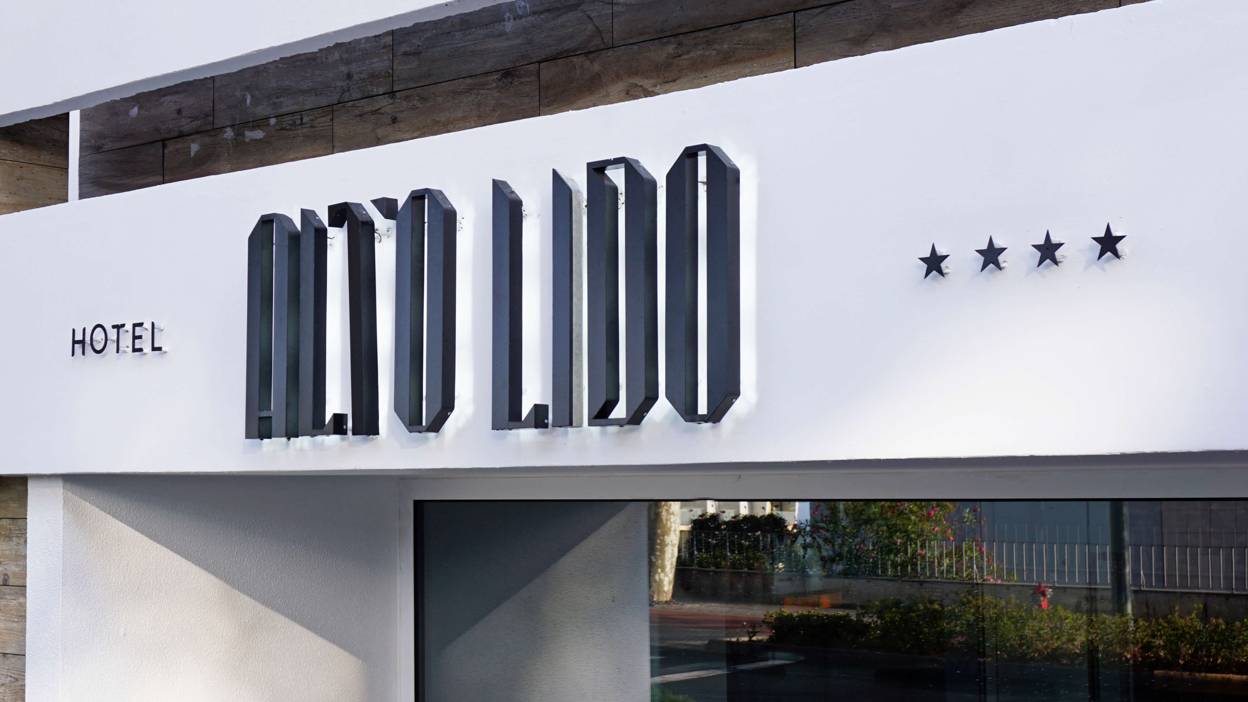
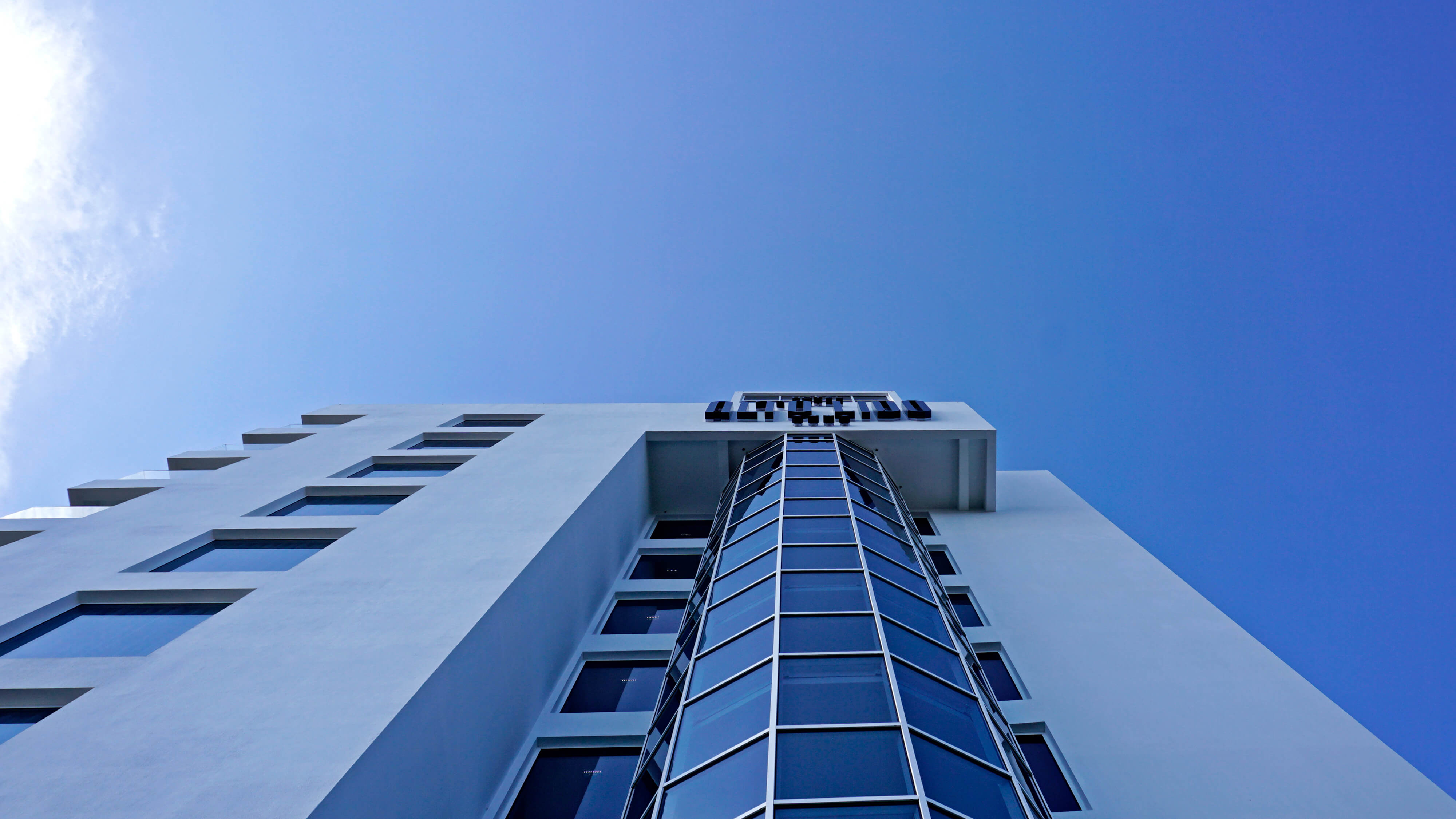
Signage
2018
Reinventing an hotel that had existed for the past 37 years, with distinct pronounced architectural lines and a decade-specific look & feel, demanded energy, willpower and a lot of nerve. Blug cleared the way and opened the mental space necessary to be able to look beyond these lines without dismissing them. A path to the modernization of the brand identity, without leaving the ideals and values of the Cardoso Group and its family heritage behind.
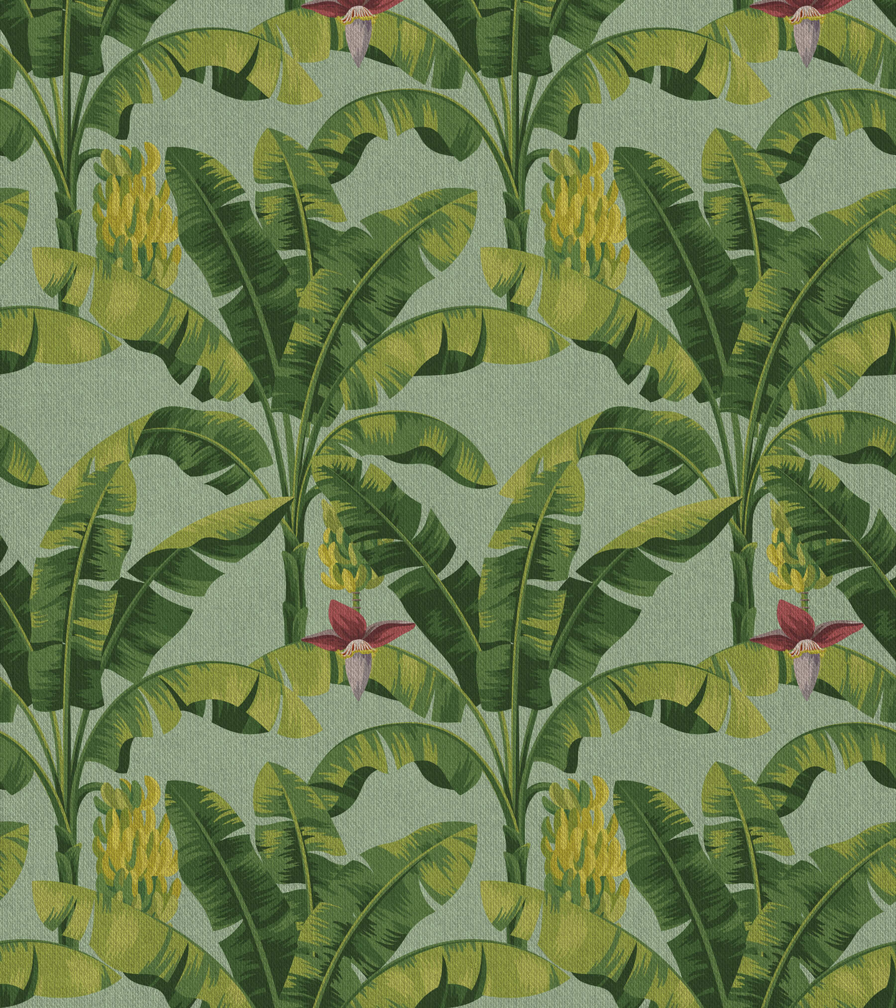
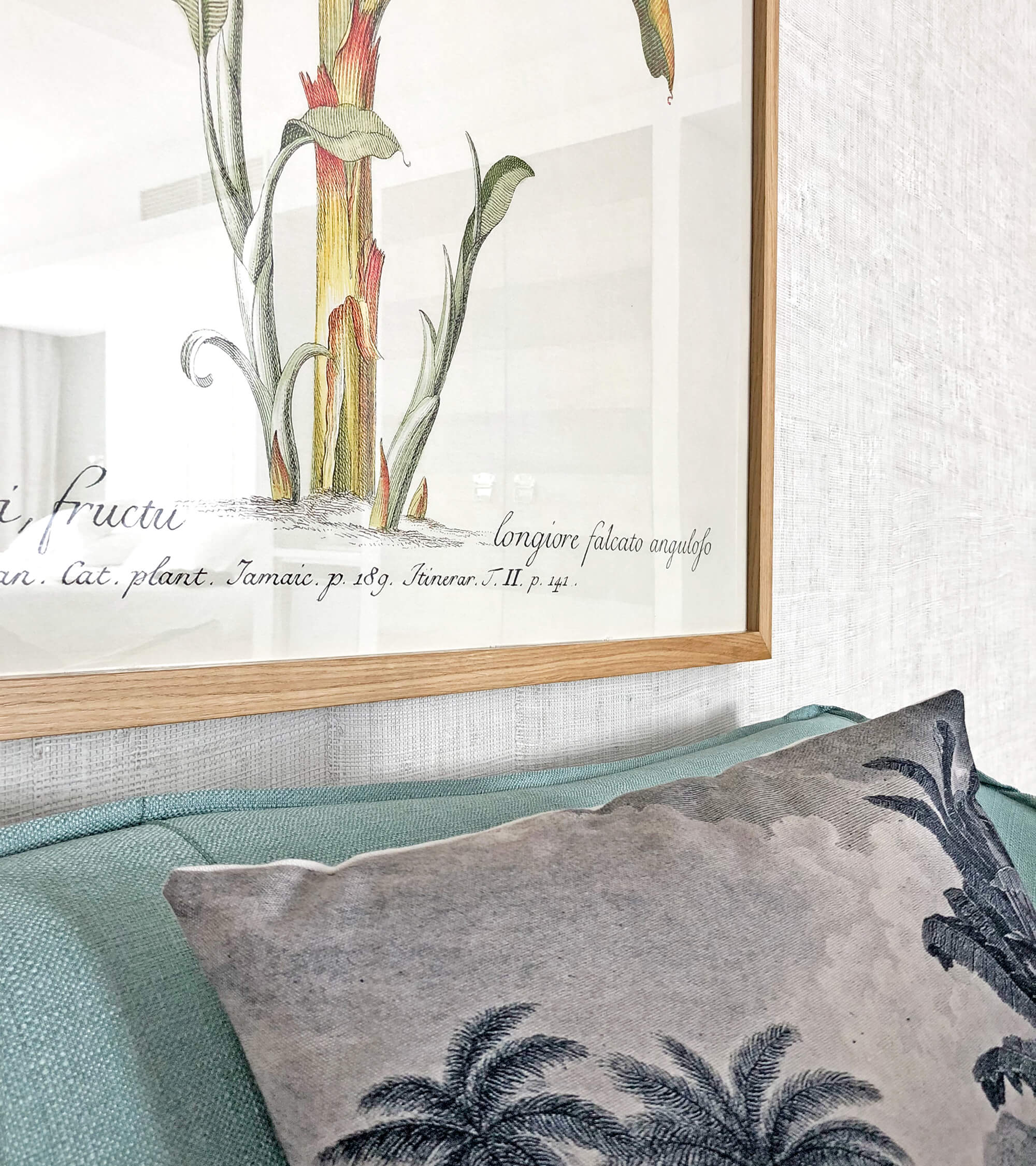
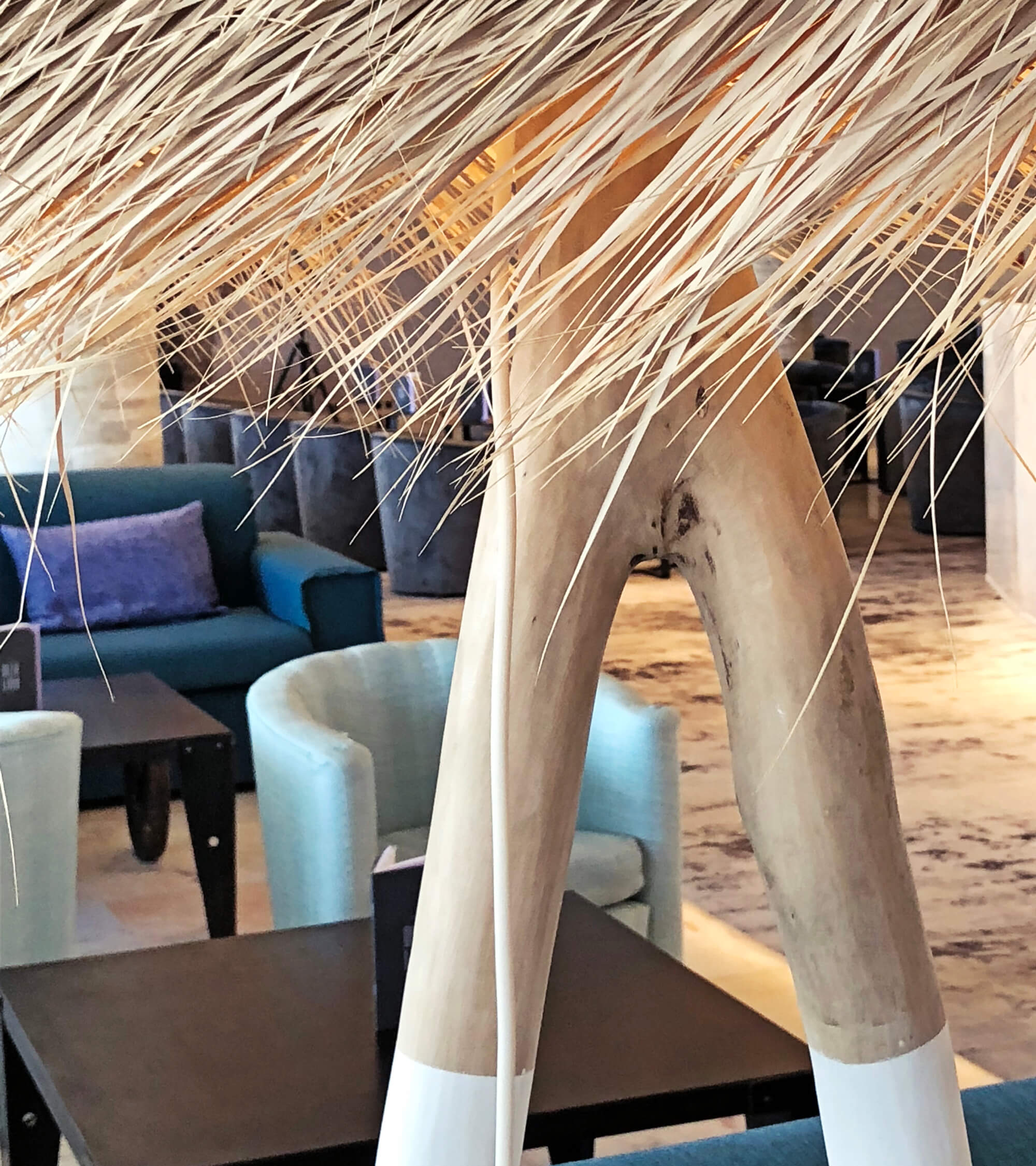
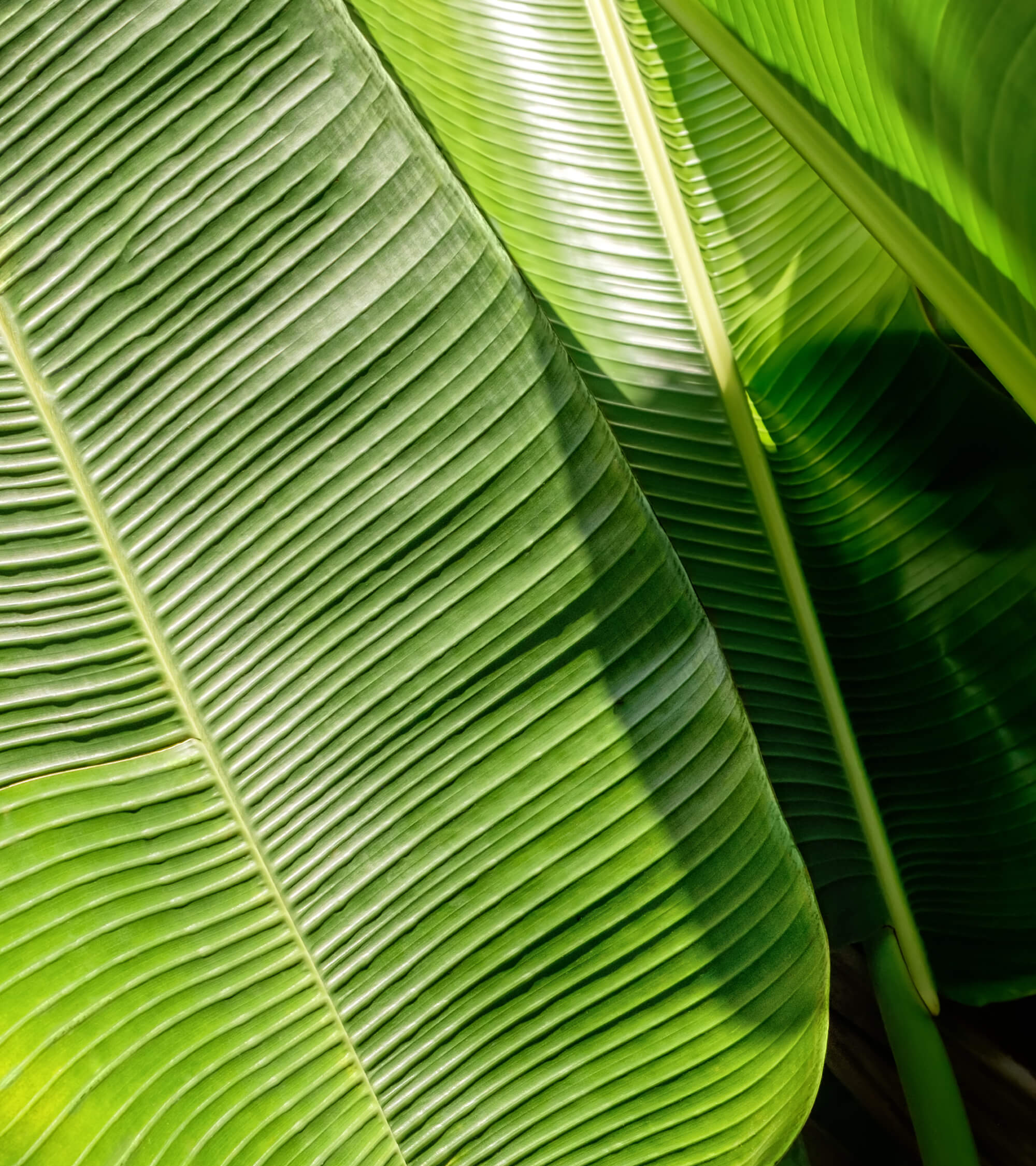
With a new architectural project, inspired by the island's natural references (the landscapes, the banana trees and the wicker material) became a reflection of the organic and authentic feeling of the island (on the top of one of its most distinct locations). Hotel Alto Lido is a place where paths cross and stories are waiting to be shared.
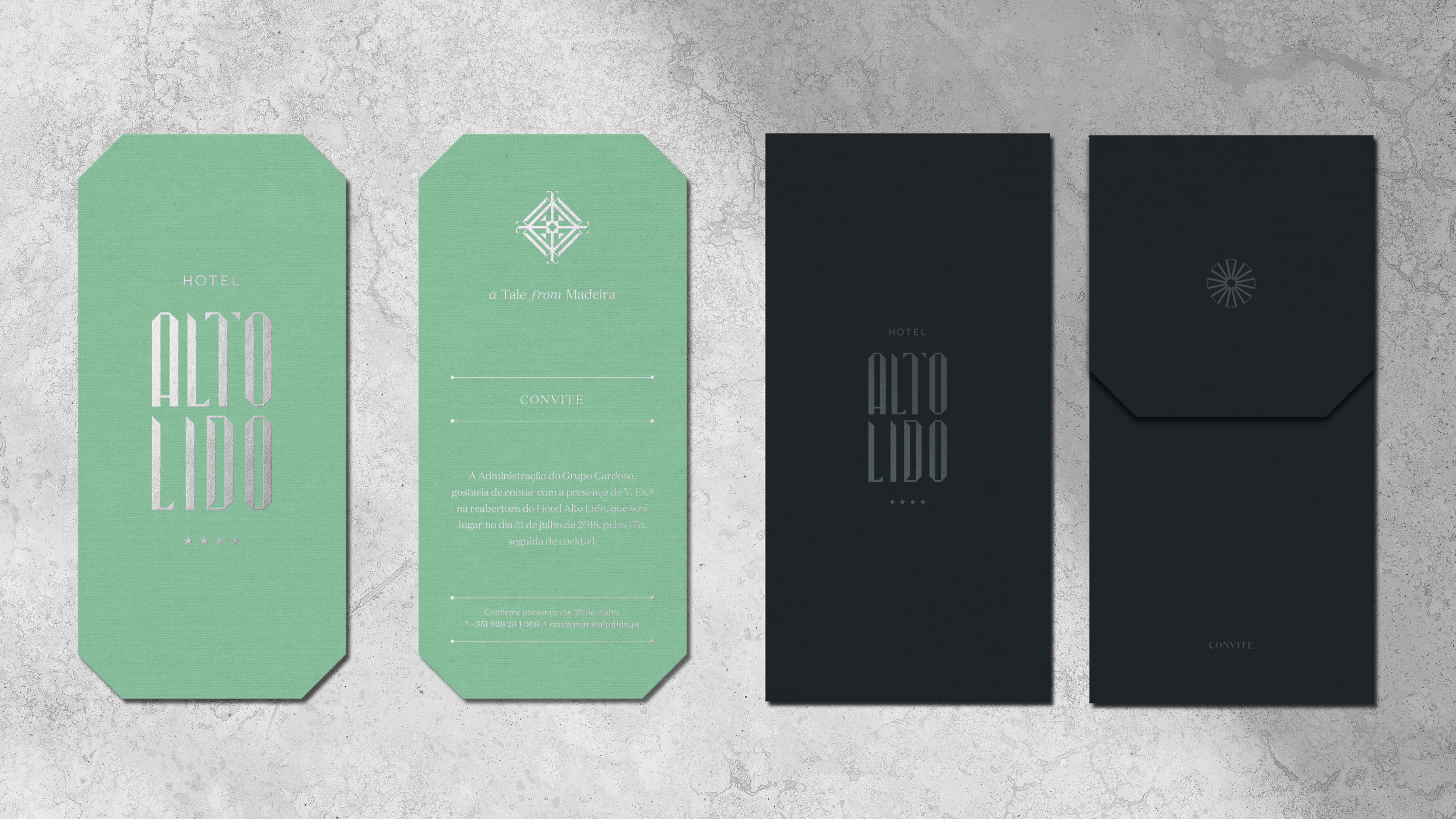
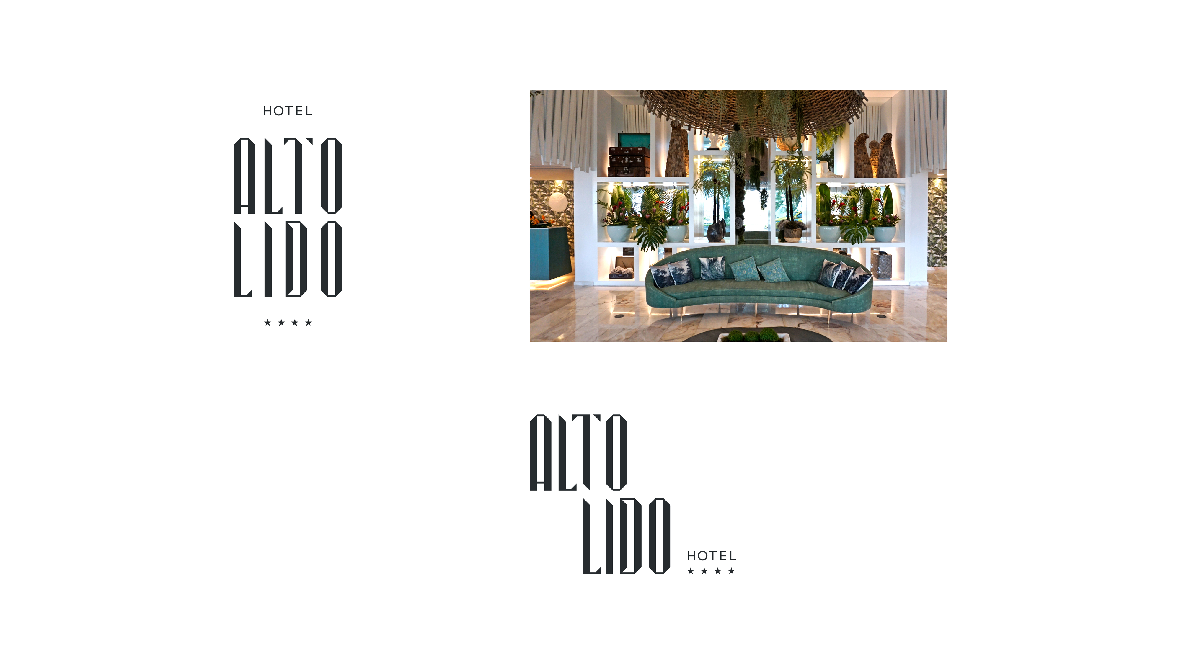
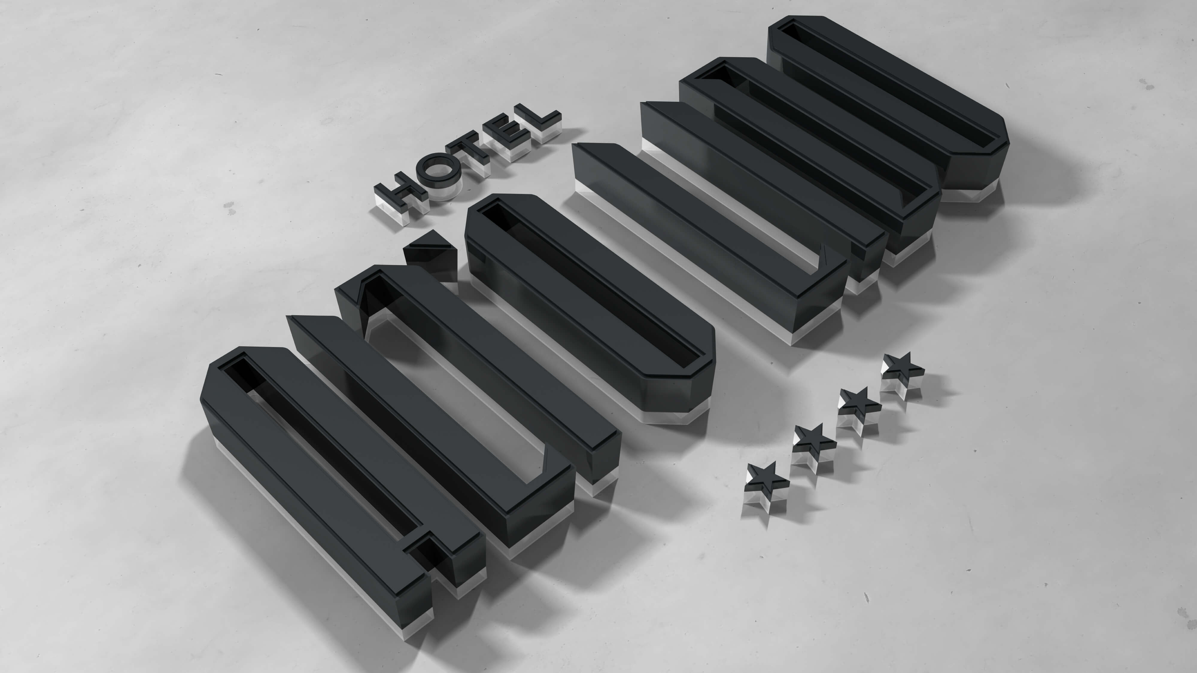
“The architectural features were an integral part of the original briefing and provided the pillars for the development of the Wordmark. However, above all else, the brand's core values were imbued with the permanent organicity that creates a special bond with the island's roots.
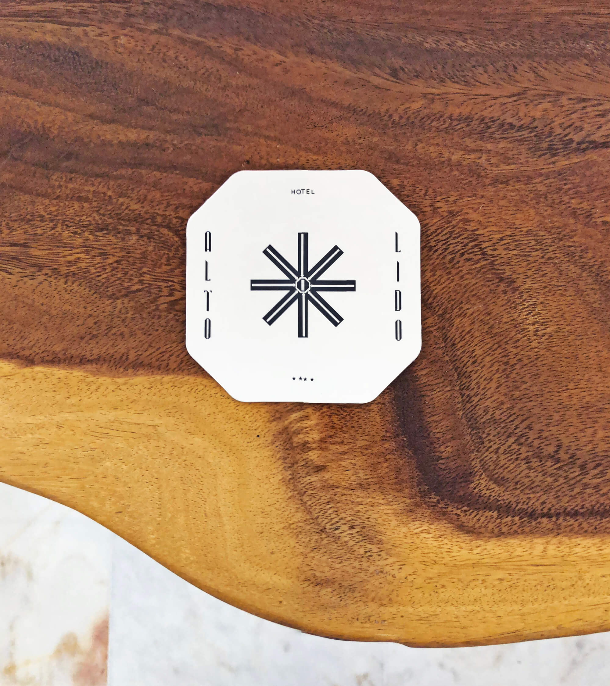
With that in mind, we designed and created a special identity, one that was able to reflect the architecture's minimalism and the angle's precision. The woods inspired and kept the organic side of the identity alive, infusing a bit of magic and inspiring the ultimate fusion between the hotel and the island. A distinct, contemporary and sophisticated way to present itself.
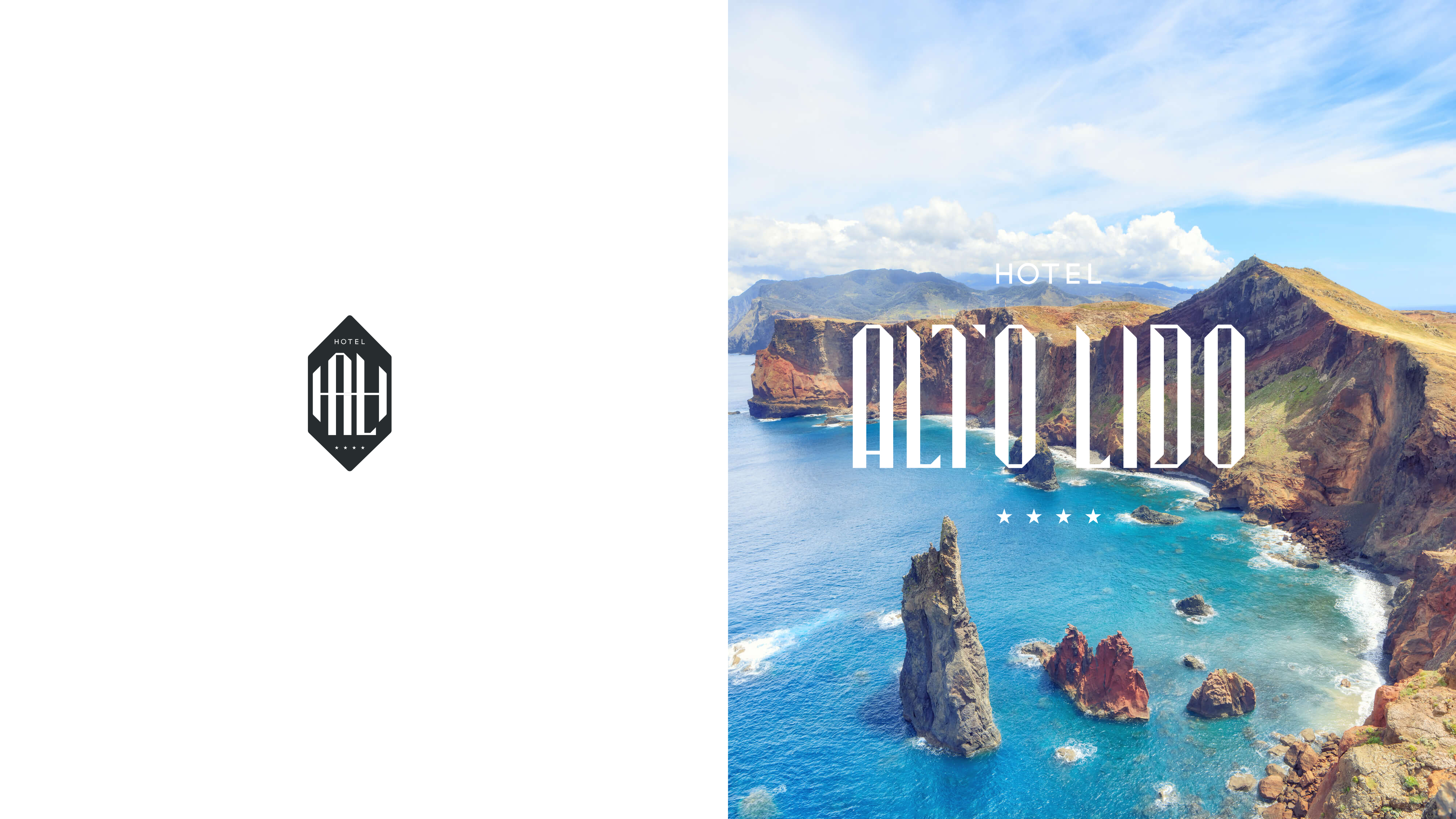
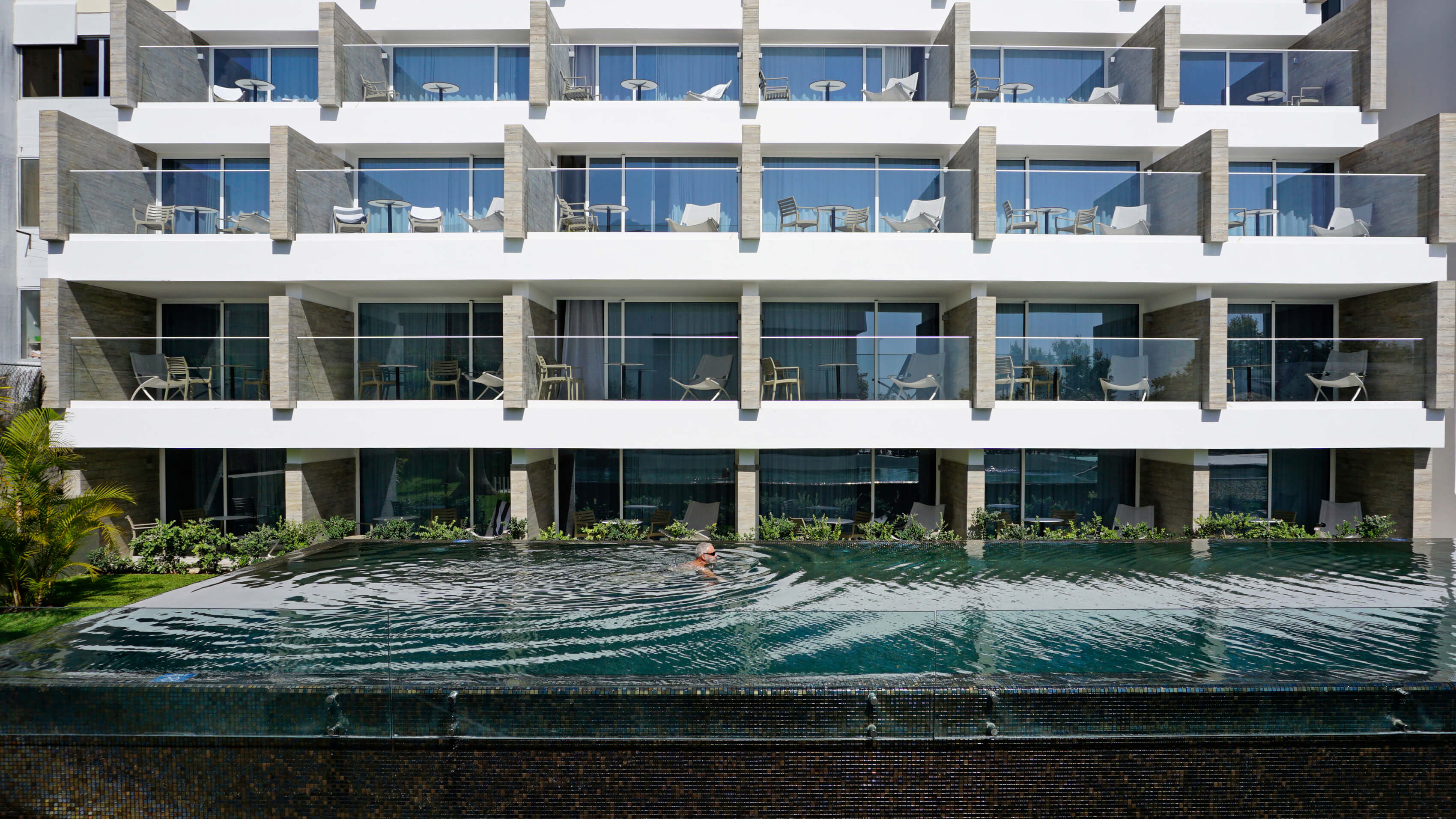
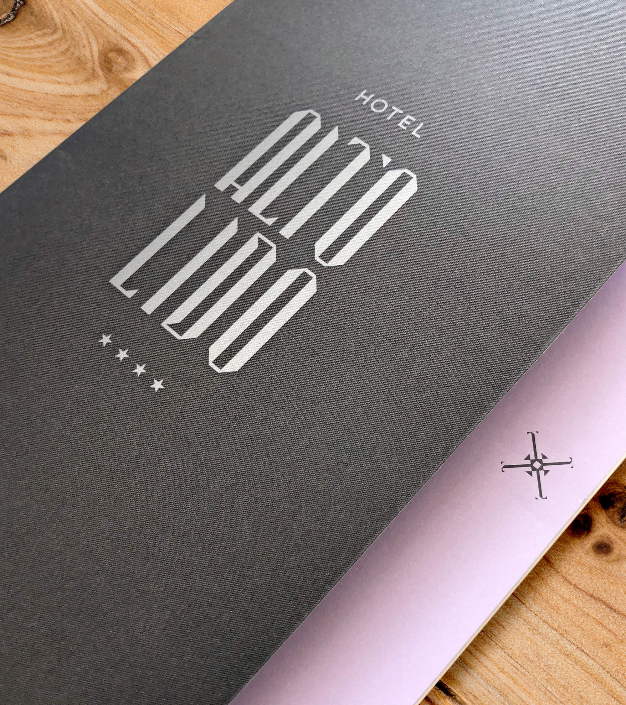
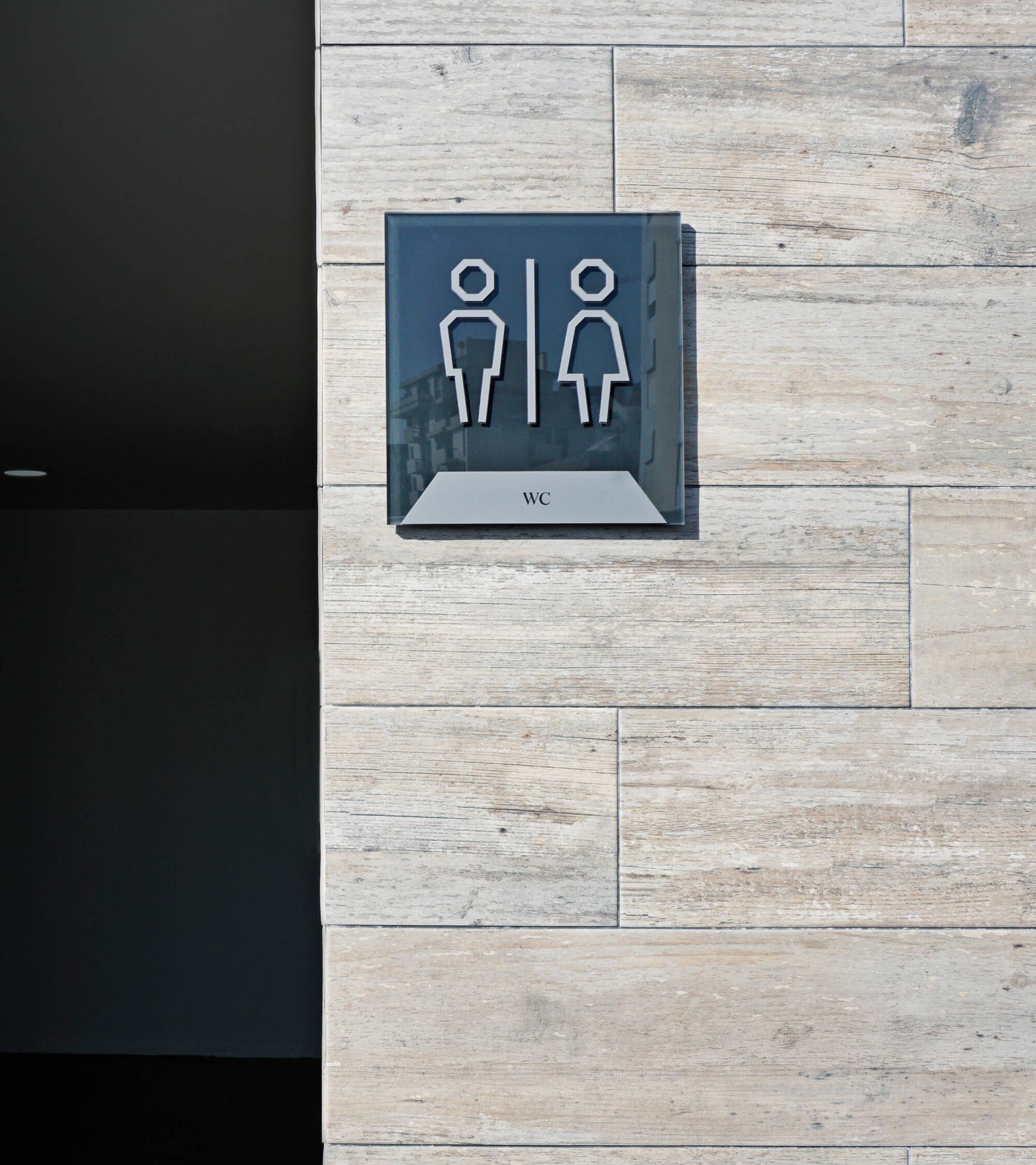
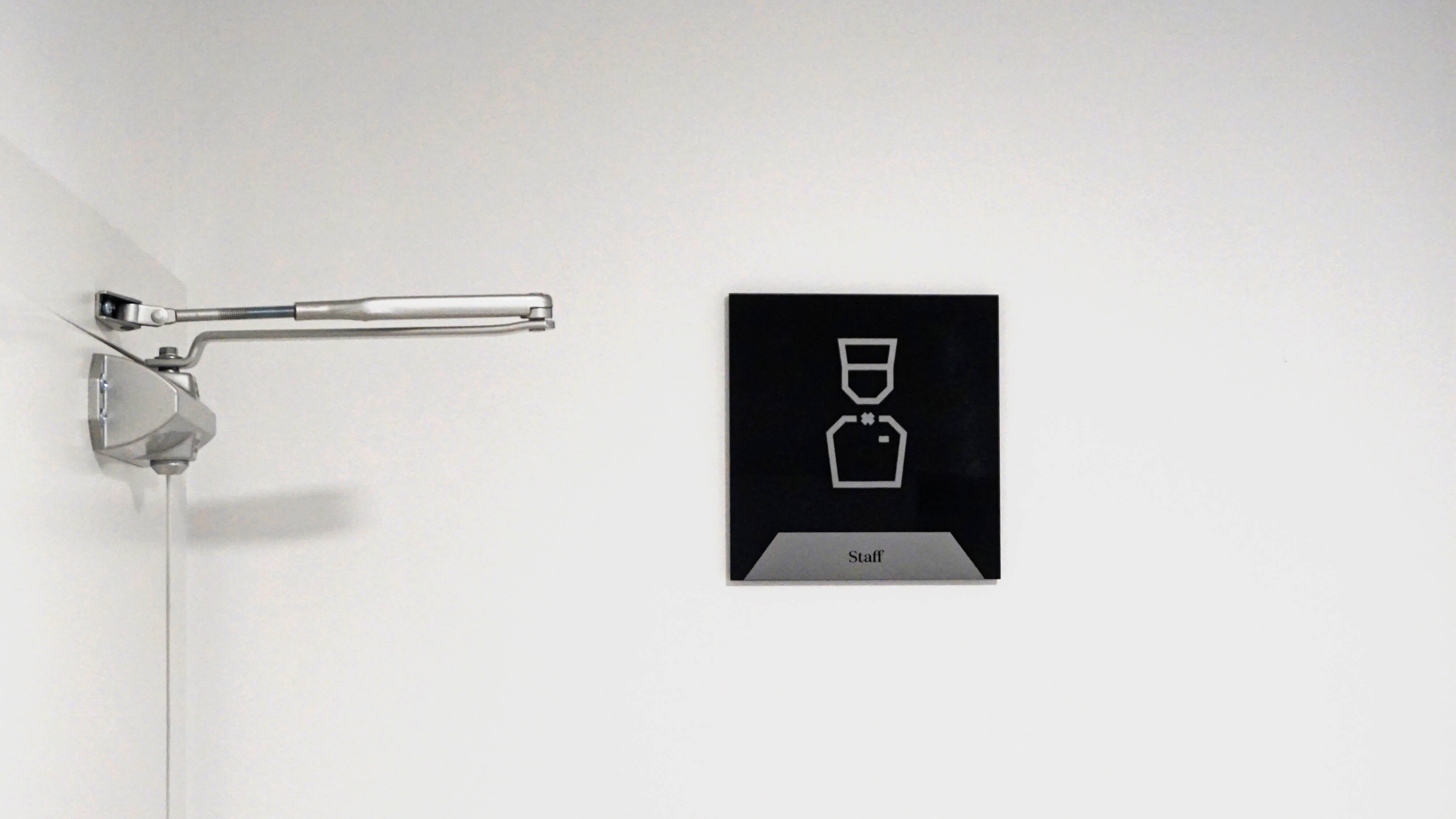
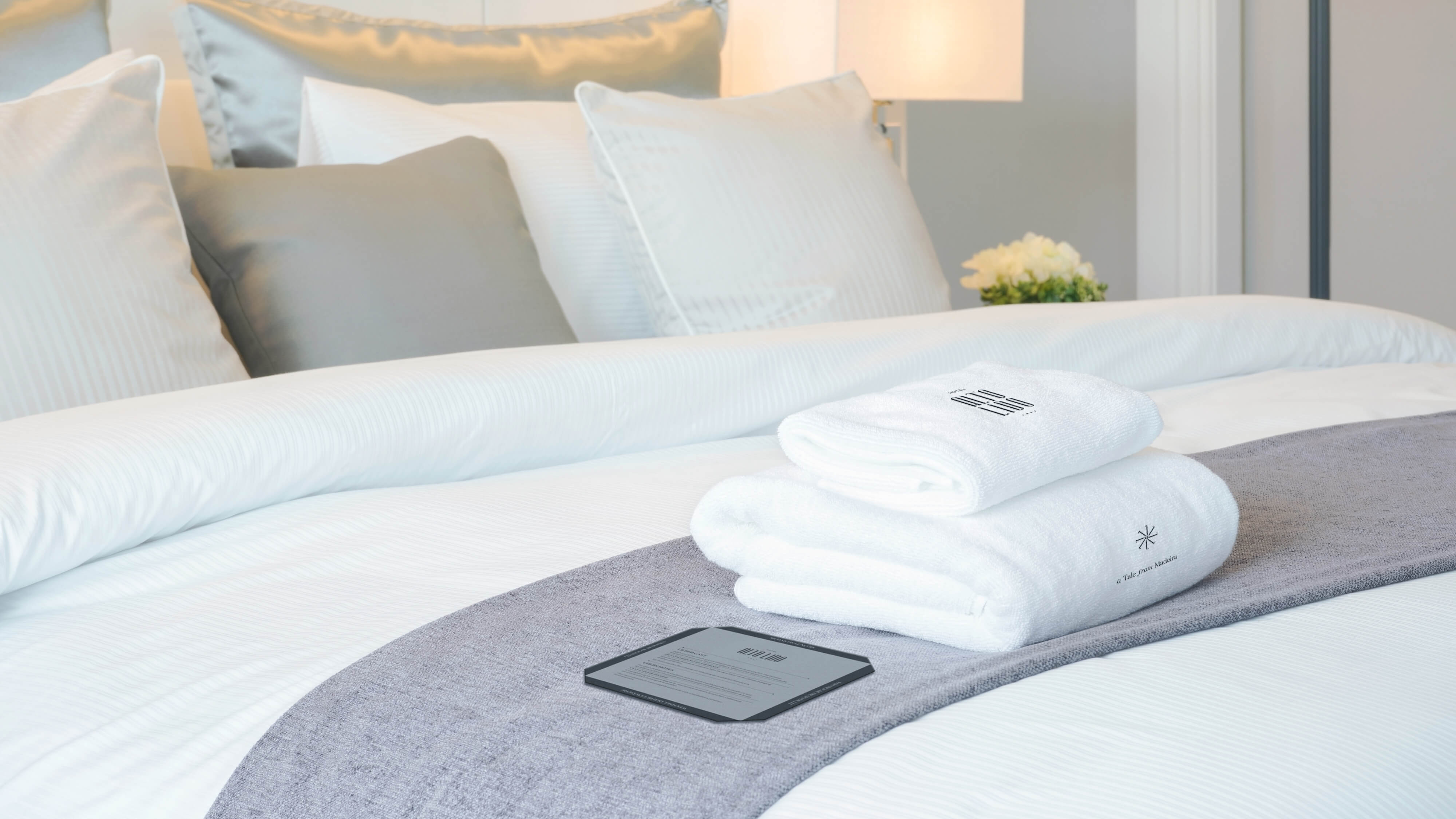
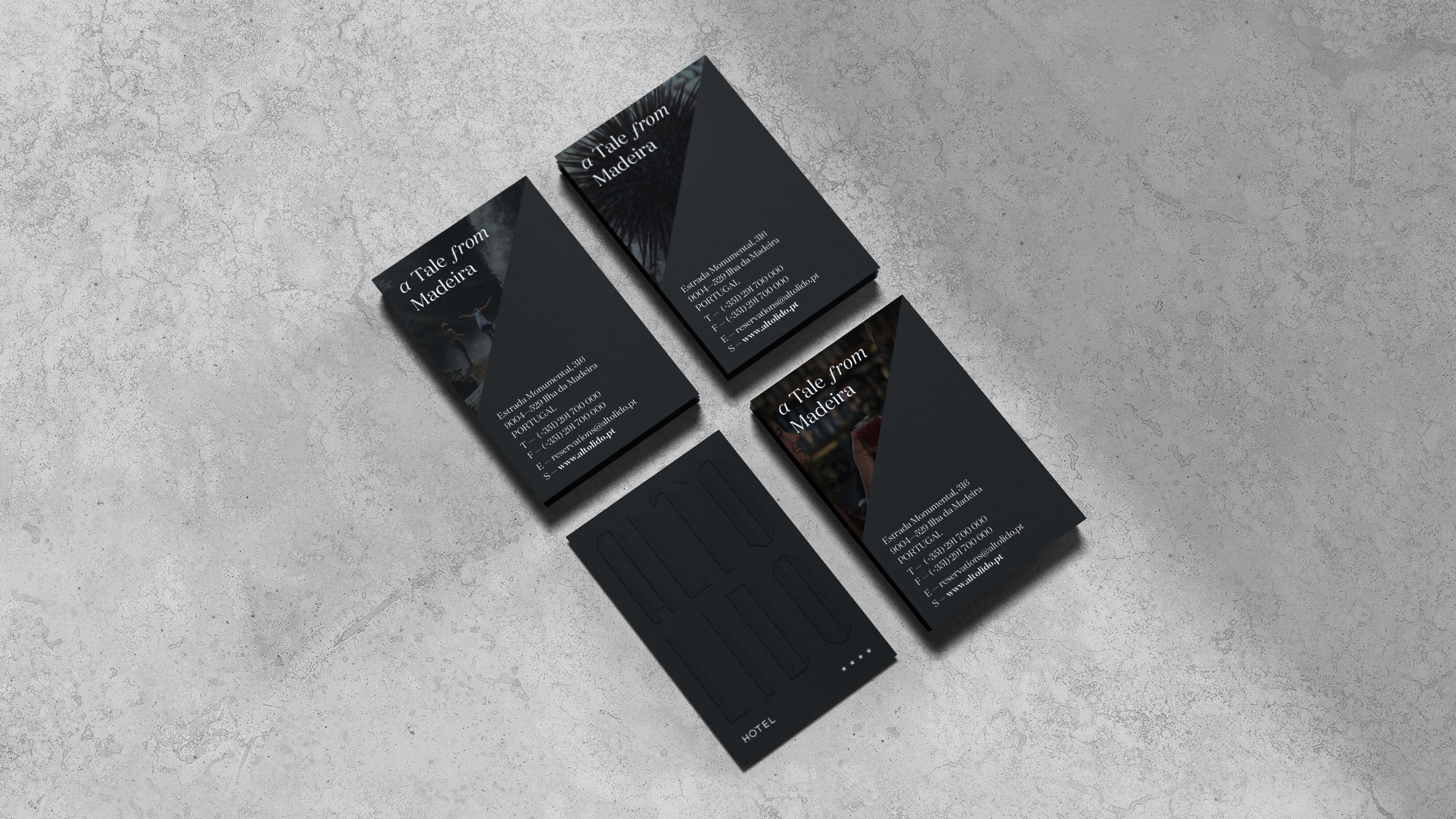
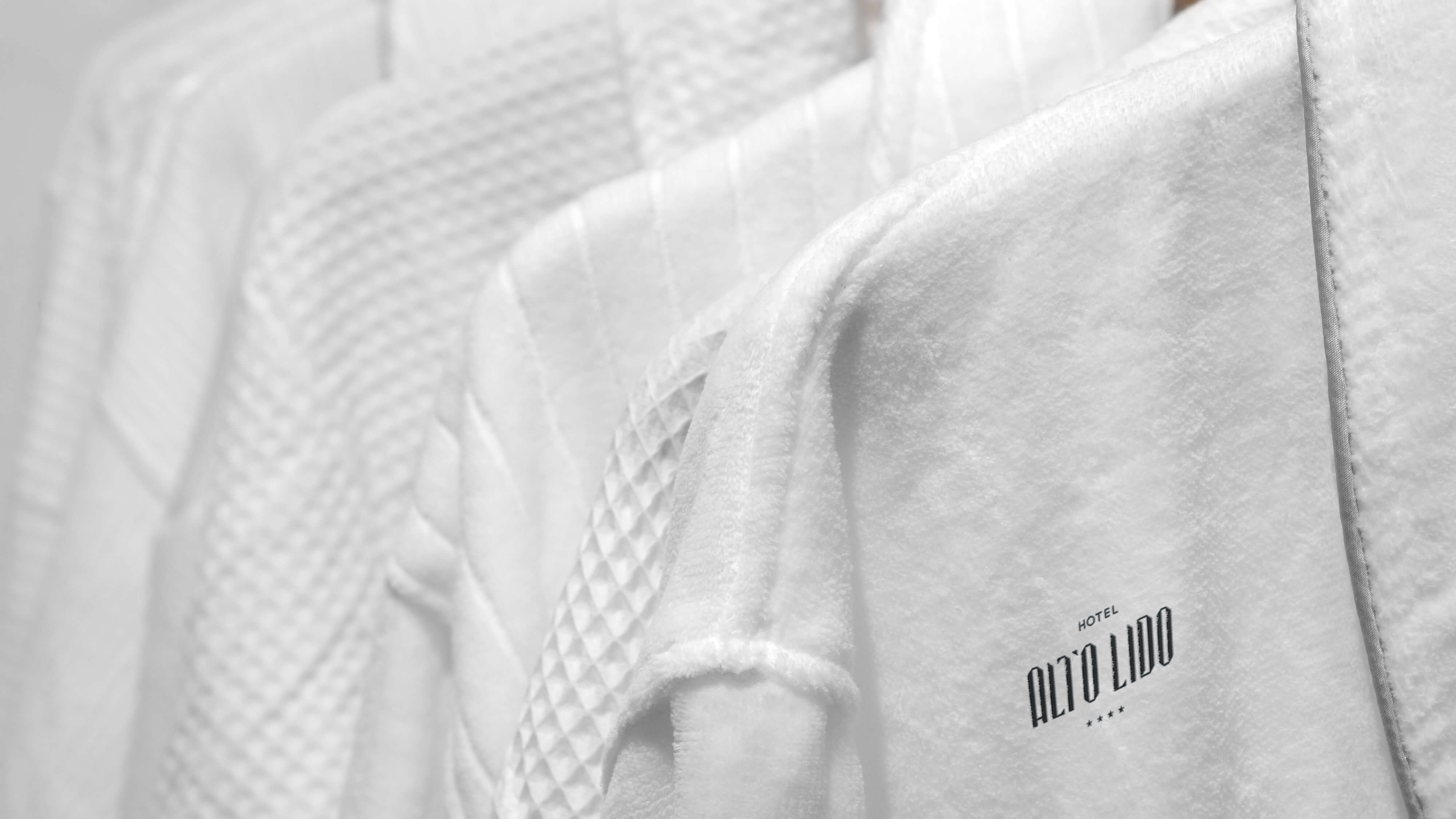
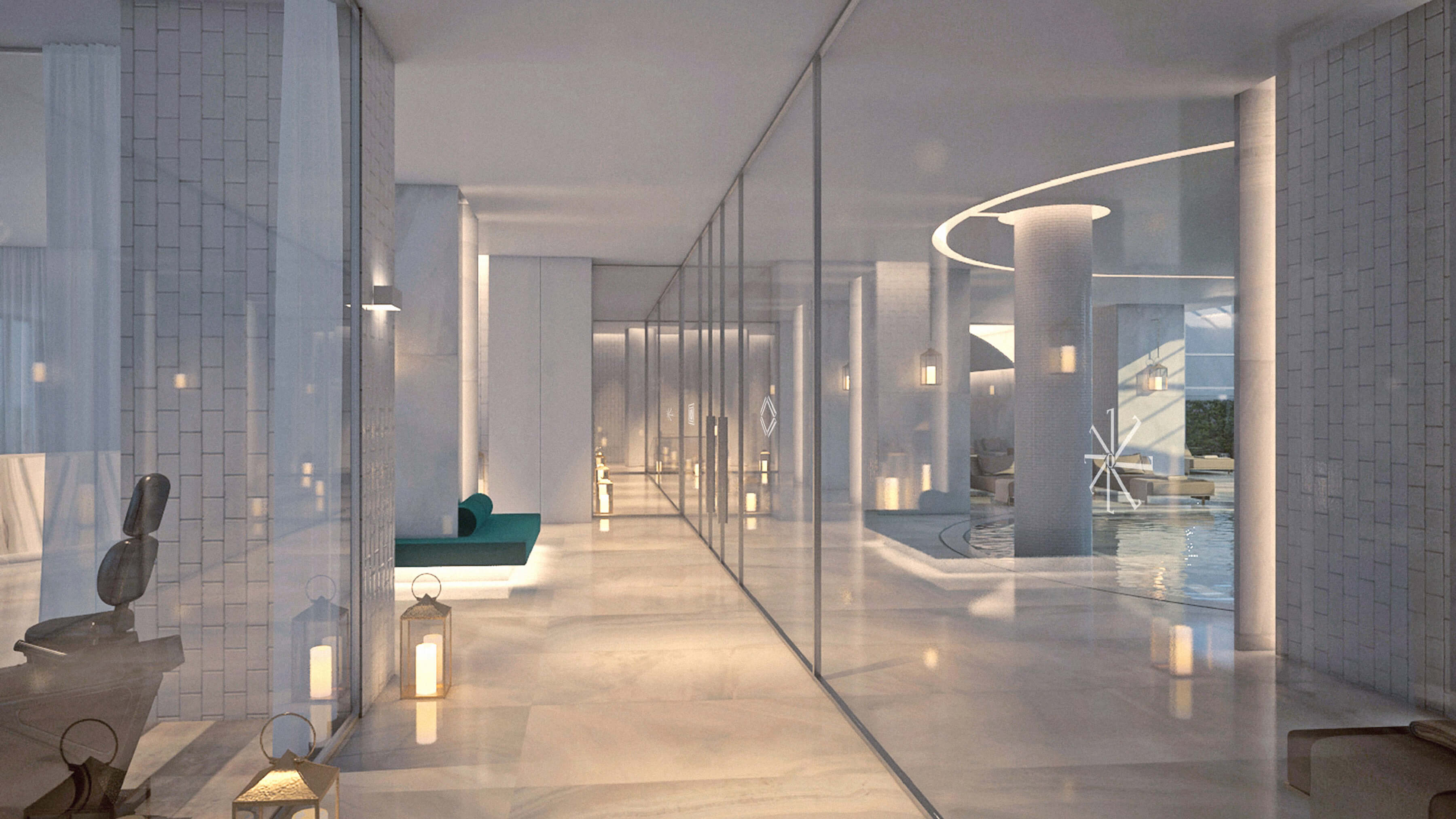
Presented in Grey Wood and Grey Sandstone, inspired by the black pebble beaches of Madeira, it evoked the volcanic origin, the long lost link between nature and urbanity; and the deep contrast of the different shades of gray of the architectural materials.
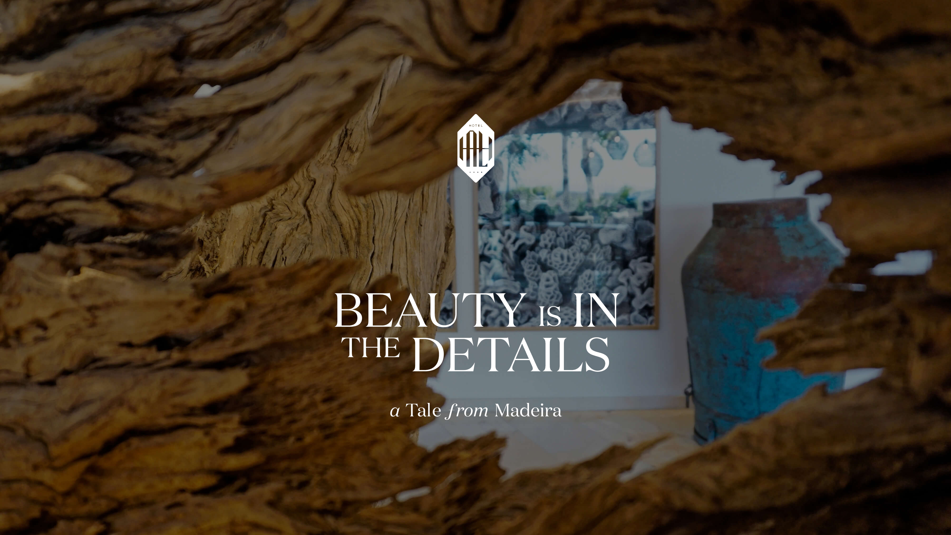
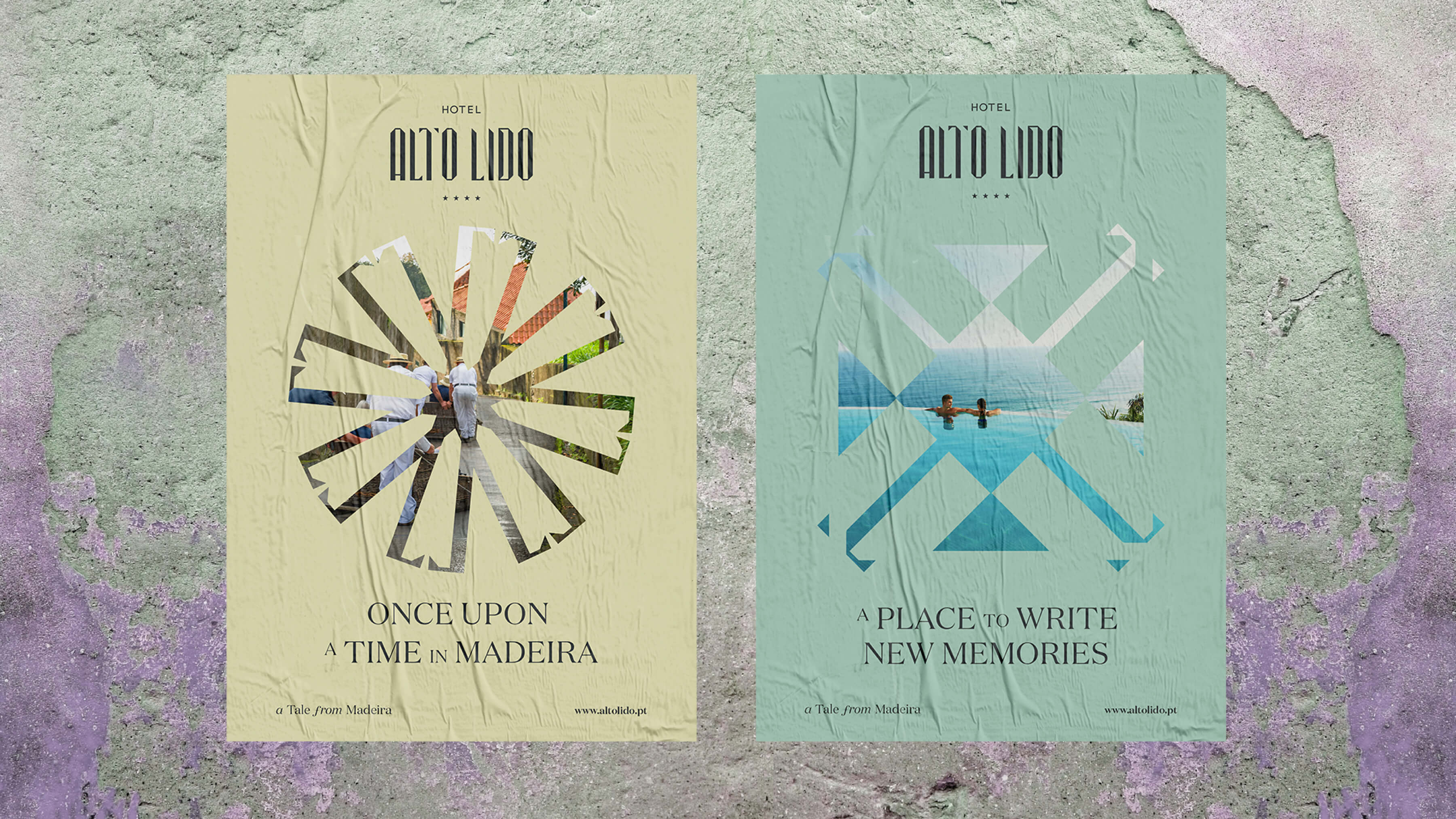
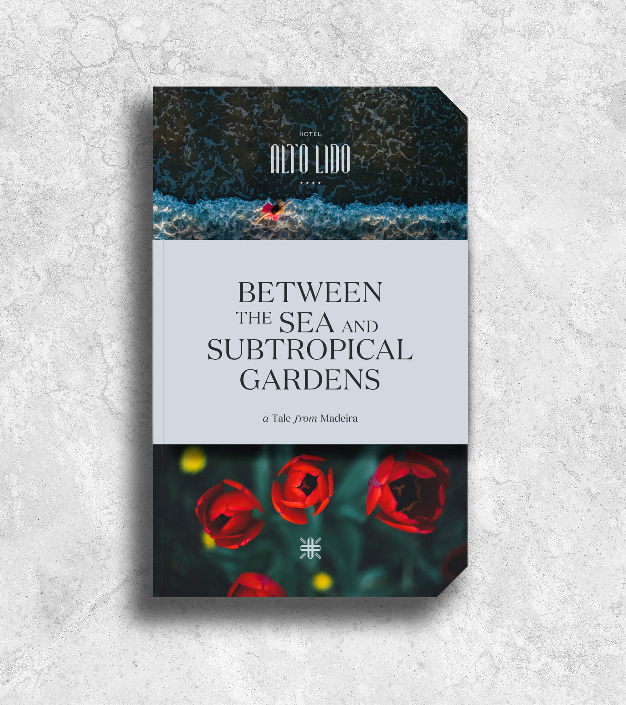
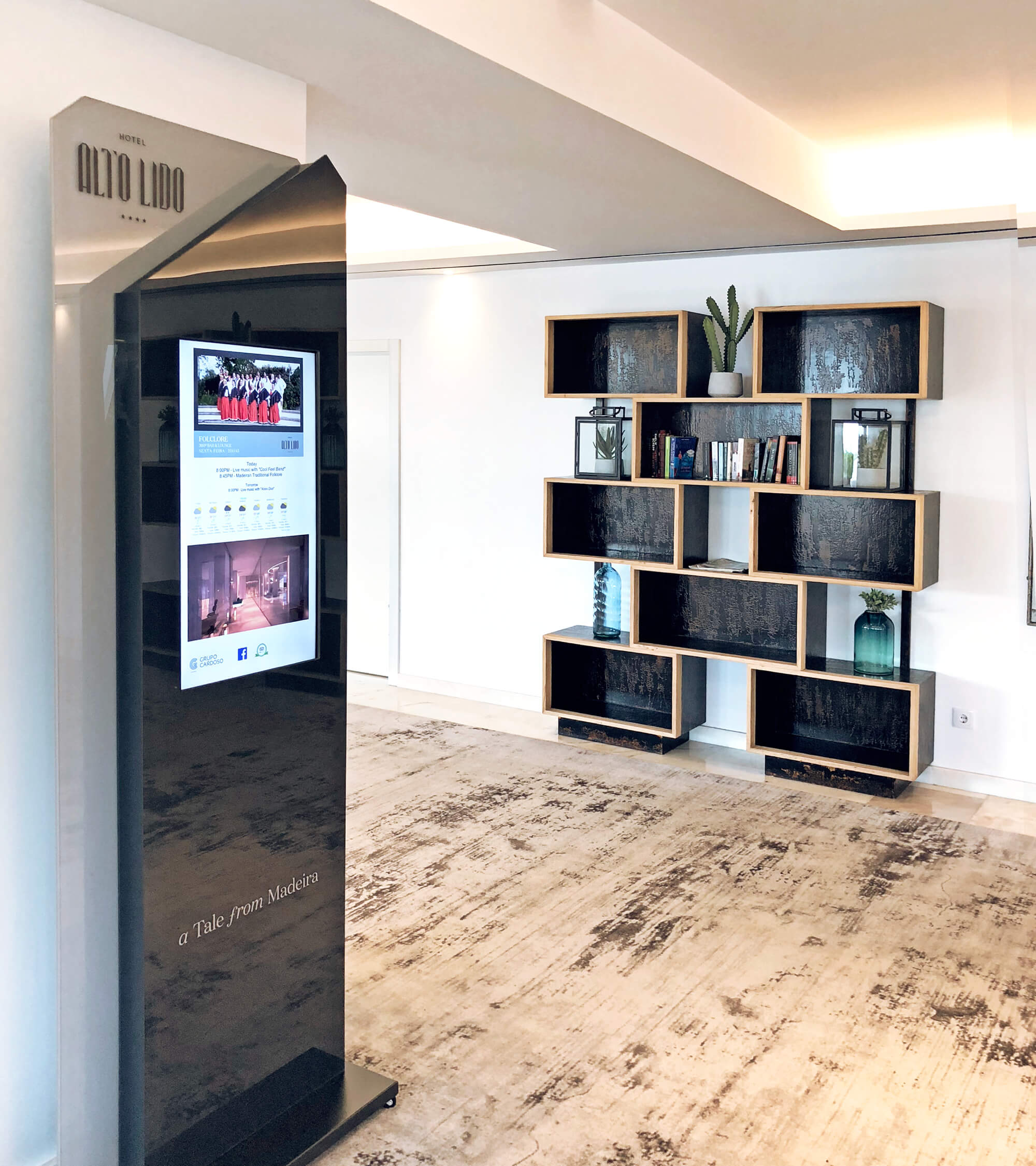
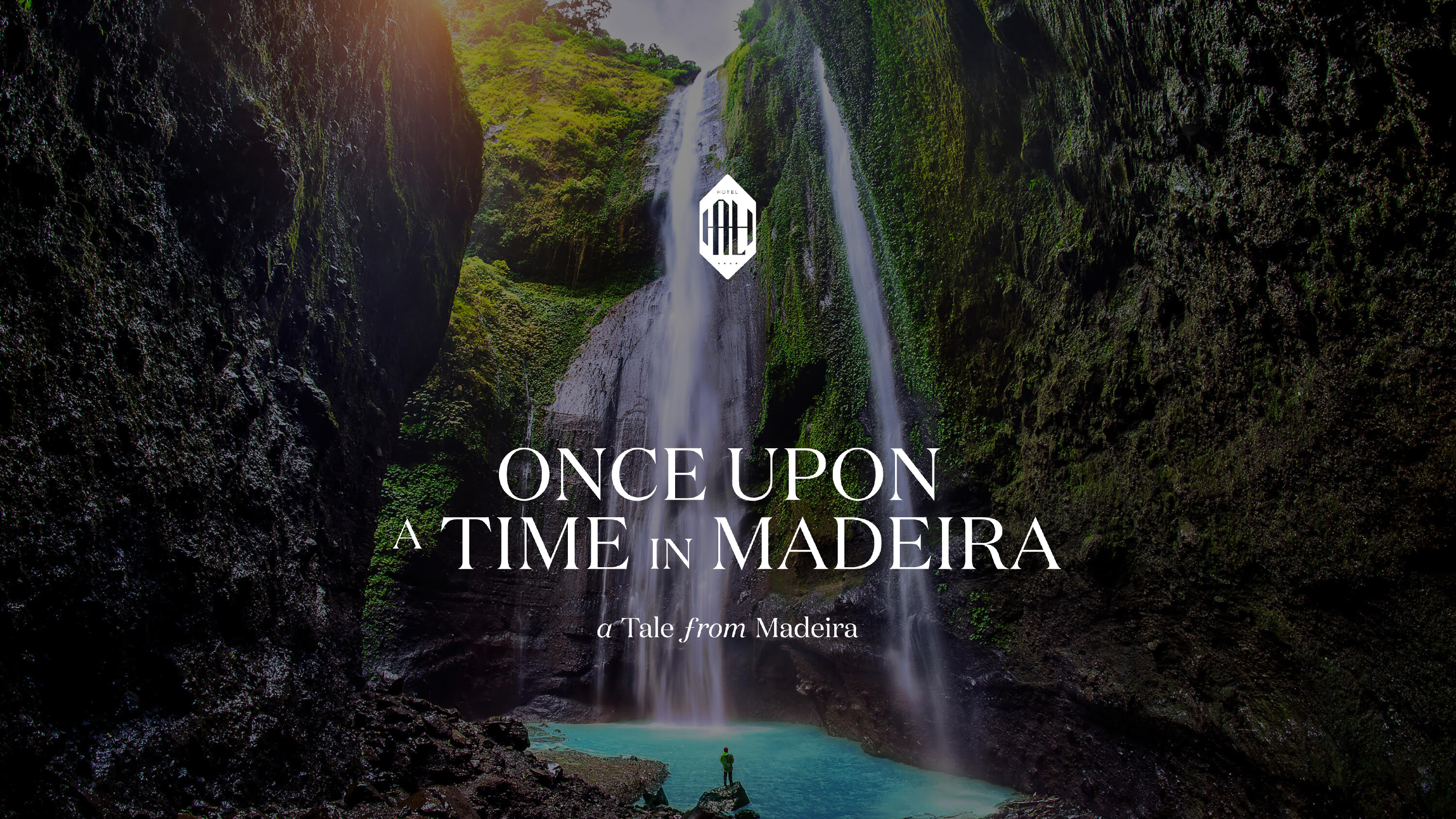
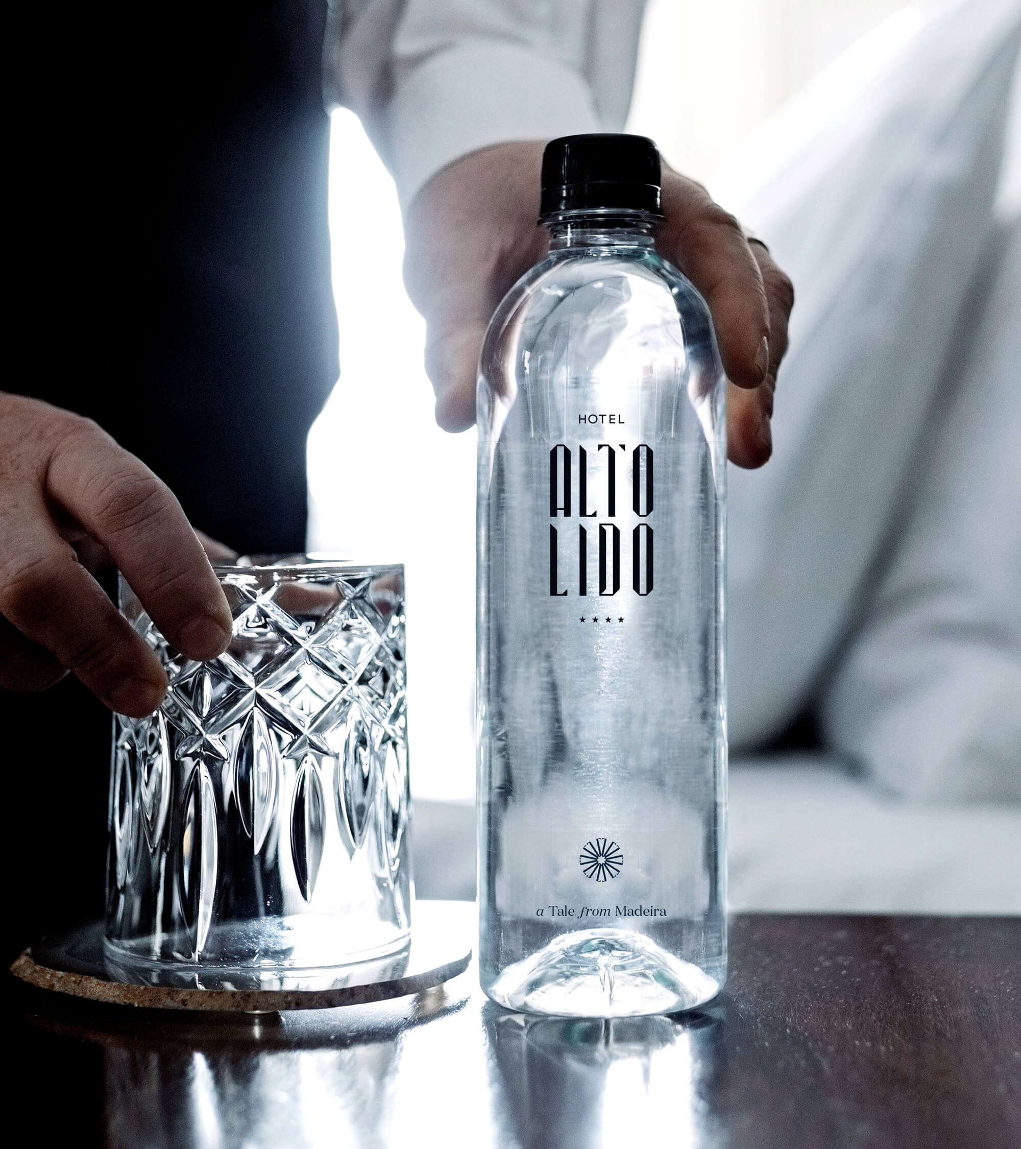
Madeira became a mystical destination, a place where tales could be told, where ancient legends are still alive.
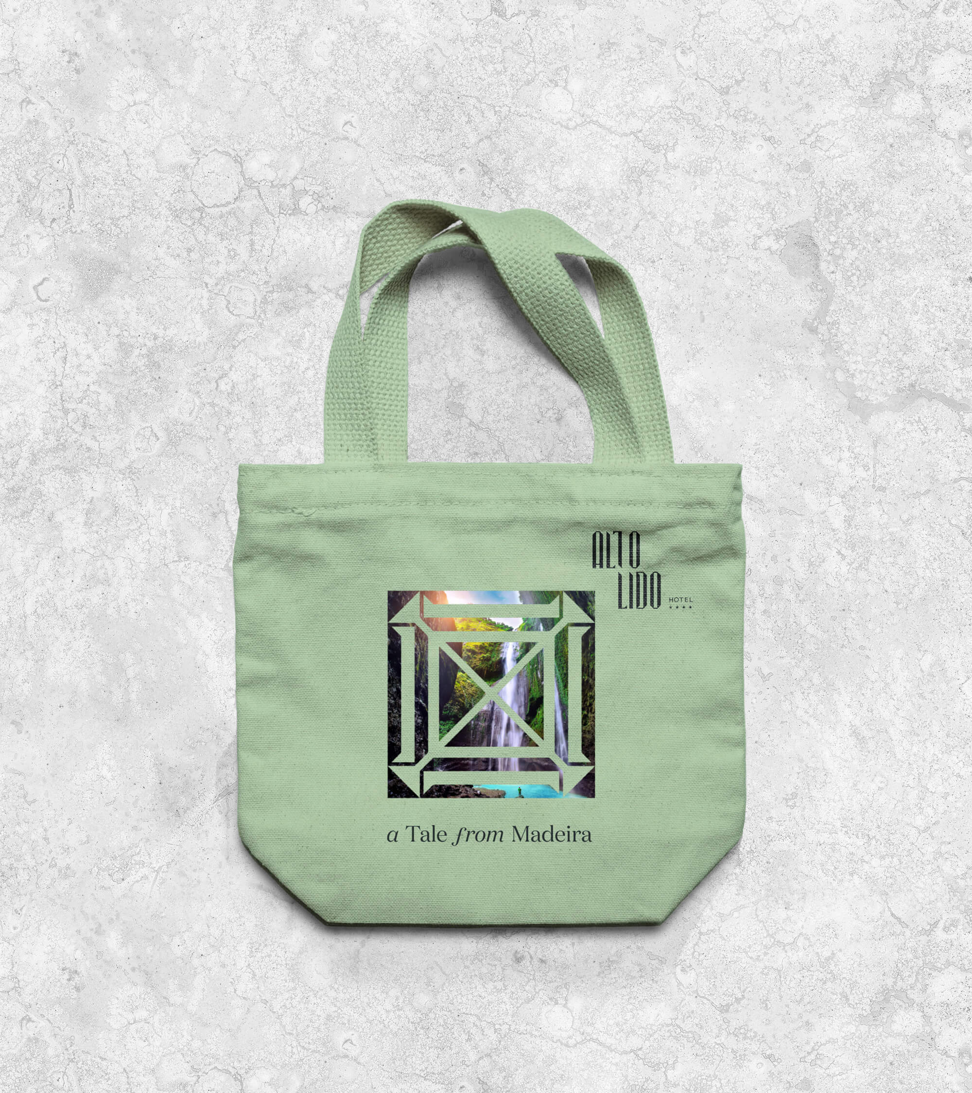
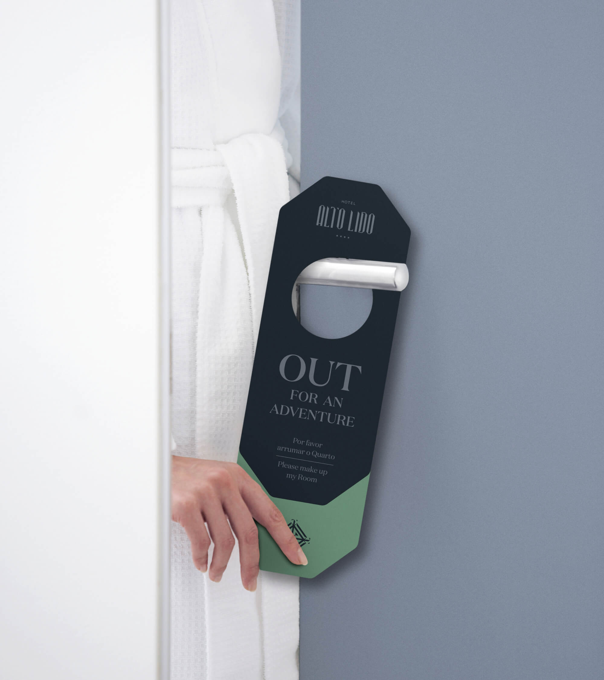
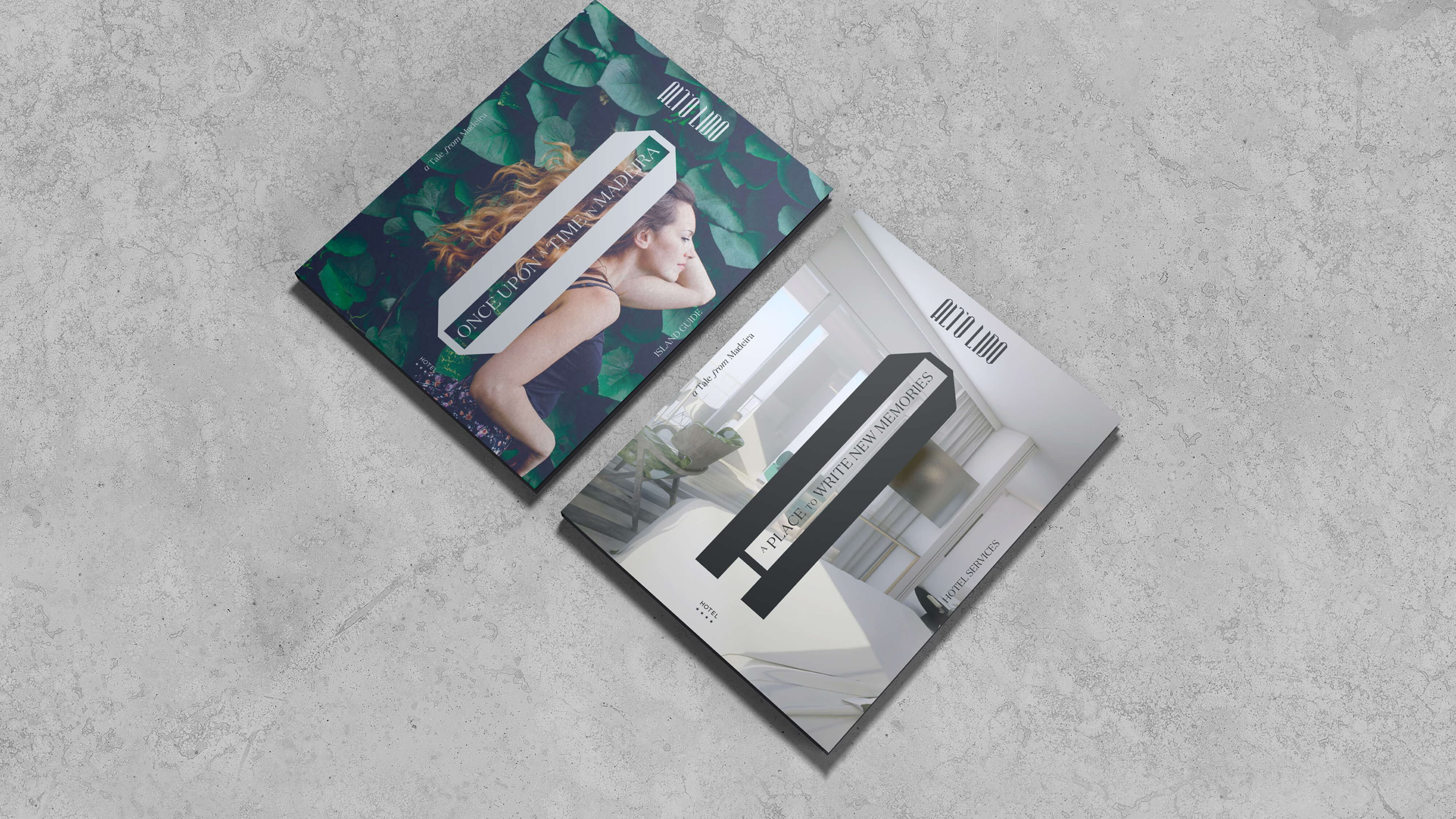
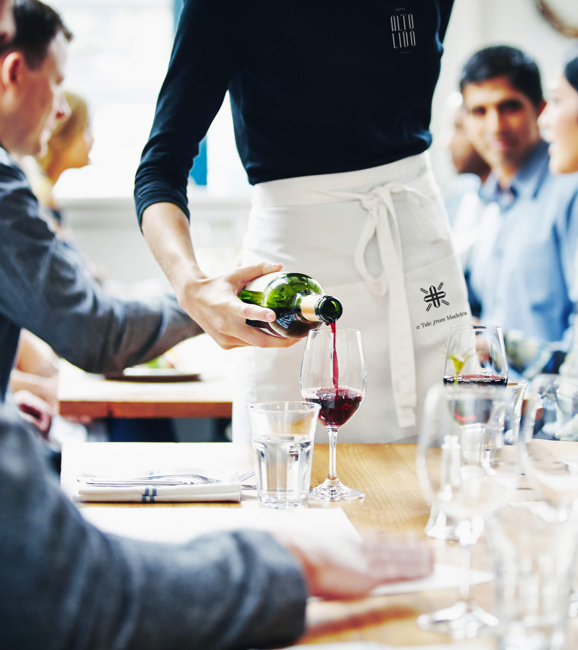
A Tale From Madeira is an inspiring and aspirational budding relationship between guest and hotel, between traveller and destination. With a strong storytelling potential, this claim reveals a place with stories to tell. Here, you'll be able to create your own adventure, share your own memories, tell your holiday tale. This is also a personal add-on to the brand's strong sobriety, a way to inject some non-curbed enthusiasm to the identity's straight lines.
We've been telling you a story all along. Actually, we've been preparing you for this: the tone of voice for this brand couldn't possibly go in another direction: Once Upon a Time in Madeira invites you to create your own memories, making them last longer in your personal storytelling, reenacting and recreating all those adventures lived while relaxing at this unique hotel. The place you could always come home to, to inspire new adventures and some well-deserved daydreaming.
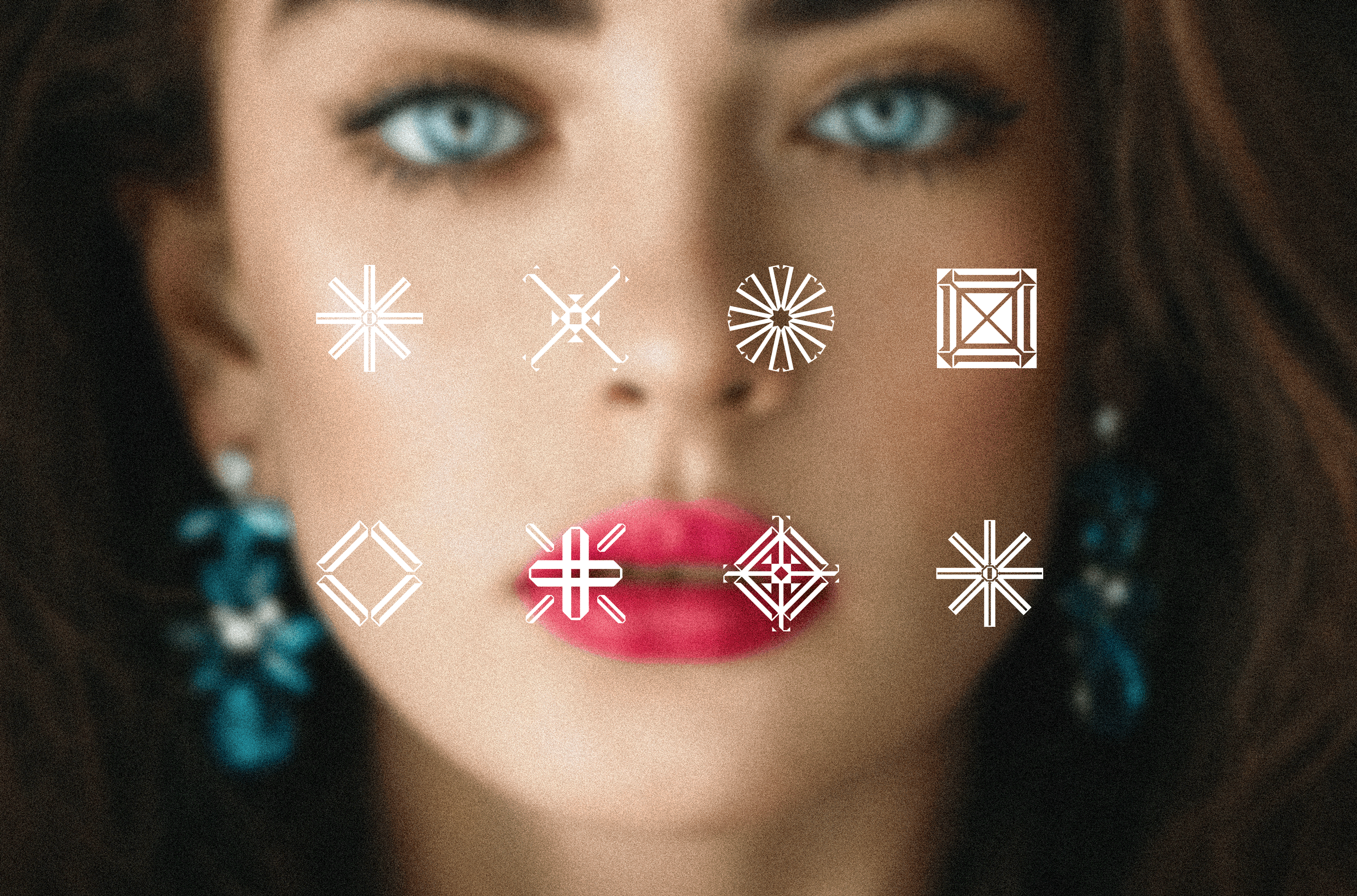
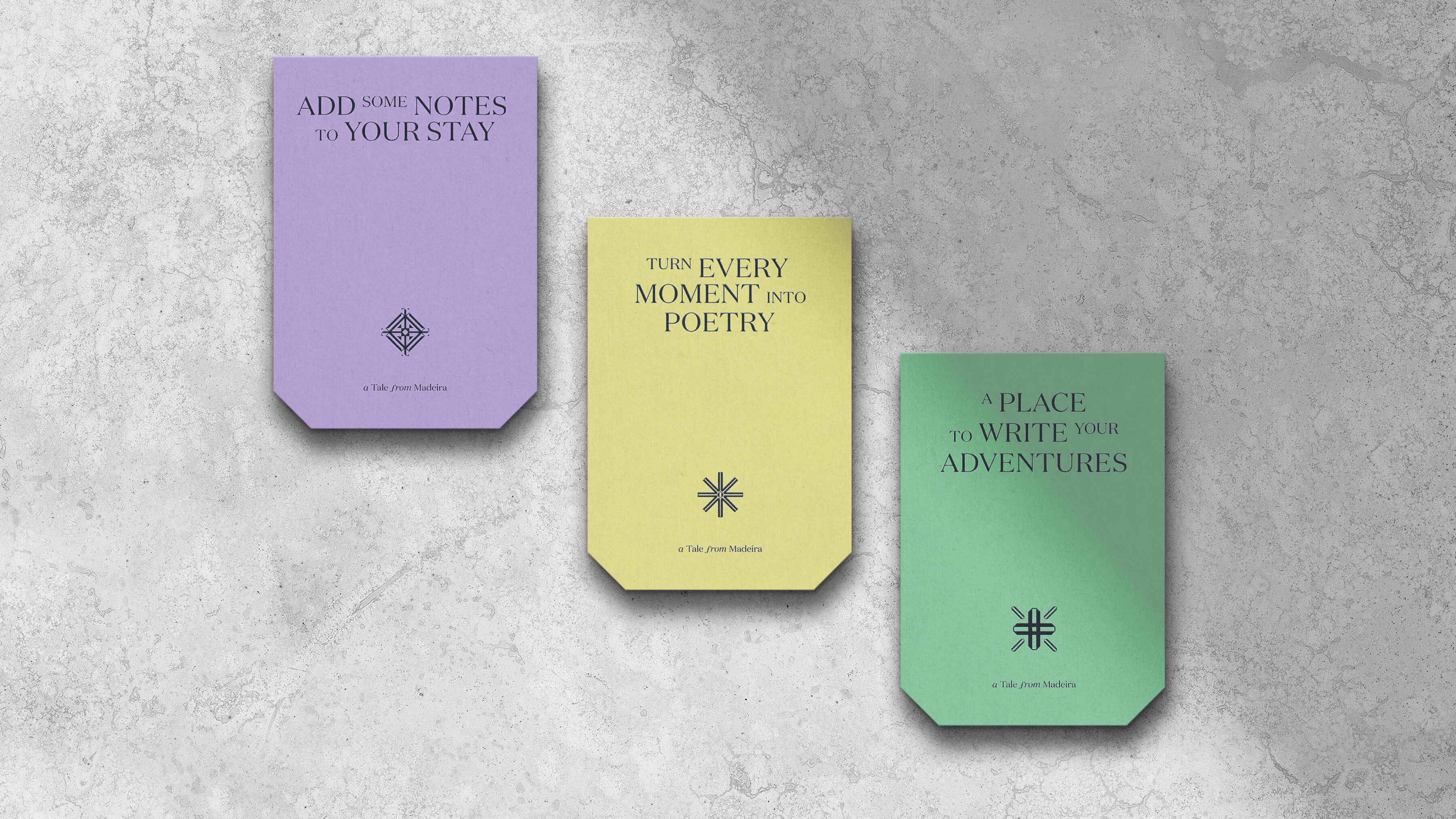
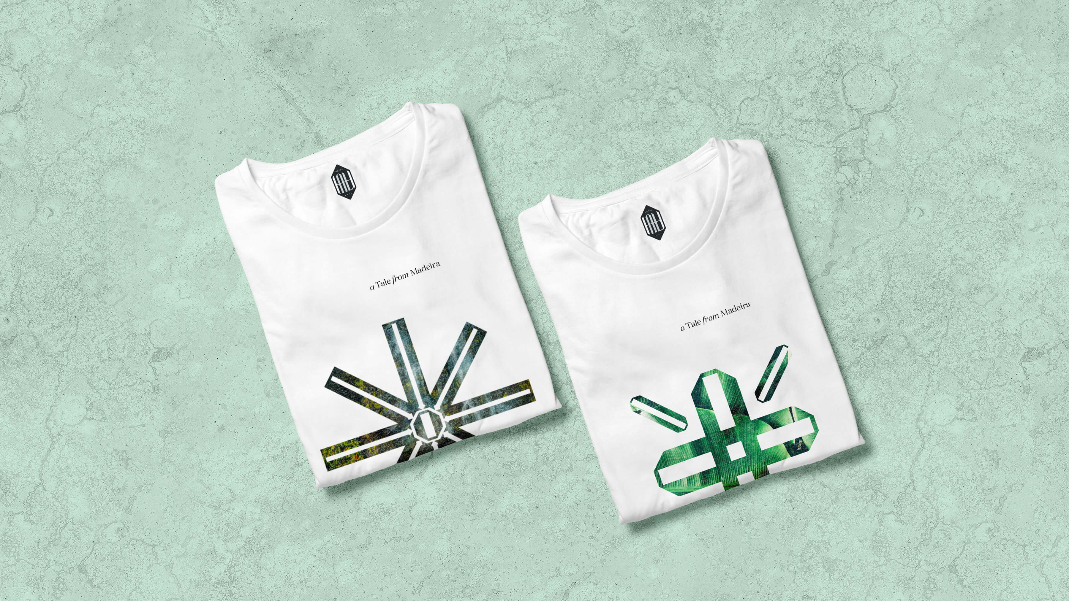
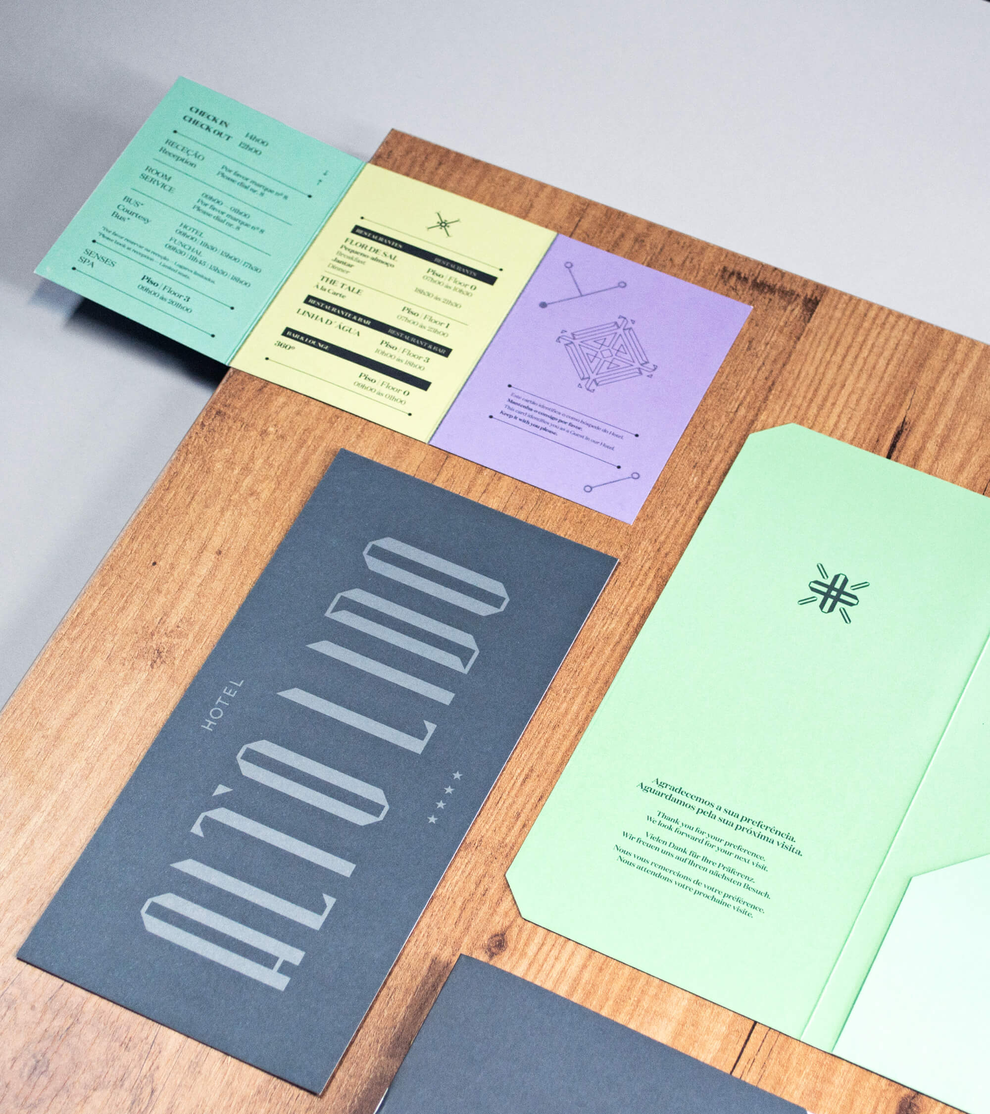
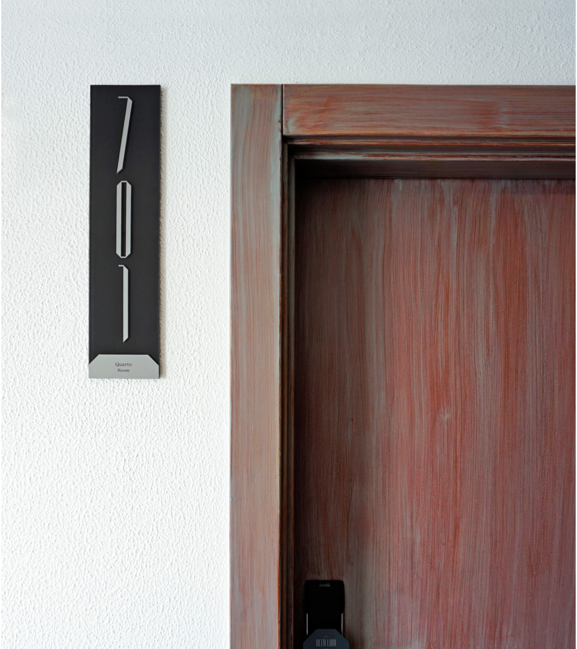
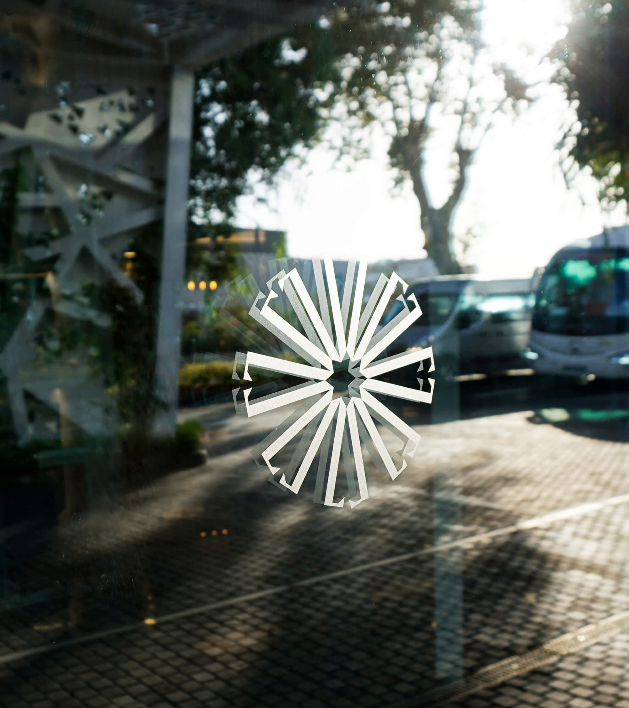
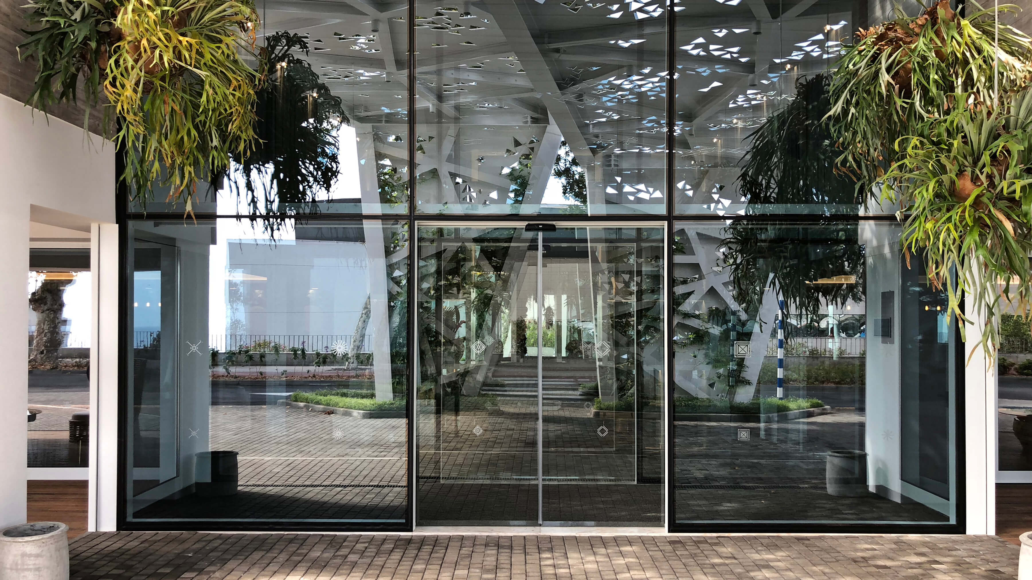
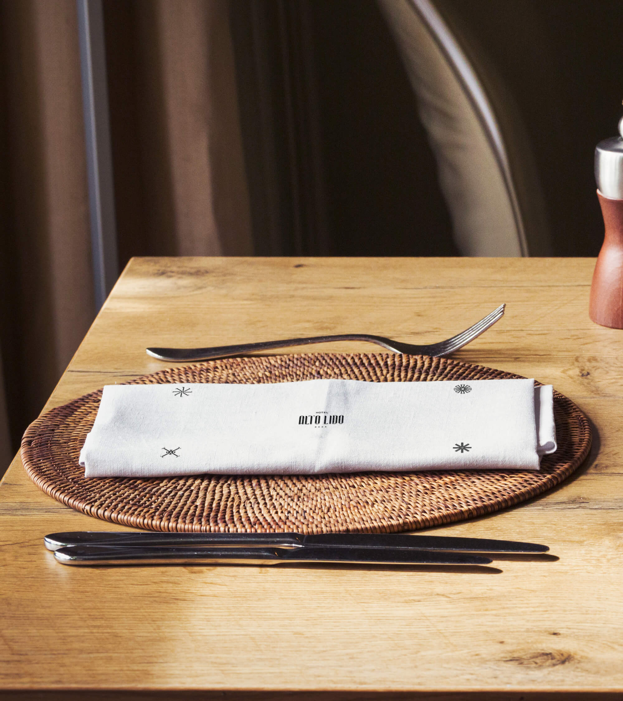
And a story is never complete without the delicate frameworks that encapsulate the keywords for the experience: in our case, Beauty Is In The Details. We created each monogram based on the brand identity letters, graphic ornaments inspired by the classic fairytale books and debutante balls that happened in the salloons. Like a jewellery piece, they complete, they complement and they enrich the brand's manifestations, adding strength and personality. Monograms have a huge range of application, reinforcing the presence of the brand in every detail.
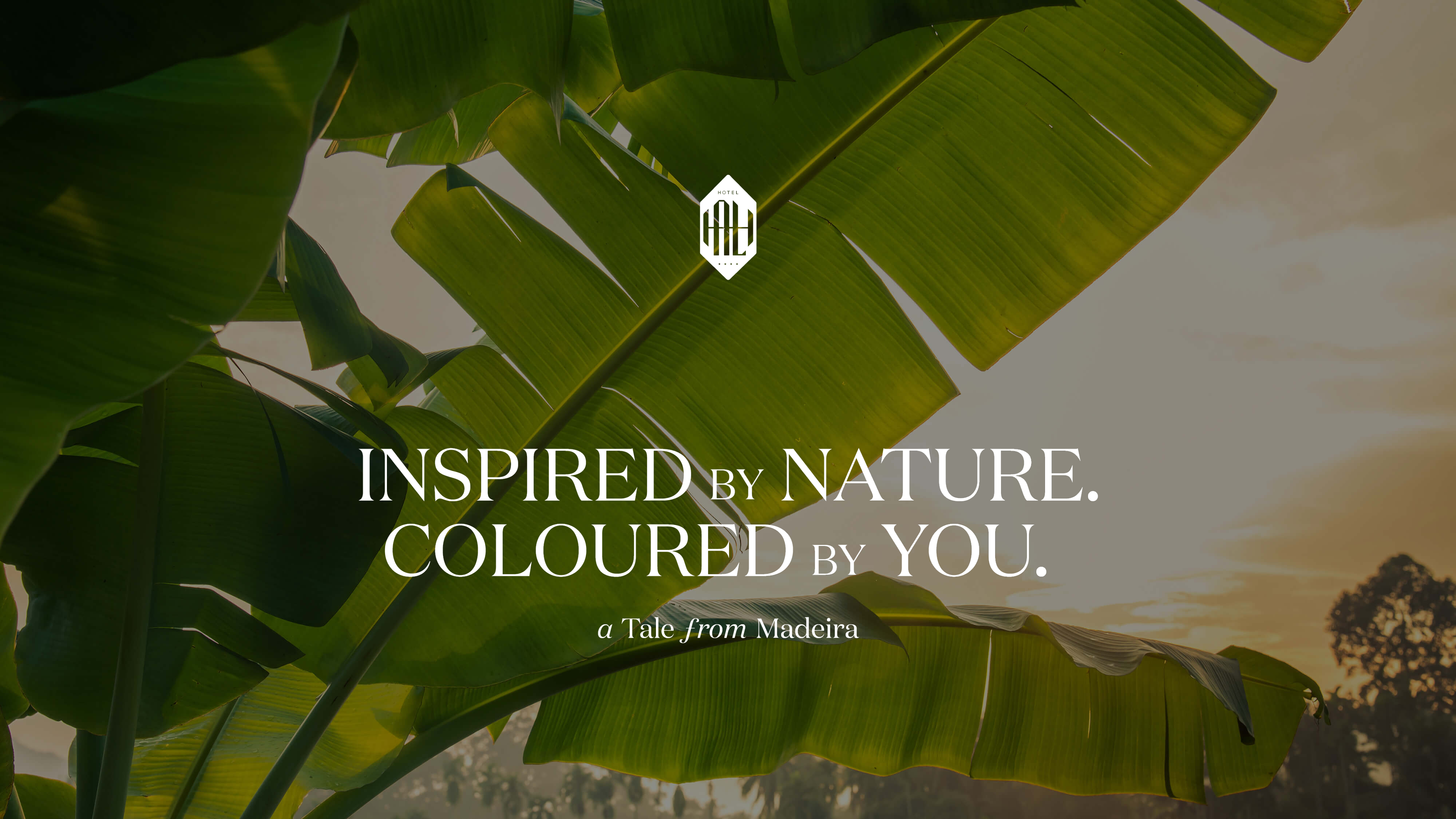
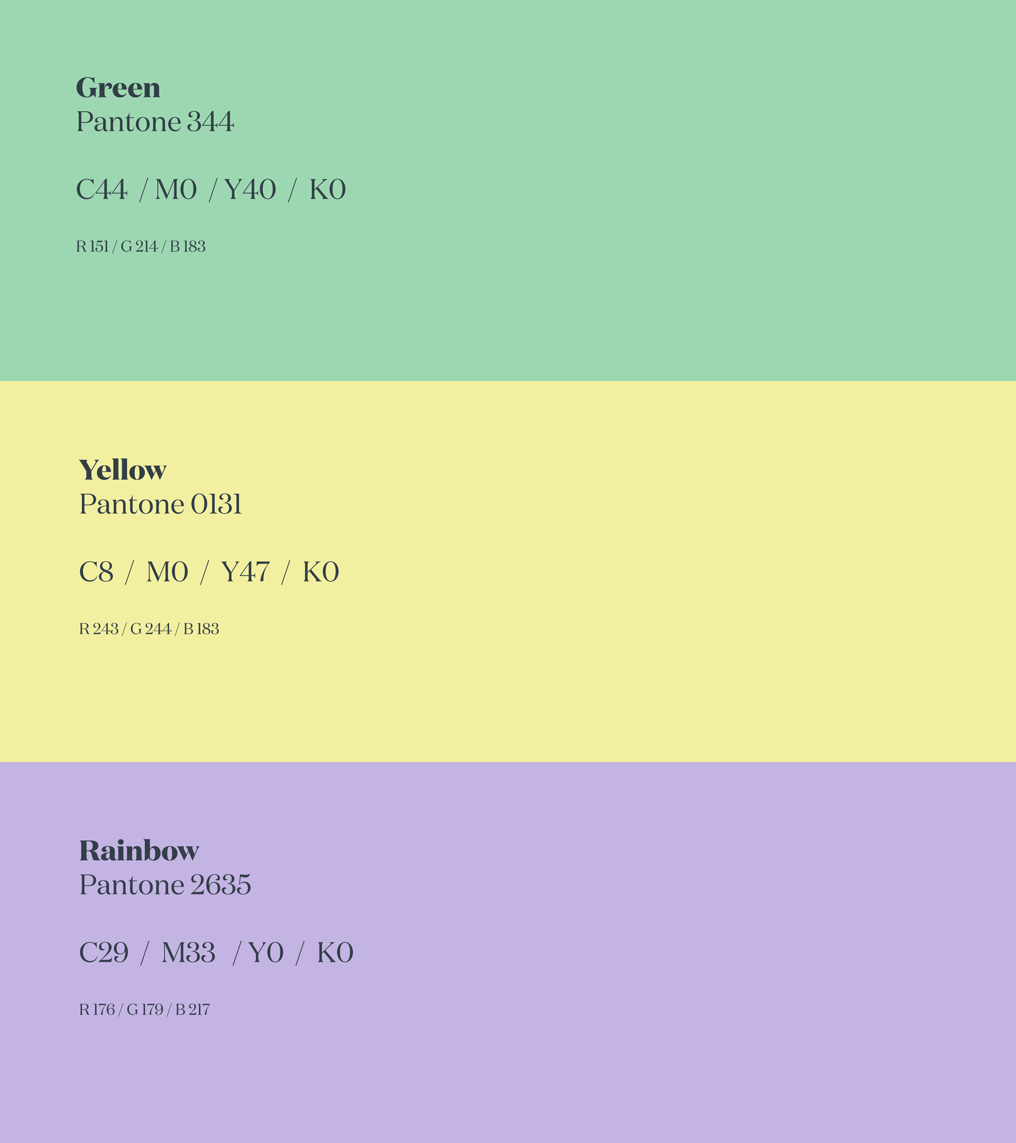
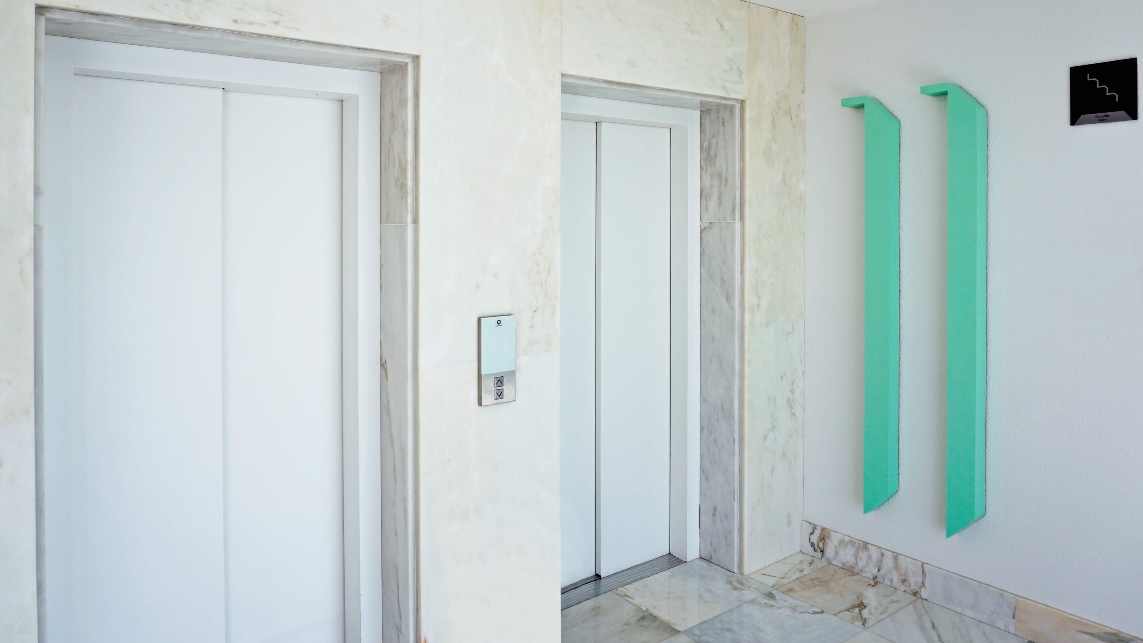
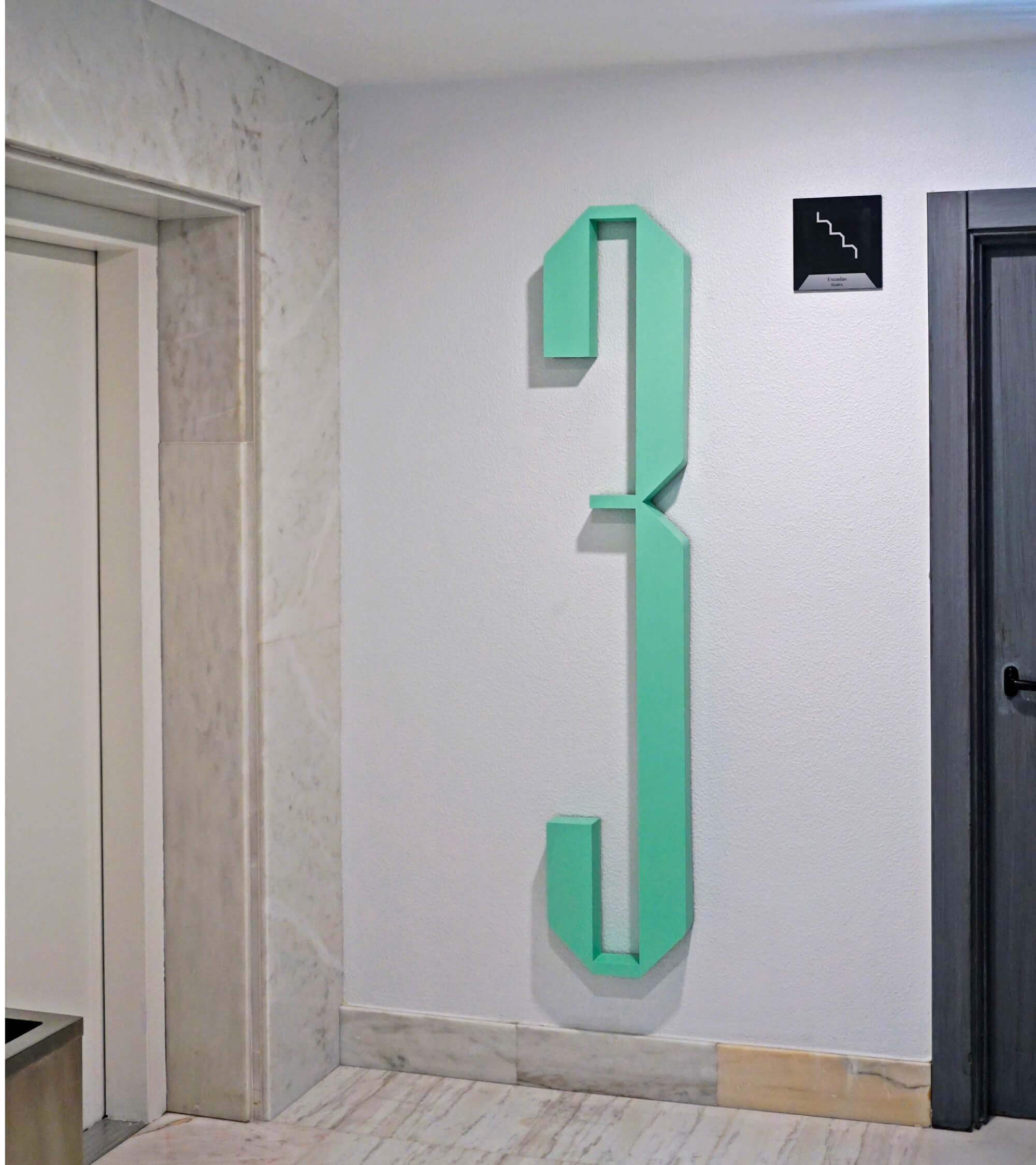
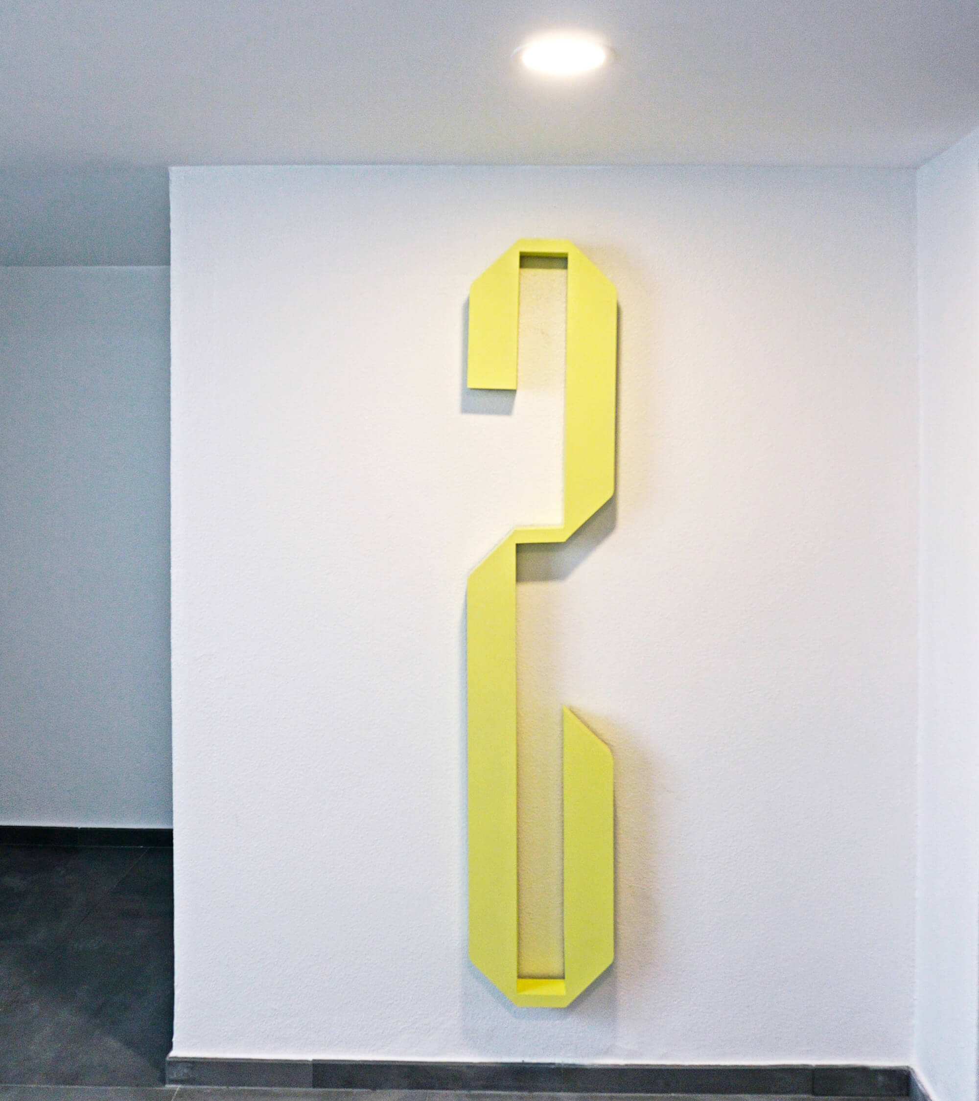
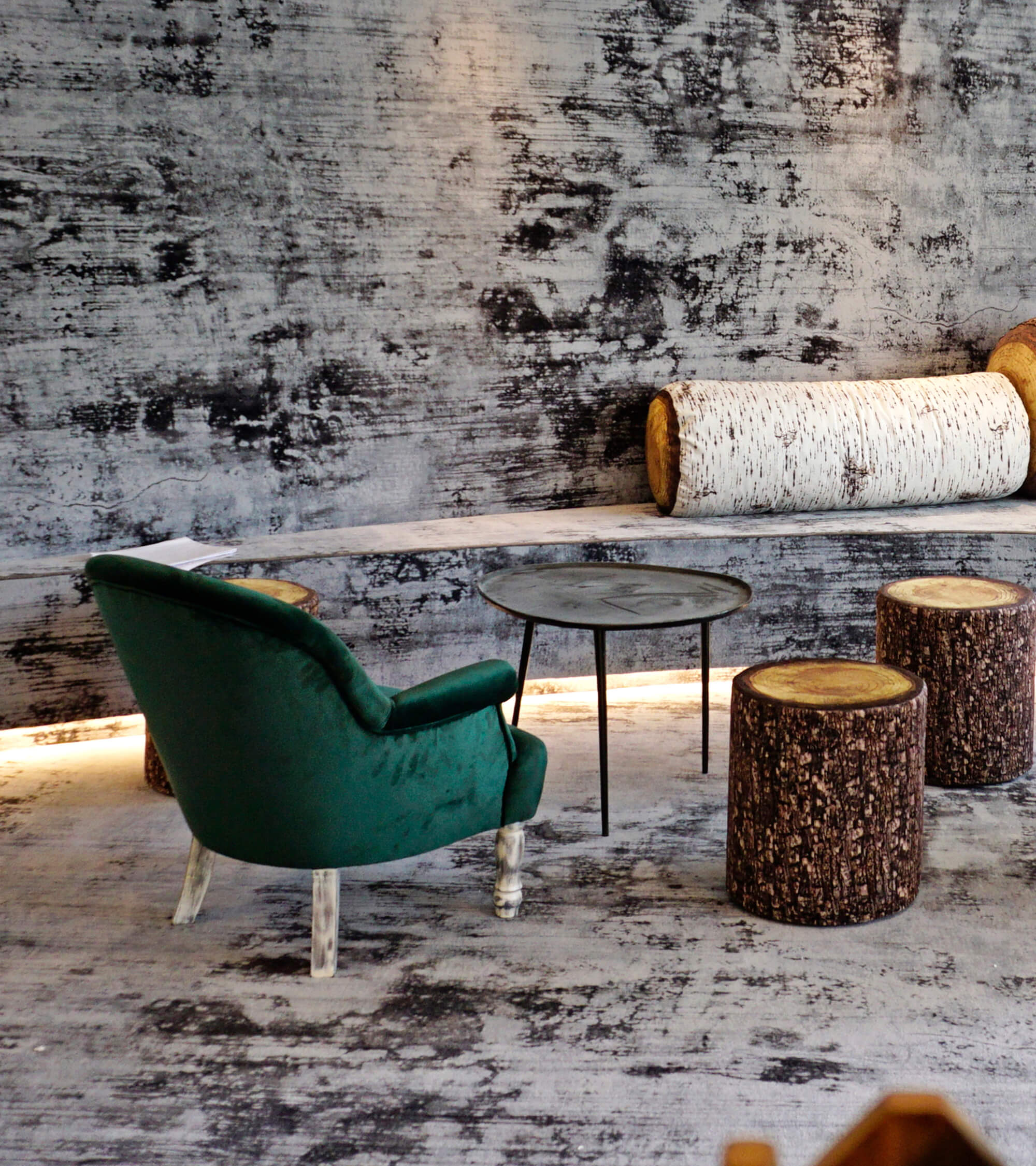
"Inspired by Nature, Coloured by You" was our exercise: we added a slot of complementary colours, destined to complement the natural and organic nature of the location and to add a relaxed, fun vibe to the Identity's graphic universe dominated by dark, grey tones.
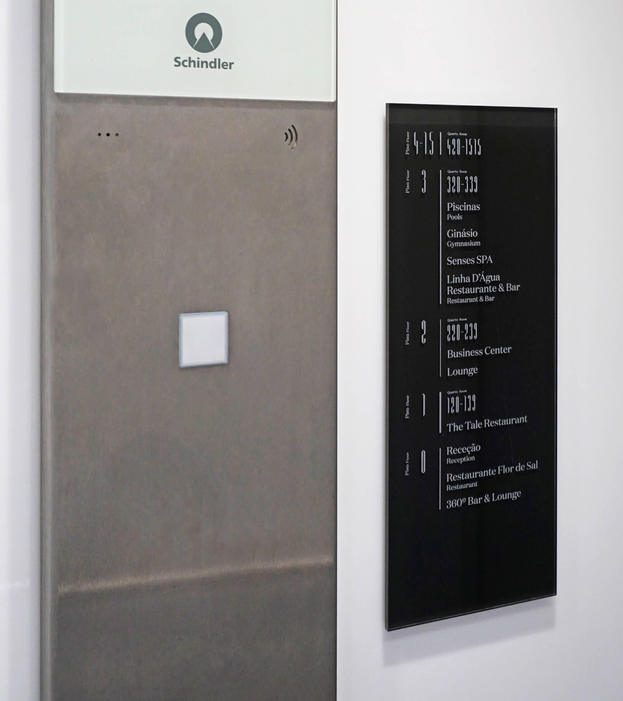
We identified the hotel block as well as representing a colour of the identity, to make sure everyone would leave with lots of tales to tell and the need to come back for more.